I think a feature for adding empty space(s) between lines can be significantly helpful. For fencing out the parts of a document.
Something like this:
- List item
- List item
- List item
Empty space - List item
- List item
- List item

I think a feature for adding empty space(s) between lines can be significantly helpful. For fencing out the parts of a document.
Something like this:
You can add a few blank lines in the note field of the last item in the upper section.
Or, for something more visible, add a color label to an empty bullet point to separate things.
Logically though, if you need this to separate two groups, it might be better to add two parent items (e.g. “First half of 2018” and “Second half of 2018”) and put each group under them. That’s the more “outliner-y” way in my opinion 
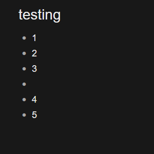
This is not the way it should look. Not pretty at all.
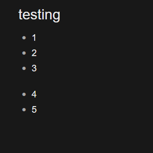
This image shows my idea in a better way. Much prettier than adding colors with empty bullets. And the space is not clickable.
Ok, that’s valid, from your previous example I didn’t consider that the last item might have child items.
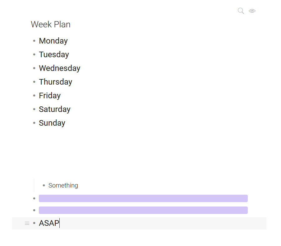
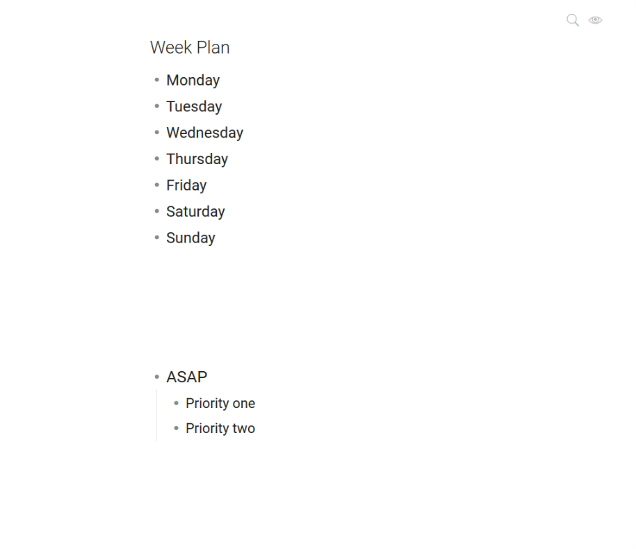
But in your example, can’t you group Monday - Sunday under “Weekdays” and “ASAP” somewhere else? See the last paragraph of my last reply, thanks.
@Leonardo_Callie I have a similar use case to yours. And it seems very easy to solve your example without new functionality.
Current tasks v1
Another, even better solution, would be to use custom date representation (turn off “default” date format and use the one that has “day of week” present). Then you can actually remove one level or nesting and have something like:
Current tasks v2
I’d like to second Leonardo’s original feature request – to be able to add empty space(s) between lines – but suggest a (theoretically) easy and non-disruptive way it could be implemented.
What if blank items had invisible bullets? The bullets would only become visible when the blank item is being edited. (Also, if you wish, on mouseover.) This would add a powerful new ability: to create visual gaps within lists.
(With pen & paper, this is the most natural thing to do, and can be very helpful.)
Currently in Dynalist this is kind of possible, but the blank items’ bullets are visually distracting and serve no purpose – for example, unlike normal items’ bullets, blank items’ bullets do not indicate whether the item has children, because obviously blank items do not have children. (Actually blank parents are possible – so let’s say more precisely: bullets should be invisible for blank childless items not being edited or moused over.)
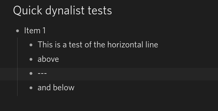
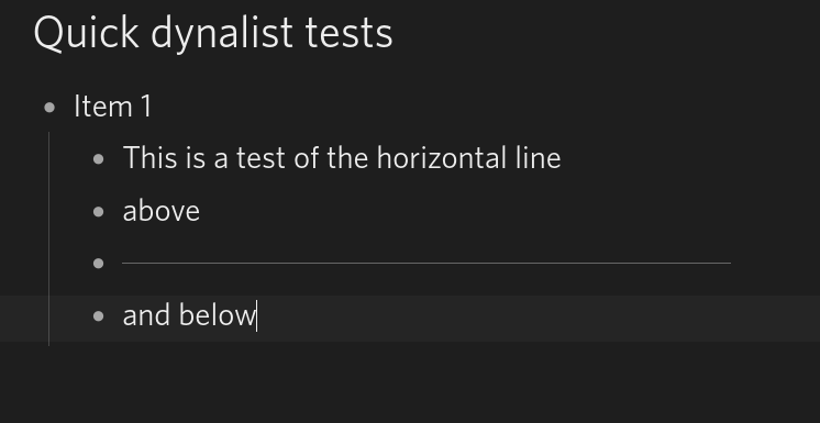
I find a great way to section-off different parts of a list (that you want to keep on one level for some reason) is to use the horizontal line available in the Powerpack add-on.
You add a bullet with three dashes and it renders as a horizontal line across the width of your list. It’s not quite the same as white space but for me serves a similar visual purpose.
Obviously you need to use the Powerpack add-on (see: Powerpack 3) which you may not wish to use but it is full of useful features.
What you type
How it looks
It would be great for people who don’t use Powerpack if this was a standard feature.
With invisible bullets, I wonder how you can distinguish that part of the blank space from the black space at the bottom of the document?
The way I envision using it (and sometimes use it already), the blank lines would be spacers, so there almost always be lines of text visible below (after) them.
Of course one might add one or few blank lines to the bottom of the document in preparation for adding a new section of text. And I suppose one might occasionally navigate away and back before actually beginning to add the new text. This case of having an unknown number of invisible bullets at the bottom of the document could be addressed by having mouseover cause the bullets to reappear. (Otherwise, as in any text editor, one could just move the cursor down to explore how many blank lines there are.) I guess I’m in favor of the mouseover (which already causes the menu and expand/collapse icons to appear), but to me it also doesn’t seem like a big problem.
A couple of further thoughts:
+1000! I’ve wanted this feature since I started using Dynalist, but unwisely assumed it was coming as the product continued to develop. I’ve tried a number of solutions to add space between list items.
The empty bullet is a visual distraction.
I added a CTRL-SHIFT-ENTER line break, which seems like it’d be awesome. But if the list item has children, you end up with an unwieldly gap inside that item when you zoom in:
I really like Marcus M.'s suggestions about somehow hiding the bullet point. Having a tickbox to hide the bullet for empty lines would be awesome!
Sorry for the late reply. I carefully read your suggestions @MarcusM @smottz, but I’m still not convinced this is a necessary feature in Dynalist.
I totally understand that in a text editor or word processor, you can add a bunch of new lines or even start a new page; there are lots of ways to add empty spaces between sections. But Dynalist is an outliner, and an outliner has a hierarchical structure. That’s the defining characteristic of outliners in general.
For example, if you want to add space between 1, 2, 3 and 4, 5, there should be a reason for it that I don’t know. By grouping them into two separate parents, you can expand/collapse them independently, and to be zoomed into independently. Both these benefits are not available if you just add a bunch of new lines.
If you guys have more convincing examples that cannot be solved by reorganizing the items, please do let me know! Maybe we can come up with a way to enhance it via custom CSS.
As it stands now, I don’t think we’ll add this functionality to core Dynalist for everyone. By bumping this thread let’s see if this can get more interest… right now it looks like only a few people are interested in this feature.
Thank you, @Erica, for the time spent to respond and for your attention. Love the service.
I think the idea is the space acts as the most clean and minimal approach to separate two related, but unique elements. For instance, your reply in this thread was a single, topical response, but was subdivided into paragraphs to provide a minimal amount of separation between multiple contributing concepts for the sake of clarity.
From time to time, I have a similar desire to present a list of items, but acknowledge the subtle differences between a few groupings. For instance, and I’m inventing this in the moment for the sake of illustration, I may have a Dynalist item that is a specific day. Within that item, I may wish to have an “AM” and a “PM” list of one or two tasks I wish to see at a glance. Since there are only a couple of items for AM and PM, the creation of a level for each grouping seems a bit more convoluted than necessary, as I don’t wish to expand or zoom in to see just one or two terminal pieces of information. If I wanted to see the whole day, though, it’d be nice to have the option of spacing this presentation in such a way that the information is clearly presented as a whole, but with a subtle divider (consisting of nothing but space, which is as subtle as it comes). Adding space between two items helps customize the presentation of two items in the simplest way possible. We all implicitly understand this as space is used in all written communication (even within a sentence itself, like this one) to improve clarity of communication. Lists/outlines do not depart from that convention, and can enjoy all of the same benefits of its availability.
If there isn’t much demand for such a feature, though, I completely understand and don’t wish to steal resources for a personal wish. It’s just that I wish it so bad! 
Thanks, @Erica.
On the one hand, I agree with you that Dynalist is an outliner. On the other hand, Dynalist has many features which other outliners lack (individually or in combination), including formatting, notes, hoisting, jumping, web and inter-outline linking, folding, tags, dates, images, and much more.
Particularly because of its hoisting ability, I’ve found Dynalist lends itself to composing and organizing information which is slightly more than an outline but less than a document. (Again, I’ll mention the analogy of a paper list, which can naturally have internal dividers.) Because of Dynalist’s outline structure, the information is still well integrated.
Dynalist’s current ability to change from List View to Article View is another feature which hints at the possibility of viewing information in a more document-like way.
I can understand (and agree with) why you wouldn’t want to take Dynalist too far in the direction of a word processor. But the possibility of incorporating blank lines (or another form of list divider, like a horizontal rule, if you prefer), seems to me like a potentially small but powerful extension of its outliner design and functionality.
Is it just @smottz and me, or do other Dynalist users agree?
@MarcusM @smottz @Erica - I’d also like the ability to insert blanks and /or horizontal lines to split sections within a document but here’s a css solution you can try now that’s been working for me.
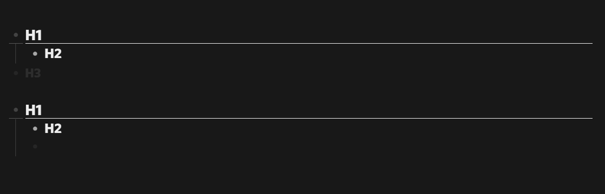
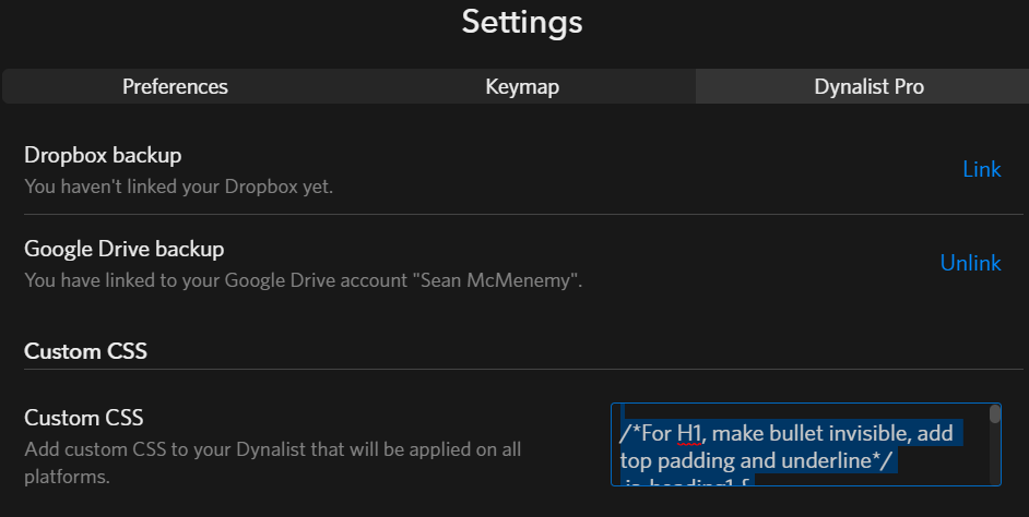
I wrote some css that simulates this (shared below). It adds padding and a border to H1 items and makes H3 items appear (nearly) invisible.(just swap the opacity to zero if you’d like).
/*For H1, make bullet invisible, add top padding and underline*/
.is-heading1 {
	padding-top: 30px;
	}

.is-heading1 .node-line {
	border-bottom: .1px solid white;
	max-width: 90%;
	}

.is-heading1 .Node-bullet {
	opacity: 0.3;
    }

/*Make H3 appear blank - Use for extra spacing*/
.is-heading3 {
	opacity: 0.1;
	}

/* show search terms in bold and italic without background*/
.search-match {
    font-style: italic;
    font-weight: bold;
    background: black;
}
Just add it here:
Nice one! I think it would fit very nicely in this post: Post your current Custom CSS (with comments)! So that others can get some inspiration! 
Hi Erica,
This IS a necessary feature. I’ve been testing Dynalist for a week now and the lack of this feature is one of the things keeping me from truly embracing Dynalist.
Like somebody else mentioned above, you can use empty note fields to simulate this, but this is in incredible hassle, since the need for empty spaces is dynamic (depending on your zoom-level and which bullet is next in the list), so you need to remove empty spaces and insert them elsewhere…
I think the best way for this feature would be a toggle in the settings pane:
“Add padding around expanded bullets:
above: yes/no
underneath: yes/no”
This allows a more clean view of an item when you expand it, because the child bullets won’t be squeezed to closely to the next parent bullet.
And when you collapse the bullet again, the padding will disappear, making the bullet fit nicely inside the list of other bullets.
Kind regards,
Tim
Tim, I don’t think you’re describing the same feature.
Anyway, I do wonder how much these various desires for extra vertical space could be satisfied through CSS. For example, if there is (or could be) a CSS property (or whatever the right term is) identifying blank items (items containing no text or only spaces), then one could customize the CSS to hide bullets for those items. That would satisfy my request.
As for your request, Tim, it may already be possible through CSS. For example, @Sebastien_Plat has shared some CSS which tweaks vertical spacing (also borders) depending on whether an item is a parent, is expanded, and so on.
I would so love this feature.
The cleanliness of having some blank white space helps me visualize and be more productive. Right now, I am resorting to using Notepad++ for this but if Dynalist had this feature (make empty lines bullets blank), it would be a big help!
I’m surprised nobody posted the simple solution, or I missed it.

Ctrl+Shift+Enter or ⇧⌘Enter creates new lines (white space).