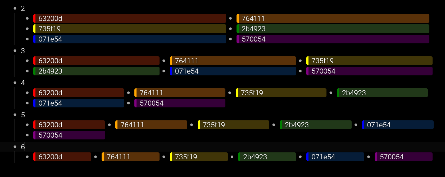
Thank you for your suggestions, @Joshua_Reinier! I managed to make what I wanted using H1, Add checkbox and Check off variables (let’s name them like that). The below CCS make children of any bullet which have H1 and checkbox or check off or another combination of that variables to be arranged in 2/3/4/5 or 6 columns. It’s configured for my display, so maybe if someone want to use it, they should modify the width of the columns. I use it in conjunction with AutoHotKey shortcuts (posted below). Also, be aware that I sacrificed the checkbox usability, but it remains the “check off” to be used.
.is-heading1 ~ .Node-children > .Node-outer {
display: inline-block;
vertical-align: top;
}
.is-heading1 ~ .Node-children > .Node-outer > .Node {
width: 172px;
}
/*============================================================================== */
.Node.has-checkbox.is-checked > .is-heading1 ~ .Node-children > .Node-outer {
display: inline-block;
vertical-align: top;
}
.Node.has-checkbox.is-checked > .is-heading1 ~ .Node-children > .Node-outer > .Node {
width: 344px;
}
.Node.has-checkbox.is-checked > .is-heading1 .Node-checkbox { display: none !important; }
.Node.has-checkbox.is-checked > .is-heading1 .Node-content,
.Node.has-checkbox.is-checked > .is-heading1 .Node-renderedContent,
.Node.has-checkbox.is-checked > .is-heading1 .Node-note,
.Node.has-checkbox.is-checked > .is-heading1 .Node-renderedNote {
color: white !important;
text-decoration: none !important;
}
.Node.has-checkbox.is-checked > .is-heading1 ~ .Node-children .Node-content,
.Node.has-checkbox.is-checked > .is-heading1 ~ .Node-children .Node-renderedContent,
.Node.has-checkbox.is-checked > .is-heading1 ~ .Node-children .Node-note,
.Node.has-checkbox.is-checked > .is-heading1 ~ .Node-children .Node-renderedNote {
color: white !important;
}
/*============================================================================== */
.Node.has-checkbox > .is-heading1 ~ .Node-children > .Node-outer {
display: inline-block;
vertical-align: top;
}
.Node.has-checkbox > .is-heading1 ~ .Node-children > .Node-outer > .Node {
width: 255px;
}
.Node.has-checkbox > .is-heading1 .Node-checkbox { display: none !important; }
.Node.has-checkbox > .is-heading1 .Node-content,
.Node.has-checkbox > .is-heading1 .Node-renderedContent,
.Node.has-checkbox > .is-heading1 .Node-note,
.Node.has-checkbox > .is-heading1 .Node-renderedNote {
color: white !important;
text-decoration: none !important;
}
.Node.has-checkbox > .is-heading1 ~ .Node-children .Node-content,
.Node.has-checkbox > .is-heading1 ~ .Node-children .Node-renderedContent,
.Node.has-checkbox > .is-heading1 ~ .Node-children .Node-note,
.Node.has-checkbox > .is-heading1 ~ .Node-children .Node-renderedNote {
color: white !important;
}
/*============================================================================== */
.Node.is-checked > .is-heading1 ~ .Node-children > .Node-outer {
display: inline-block;
vertical-align: top;
}
.Node.is-checked > .is-heading1 ~ .Node-children > .Node-outer > .Node {
width: 207px;
}
.Node.is-checked > .is-heading1 .Node-content,
.Node.is-checked > .is-heading1 .Node-renderedContent,
.Node.is-checked > .is-heading1 .Node-note,
.Node.is-checked > .is-heading1 .Node-renderedNote {
color: white !important;
text-decoration: none !important;
}
.Node.is-checked > .is-heading1 ~ .Node-children .Node-content,
.Node.is-checked > .is-heading1 ~ .Node-children .Node-renderedContent,
.Node.is-checked > .is-heading1 ~ .Node-children .Node-note,
.Node.is-checked > .is-heading1 ~ .Node-children .Node-renderedNote {
color: white !important;
}
/*============================================================================== */
.Node.has-checkbox > .Node-children > .Node-outer {
display: inline-block;
vertical-align: top;
}
.Node.has-checkbox > .Node-children > .Node-outer > .Node {
width: 512px;
}
.Node.has-checkbox > .Node-self .Node-checkbox { display: none !important; }
/*============================================================================== */
.is-mediumFont .Node-self.is-heading1 .Node-contentContainer {
font-size: 18px;
}
.is-mediumFont .Node-self.is-heading1 .node-line {
line-height: 22px;
min-height: 22px;
font-weight: 1;
}
.is-heading .Node-contentContainer {
text-shadow: 0 0 0px;
}
AutoHotKey script (! = alt, # = windows key, ^ = ctrl, + = shift)
!#6:: sendinput ^+h
!#3:: sendinput ^+h^+c^{enter}
!#4:: sendinput ^+h^+c
!#5:: sendinput ^+h^{enter}
!#2:: sendinput ^+c

 Maybe I will post it separately after my exams are over.