OK this one is going to sound petty, but bare with me. There are currently three options for note-reveal: full note; first line and hidden. Would it be possible to have an option in setting to choose which of these is available while toggling with the shortcut key? I like to flick notes on and off a lot and I don’t use the full hidden option ever - I therefore have to click once to switch notes on, and twice to switch them off, and frequently forget to do the latter - it would be really nice to have the possibility of just changing it to two options, so one click opens them and one click closes them. Of course as you obviously know some people want ‘closed’ to be one line showing and some want completely hidden - I therefore imagine a set of three toggles in the settings, one for each mode - if they are ticked, they will be in the ‘rotations’ and if not they won’t be - so if I only tick open notes and one line options in settings then pressing the notes toggle shortcut will only cycle through those two options. I hope this is clear!
+1 I would really like this as well, specifically because sometimes I have really long code snippets using piotr’s powerpack and would like to conditionally hide some note areas
By default, I would prefer to have all my bulletpoint’s notes fully shown, and be able to conditionally toggle notes I don’t want to look at
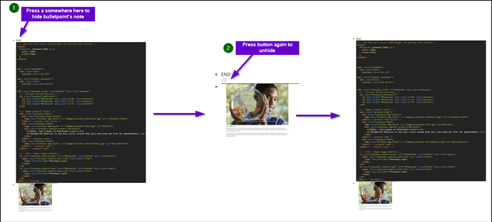
More or less this diagram
If you’re on Windows you can toggle them with Alt+N. Am I missing something? Or do you want to toggle between 2 states instead of 3?
I don’t know about @Stephen_Dewitt Stephen but I would really like a way to toggle elements individually, as opposed to all or nothing kind of deal
e.g.
I prefer everything fully on (notes: show) but occassionally would like to have some notes hidden per basis until toggled (notes: hide)
Yes I want to toggle between two states instead of three. 
I think Vincent wants to toggle different notes on and off, which is related but quite different to what I’m asking for - seems like more of a piotr thing 
Looks like you guys are talking about different things then.
@Stephen_Dewitt: right now on average 1.5 shortcut presses while you want 1 shortcut presses… honestly I don’t know if that’s worth changing anything 
Hi Erica, fair enough - I guess I just have to learn 1 click on, 2 clicks off 
2 shortcut presses is still much faster than any mouse clicks ![]()
@Erica, isn’t there another thread discussing this topic? I would also like to request a way for “full hidden option” to be completely turned off, and I thought you were soliciting feedback on that elsewhere.
I especially don’t want it in the keyboard toggle cycle. Seeing the little note icons is not useful, since it doesn’t even collapse the vertical space. I would like either 1st line or everything, with ability to turn note icon off.
You mean here?
Yes that was it, thanks. I already voted in it, though I did just update my vote 
So this discussion topic is not really covered by that poll, as it’s predicated on notes set to hidden, and I’m advocating turning off the hide note ability somehow. But it’s lower priority compared to other items.
I see. Just making sure I understand what you mean correctly, you want to toggle between show all notes and show 1st, and omitting the hide note option entirely?
Correct, I don’t see any utility in hide notes, at least how it’s implemented now. If hiding Notes actually hid their lines, at least you could see more item content vertically. Currently it just hides the text, and you see the little icon. To me personally that’s not useful, I’d love to have that option disabled completely by preference.
Why not make the option do “hide notes completely (doesn’t show icon)” instead of omitting an option?
Personally I think it makes more sense since the number of people who want to hide notes completely should more than the number of people who wants to disable the 3rd hide note mode altogether.
Sure, as long as “hide completely” means also collapse vertically, not just leaving an empty line where the note was previously shown (which I could see some people may prefer for presentation mode). You can go a bit crazy here with configurability, so this is also probably an area for the product to have a strong opinion about what fits the most users (and I hate saying that because I disagree with the current approach).
