
It simply means “quick way to open the inbox location”. Does that make it clearer?
do you mean press a hotkey, immediately zoom into that bulletpoint designated as “inbox”?
that would be nice 
Yes that’s exactly what I meant. Whether it should be a hotkey or a button is the topic of this poll.
Not really, the thing I want to do quickly in regards to inbox is send things there, which we have a function for. Why do you want to go there quickly? I’d prefer to go other places quickly, like my ‘today’ list
For reviewing the inbox item and sending them to appropriate places, I would assume.
Mmm fair enough, we must have different workflows as clearing my inbox is something I do once a day, never something I need to do rapidly or multiple times in a day - my vote is option 4: ‘Have a shortcut to go to a list instantly, but have this be separately customisable from the inbox (and, ideally, allow more than one of these)’ - to be honest though, if bookmarks have highly unique names I do find ctrl + o -> first few letters -> enter rapid enough, but I wouldn’t say no to faster
That sounds a little hard to design properly. I mean we could offer 1 slot, 3 slots, or 5 slots, but I guess there will always be people who find it to be not enough. Sounds more like something that’s in a efficiency-focused plugin rather than Dynalist itself.
There should be easy to make a macro though (open finder - enter correct term - hit Enter), if that’s your thing.
1 Like
Yes it is easy - ok I bow out of this vote
1 Like
where is that shortcut anyhow? I can’t find it
Also I’m using the inbox mostly as a “maybe do-it later project ideas”, whenever I get a tangential idea
In keymap settings, under “navigating & moving”. Make sure you’re on the latest version
1 Like
For me inbox is that top level of my document. I would love a quick way to get their on mobile. The issue is, if I’m on row 79 of the current context, the upward nav links are only available at the top and i must vigorously scroll to get there. Safari on the other hand shows me the top by simply tapping the top edge of the screen.
1 Like
An option to make the breadcrumbs fixed in position?
2 Likes
If by that you mean the line that goes
Top > Middle > Lower
Okay.
Yeah, that’s what the WorkFlowy app does, at least.
The obvious pro is that it’s easy to go back and go to home. The obvious con is that it takes up some screen space.
I suggest to mimic iPhone Safari. The location bar is hidden but appears if you tap the top of screen.
You mean the location bar at the bottom? It appears when you scroll up in general.
In Dynalist most of the content is editable text, so tapping on them should enter editing mode, not do something else, in my opinion.
Every web browser puts the address bar at the top, not bottom. On a phone it is hidden if you scroll down.
“most content is editable”. Yes but I’m talking about the screen-edge. You can detect the edge case and treat that different from ordinary tapping an item.
Instead of a tap, you can make this happen on a scroll-up, and make it go away on a scroll-down.
I see.
Keeping the breadcrumb navigation visible at all times isn’t a bad idea though.
When I do testing on Safari, it often annoys me that I need to do a meaningless scroll up just to make the navigation bar at the bottom appear, to go back a page. The trade-off here is if you want more screen or more convenience.
Also I just realized I’m talking about the bar at the bottom that allows you to go back or switch browser tabs.
This toolbar here:
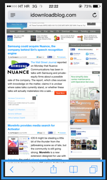
The top bar only lets you change URL and refresh.
Yes it has a different function, but I’m saying I like the stuff to go away, but give me an easy way to get those crumbs to show again.
It depends. If we talk about a narrow bar and nothing else it’s fine. (But we also need the current Title Line to know where we are at.
Just don’t compound it with the keyboard and icon bar and make it so i only get to see one item because the rest is all these other things.