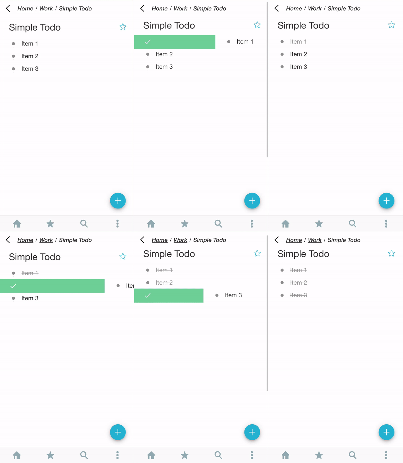
Add swipe gesture similar to Workflowy and Moo.do because open keyboard just to mark item as completed is annoying.


Thanks for the suggestion, we’ll definitely consider it!
Looks like a big time saver.
The Workflowy mobile app just added swipe gestures. I would personally like to have swipe gestures customizable. Many apps have 4 swipe gestures: short/long & left/right, allowing the user to choose what actions happen with each of those four options.
Or swipe left pulls up multiple action buttons you can pick.
Yes!
Creating (and sharing) shopping lists with Dynalist is awesome. But actually checking off items while in the store is utterly frustrating.
It’s frustrating with items without checkboxes. There, you first have to tap the item. Then the keyboard opens, along with the icons for moving, formatting, and checking off. And then you can check off.
And it’s frustrating even with checklist items. Because it’s very difficult to hit the checkbox with your finger. Especially when you’re in a supermarket and distracted.
All of this is true even with the largest font size selected in settings.
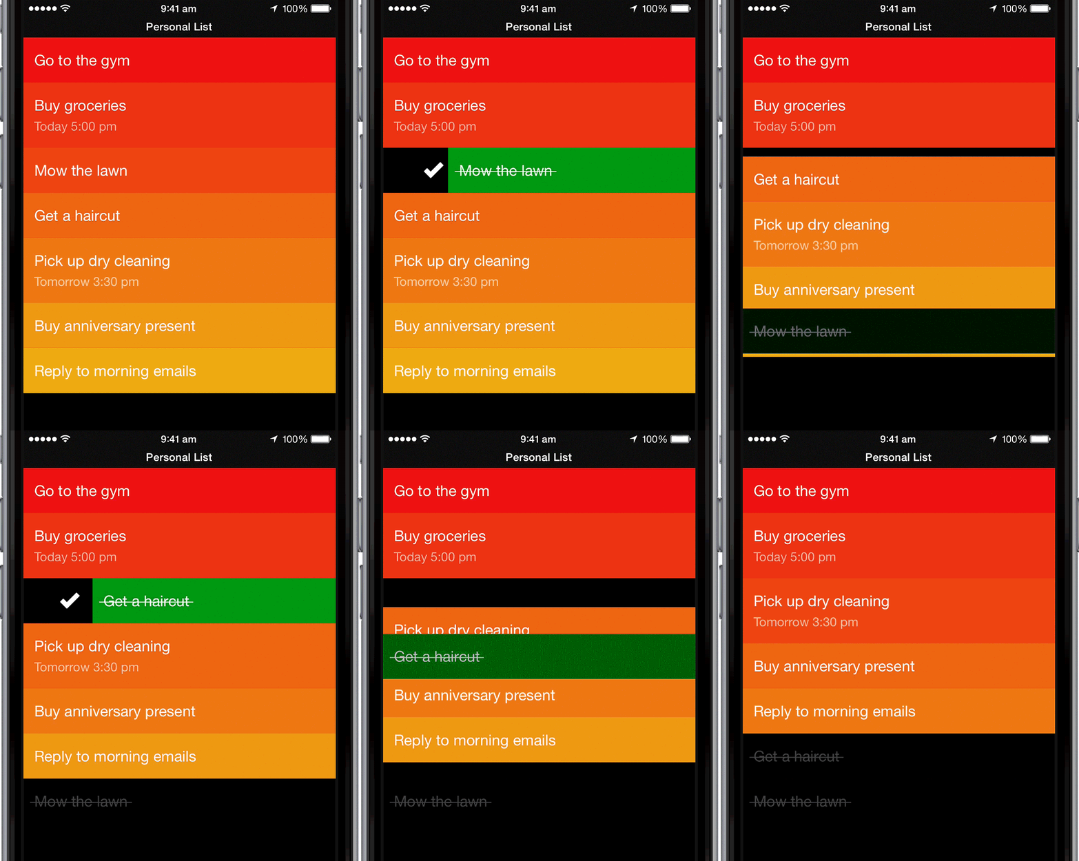
My suggestion would be to have a special “Clear Mode”. Turn it on, and the display becomes a kind of distraction-free, big font, simplified screen designed to do nothing but to…
a) check off an item (swiping right)
b) delete an item (swiping left)
c) move an item up or down (tap and hold)
Like the “Clear” App:

And then have a little bar on top that says “Clear Mode” and an “X” to let the user exit this mode.
Swipe functionality for mobile (any swipe functionality  ) is on the Dynalist Roadmap
Please add votes to prioritise 
This is the main reason I still use Workflowy for some checklists
While I’m sure many people will love swiping, there are those of us that find swiping too easy to accidentally trigger while dragging fat fingers around on a small screen. Please be sure to make the feature optional/customizable.
There is already a lock screen function in mobile. It’s the padlock icon in the top right corner. It’s a toggle for on/off.
Not sure if you could the number of likes on the posts, so: +1!
Working on this!
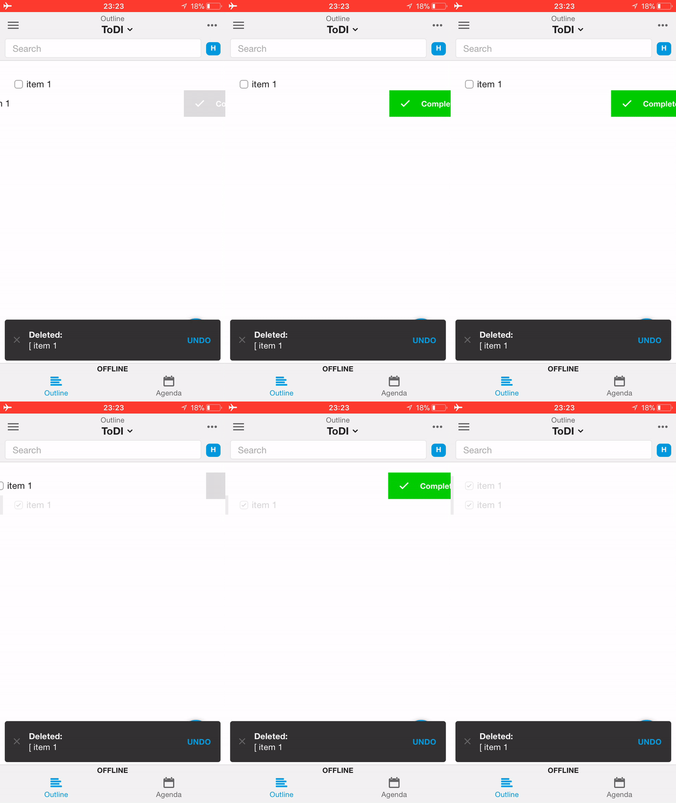
The work in progress version is that you have to drag at least 1/3 of the screen width, and there’s a red/green flashing when the action is done. And you can always use the undo button in the top bar if that happens. Not planning to make it optional for now, and we’ll make the action as noticeable as possible so that you don’t check items without noticing it.
![]()
![]()
![]()
My current todo app is SwipesApp personal. I really like the swipe aspect to put task to finished, or save for later (lets me choose tomorrow, the weekend, next, week, a specific date, or undefined. Unfortunately SwipesApp is closing down end of September:-(
So I’m looking at Dynalist since it has some nice Date possibilities.
I thought to myself that Dynalist could do something similar…
On phone, allow swipe right to send item to another list. I would define that ‘Right’ place for each superitem under the 3 bar menu. Probably with a link to place in list under which to put line item I swipe right. Similar, have a link defined for a left swipe.
So If I’m in ‘Today’, and I swipe right on ‘Buy lightbulbs’, ‘Buy lightbulbs’ would be transfered to a list item defined under Today’s 3 bar menu ‘Right’. That could take form of a link to list ‘Finished’ if I wanted. If there is not link then Dynalist would search up the superlist chain for a ‘Right’ link. If none found, then no action. Similar for left swipe.
This would put Dynalist in the same league as Trello in terms of workflow management.
For the web UI where we can’t swipe, a shortcut key like alt-shift-right arrow and alt-shift-left arrow for swiping.
For dates, I would also have that same functionality. When a date is triggered, the item could move into a right swipe list or a left swipe list, depending on date setting. That would allow something like: ‘Plan vacation’ to jump from my in two weeks list to my ‘Today’ list automatically. That would work a lot like SwipesApp does and keeps my ‘Today’ list relatively clean automatically.
These would be super helpful in Dynallist being closer to Trello and SwipesApp in terms of creating WORKFLOW and keeping lists much cleaner.
I think people will have different use cases, but configurability and/or options on swipe, should definitely be the next evolution for swipe gestures.