Ladies and Gentlemen!
@pottster!
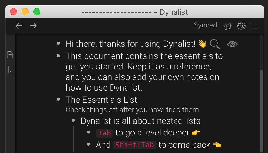
Open your app settings and behold the newest member of the stock theme collection:
Dark Gold! 
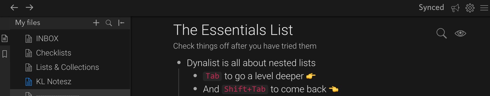
Old / original Dark theme, for fun & reference:
That was fast!
I am excited and grateful – but not satisfied. 
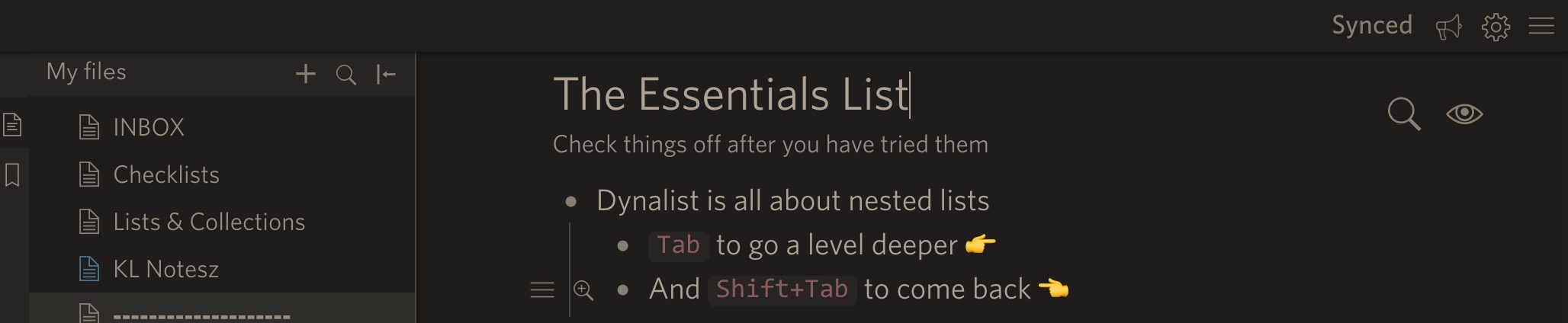
In the name of all the dark theme lovers out there, I shall point out that yes, the color gold is pleasant, however, its intensity is not much lower than the stock white’s. With the background being the same dark-dark #181818 – this combo still elicits significant light-trails when scanning lists up and down. I have found the industry lingo for this: the letters still visually vibrate!
Cant’ be just me?! 
How about you put out a ‘competition’ or a call among the users here, to design a second lower-contrast dark theme. Or, I would gladly create 5 or so different mockups to put up for vote in a poll.
Allow me to try to rephrase the objective, the key idea here:
Dynalist is missing a muted, eye-friendly dark theme for all-day reading and writing out of the box. Something like this:
Very low visual vibration.

Let’s put the new theme next to this one and ‘jump’ with your eyes from one corner to an opposite corner of the text.
The muted theme does not look ‘flashy’ or not many would call it pretty… but we are looking for a
pragmatic one, aren’t we?
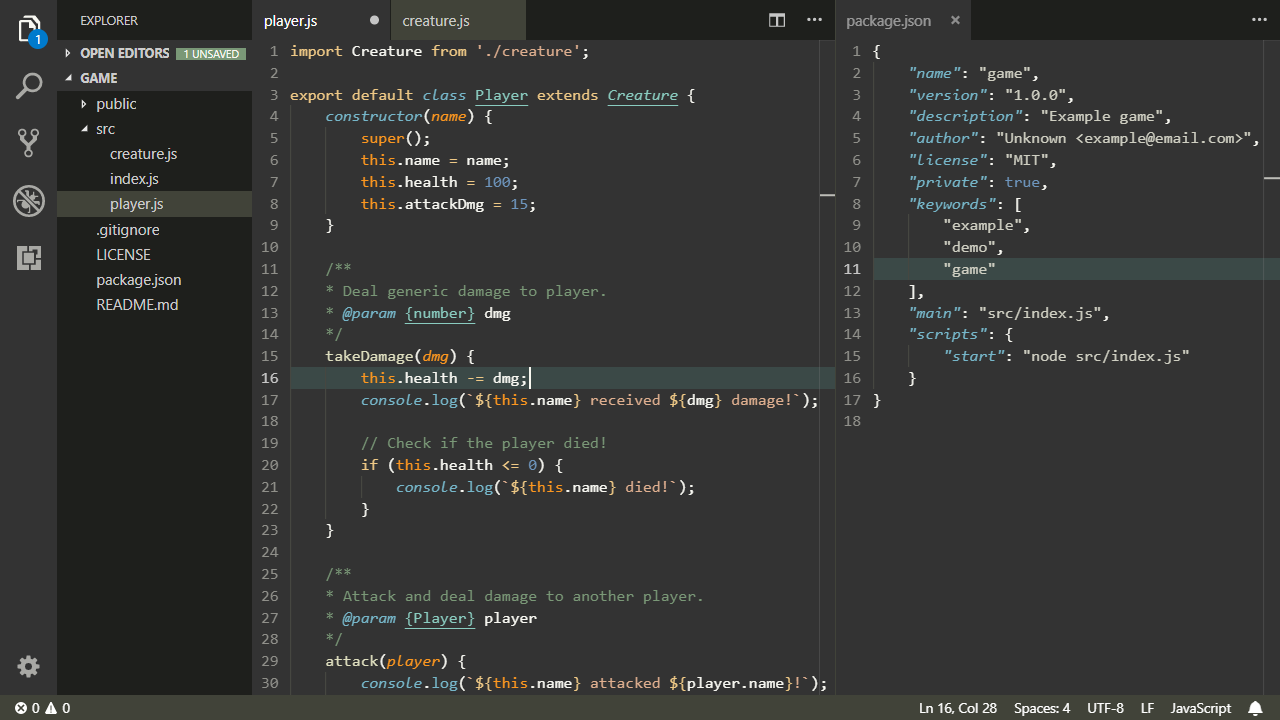
Another round of reseach into eye-frienly themes lead me to this VS skin, called Selenitic:
I found it by searching for “muted,
eye-friendly theme for all-day coding”.
What do you code in, @Shida, @Erica? Do you use a dark theme in your code editor? What about the rest of the dev team @ DynalistHQ?
To summarise: if Dynalist is going to offer an additional dark theme – darkness-wise – it should be positioned somewhere in the middle between the original Dark and Christmas and not just be a slight variation on the original Dark. (And the list of themes in the settings, could be in order from lightest to darkest?)
Christmas, for reference:
P.S.: Curious, at Dynalist, does everyone celebrate Chrismas?