Rename Dark theme to Black and introduce new dark theme that is (dark) Grey with sepia font

No problem. It was a long time ago!

Google’s Material Design guidelines for dark themes recommend avoiding black as a background colour so the contrast between interface elements is less stark…

Twitter has two dark modes:

Adobe and many other creative apps offer at least 2 dark modes:

Ableton Live has 3:

Oh, the confusion! =p

1 Like

We’re not using black, but #181818 instead. Google Material Design guideline recommends #121212, which is even darker. I think we’re following the design guideline alright (https://material.io/design/color/dark-theme.html#properties).

Any thoughts on the rest of my post? (All the examples of a second dark theme being pretty much industry standard.)

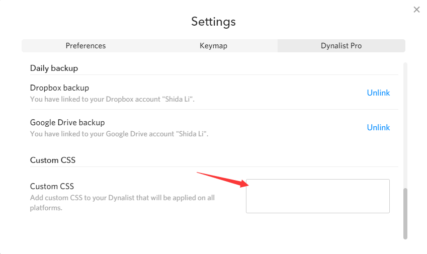
You can use Custom CSS to change any color of the app your want. This setting will also sync across the desktop app and the browser web app.

I’m not particularly against more dark themes but I think on the topic of other “apps” have more than 2 dark theme:

Windows 10:

MacOS:

Discord:
image

If the current, single dark theme of Dynalist would be as pleasant and as considered as the dark theme of macOS, this feature request would not exist. :stuck_out_tongue_winking_eye:

Not sure, if you know that the dark theme of macOS has this magical feature called Desktop Tinting.

“When active, Desktop Tinting causes window backgrounds to pick up color from the user’s desktop picture. The result is a subtle tinting effect that helps windows blend more harmoniously with their surrounding content.”

So, in a way, macOS has millions of dark themes.

Are you (@Shida) using the stock Dynalist dark theme yourself, for longer periods of time? @Erica, are you?

When scanning long lists of bright text on almost black backgrounds, don’t you get these trails in your eyes? I do. On “dim” themes (as opposed to “lights out” or almost black themes) the light-trails are not so bad. This phenomena is the reason why I started this thread. I would love to stick to discussing this key idea.

@mkteku have you tried one of the community themes https://talk.dynalist.io/c/showcase/10

1 Like

That little bit of almost-black (behind “Weekly stats”) is #121212.
The color behind the text elements, is a lighter #1E1E1E.

(Obviously, I do not want for the contrast to be too low. Something like the way Twitter does it, I feel like that’s the ticket. Don’t you?)

Are you implying that I want a lighter dark theme just because there is a trend out there?

In my book, dark “mode” is the default since:

k65Dt
:sunglasses:

As I mentioned above:
When scanning long lists of bright text on almost black backgrounds, I get these trails in my eyes. On “dim” themes (as opposed to “lights out” or almost black themes) the light-trails are not so bad. This phenomena is the reason why I started this thread.

Just wanted to follow up - any reason why this can’t be done via custom CSS? I don’t think we should use our extra bandwidth to add new themes because of personal preferences (which can already be tweaked via custom CSS).

I am trying to have a conversation; a debate on UX experience.

Pleeease answer this: do you use your own default dark theme a lot? If yes, do you get light-trails when scanning text (especially in low-light conditions)?

If you do not use your own default dark theme – how can you say much meaningful things about it?

What I have shown above is that having a lighter dark theme “in-the-box” is a matter a good, wholesome UI design; an established UX practice by now – not (just) a personal preference. Your refusal to take this fact on board, even if you won’t include it in you app, baffles me.

(In the examples you posted, Discord’s default dark is way lighter than yours; macOS is in a league of its Desktop Tinting; Windows’ dark mode is still laughable.)

(Bandwidth? Please enlighten me.)

You didn’t answer my question:

any reason why this can’t be done via custom CSS?

As for your question:

do you use your own default dark theme a lot?

Not recently, but I’ve used it for a year in the past and it’s been ok. Perhaps it’s because of the different contrast on my monitor, but I find it just fine.

(Bandwidth? Please enlighten me.)

It’s another term for developer time.

Anyway, I’m sure our themes could use some improvement. The theming system has been changed quite a few times but we haven’t really touched most of the colors for a few years already. May take a look at it some day and put some tweaks but that’s not a priority right now.

Again I just want to say this once more: You can tweak any color you want of the dark mode using custom CSS. This post for the screenshot.

1 Like

Isn’t custom CSS a Pro feature though? Looks like @mkteku isn’t a Pro user.

1 Like

That’s correct. As a free user you can use a browser extension like Stylish on web or inject using the developer console on desktop. Custom CSS is part of the “convenience” package for a built in solution but you could always accomplish the same another slightly more involved way.

I’d suggest using the Stylus Chrome Extension rather than Stylish. Stylish had some bad press relating to privacy issues.

Also, it’s notable that you’ve got CSS baked into Obsidian. I suspect that feature parity between Dynalist and Obsidian may be an ongoing discussion. Nobody said it was easy being a Developer! :wink:

Thank you for your time, I mean bandwidth :), Shida.

The desktop browser? Or some other console that allows to inject into the macOS app?

On a related note, the title bar of the macOS app staying white when system is on dark mode, is that by design? I can see how someone might argue that it is easier to find and grab it with the pointer. To me, in dark environments, it is a pain in the eyes.

Thanks for the information and attention, you too, @pottster.

Ladies and Gentlemen!
@pottster!

Open your app settings and behold the newest member of the stock theme collection:
Dark Gold! :smile:

Old / original Dark theme, for fun & reference:

That was fast!

I am excited and grateful – but not satisfied. :rofl:
In the name of all the dark theme lovers out there, I shall point out that yes, the color gold is pleasant, however, its intensity is not much lower than the stock white’s. With the background being the same dark-dark #181818 – this combo still elicits significant light-trails when scanning lists up and down. I have found the industry lingo for this: the letters still visually vibrate!
Cant’ be just me?! :confused:

How about you put out a ‘competition’ or a call among the users here, to design a second lower-contrast dark theme. Or, I would gladly create 5 or so different mockups to put up for vote in a poll.

Allow me to try to rephrase the objective, the key idea here:
Dynalist is missing a muted, eye-friendly dark theme for all-day reading and writing out of the box. Something like this:


Very low visual vibration. :slight_smile:
Let’s put the new theme next to this one and ‘jump’ with your eyes from one corner to an opposite corner of the text.

The muted theme does not look ‘flashy’ or not many would call it pretty… but we are looking for a pragmatic one, aren’t we?

Another round of reseach into eye-frienly themes lead me to this VS skin, called Selenitic:


I found it by searching for “muted, eye-friendly theme for all-day coding”.

What do you code in, @Shida, @Erica? Do you use a dark theme in your code editor? What about the rest of the dev team @ DynalistHQ?

To summarise: if Dynalist is going to offer an additional dark theme – darkness-wise – it should be positioned somewhere in the middle between the original Dark and Christmas and not just be a slight variation on the original Dark. (And the list of themes in the settings, could be in order from lightest to darkest?)

Christmas, for reference:

:slight_smile:

P.S.: Curious, at Dynalist, does everyone celebrate Chrismas? :stuck_out_tongue_winking_eye: