Rename Dark theme to Black and introduce new dark theme that is (dark) Grey with sepia font

Current dark theme is too contrasty to my eyes. Anyone else?

Any chance we’ll ever have ‘create your own theme’?

Related to this: the top bar of the macOS app stays white when system is on dark theme. Glaring at me :wink:

Thanks for all the hard work.

Left: macOS app with Dark theme. (And the white bar that should be dark.)
Right: dynalist.io in Chrome with Dark Reader extension.

1 Like

You can use custom CSS to do that.

In the app?

Any thoughts on the rest? As a DEV do you by any chance have more insight on how likely; how difficult adding extra themes to the app is?

Given that Dynalist is a “text” app, the stock themes should be much more “considered”.

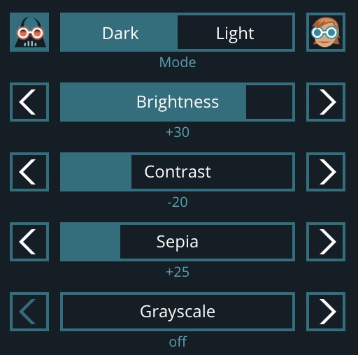
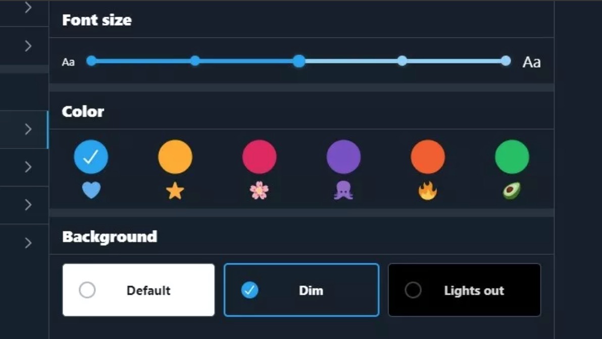
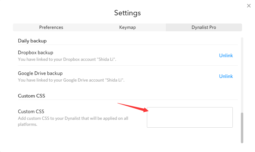
The browser extension Dark Reader has a cool way of adjusting things. Would be sweet to see something similar in the app. Or simply allow us to set our own background and font colors.

There should be a slightly darker Sepia theme as well, I just realised.

About as dark as paper in a 100 year-old book. :books:

Current dark theme is too contrasty to my eyes. Anyone else?

Completely agree. I sometimes wonder if it’s just my “old” eyes though. :man_shrugging:

1 Like

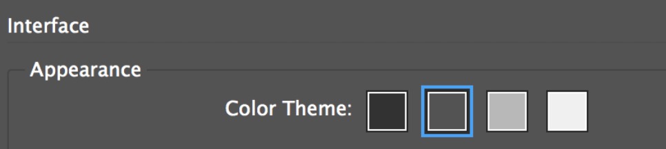
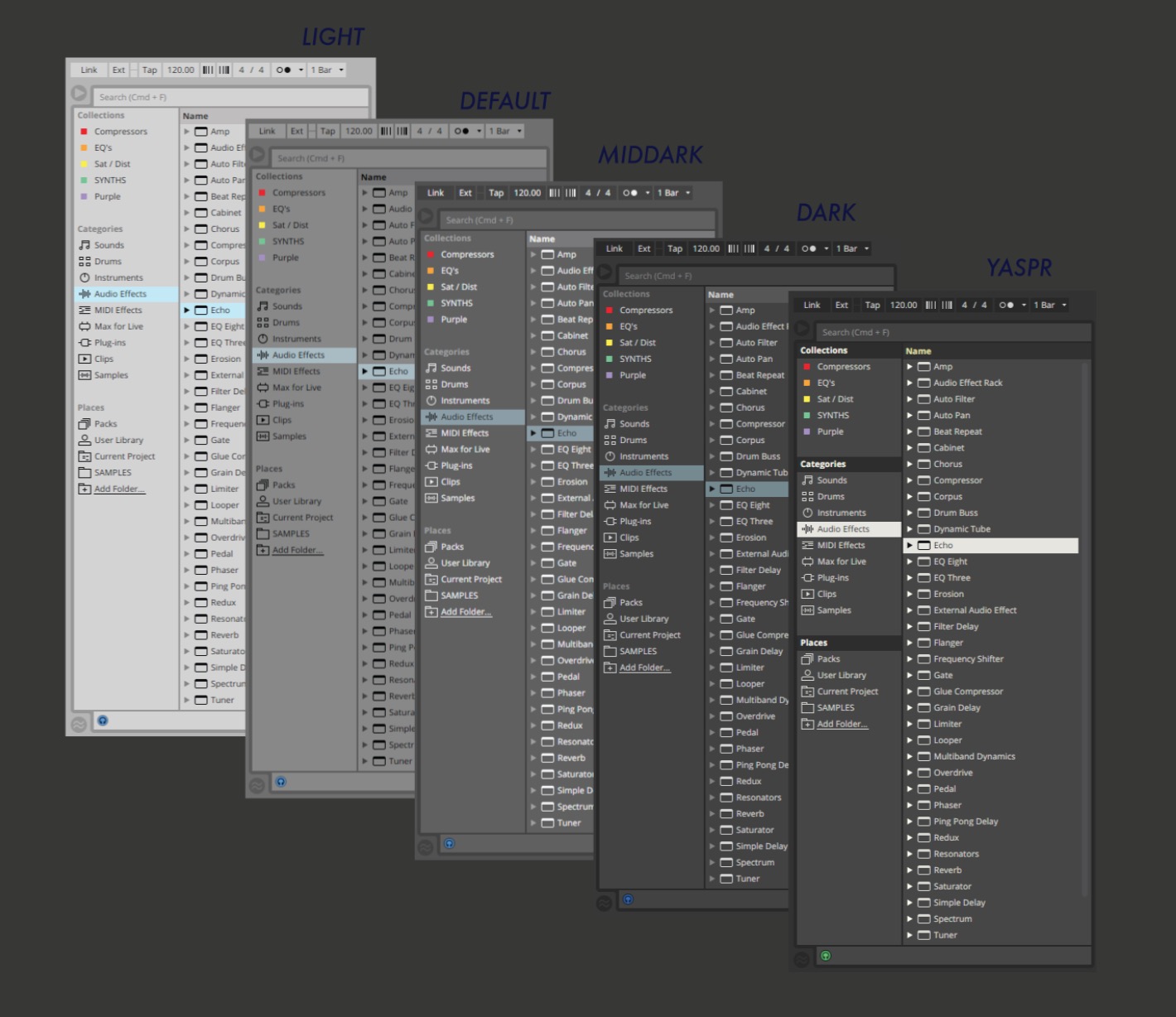
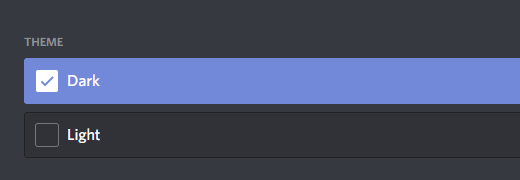
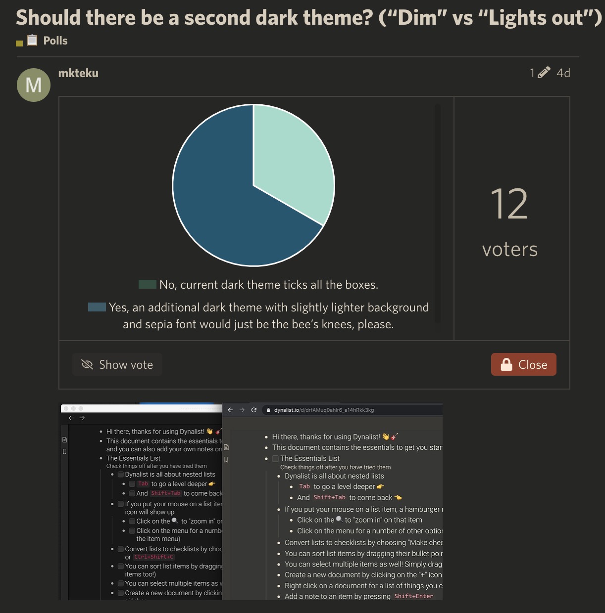
It’s not that difficult, it’s just that having two dark modes is a little confusing. Haven’t heard much complaint about contrast being too high (usually it’s the other way around; people complain when the contrast is too low and they can’t read stuff). I wonder if it has something to do with the recent “dark mode” trend? :thinking:

I mentioned it a couple of years ago Dark Theme - reduce contrast

Sorry my memory must be failing. Sorry @pottster! I was definitely wrong.

No problem. It was a long time ago!

Google’s Material Design guidelines for dark themes recommend avoiding black as a background colour so the contrast between interface elements is less stark…

Twitter has two dark modes:

Adobe and many other creative apps offer at least 2 dark modes:

Ableton Live has 3:

Oh, the confusion! =p

1 Like

We’re not using black, but #181818 instead. Google Material Design guideline recommends #121212, which is even darker. I think we’re following the design guideline alright (https://material.io/design/color/dark-theme.html#properties).

Any thoughts on the rest of my post? (All the examples of a second dark theme being pretty much industry standard.)

You can use Custom CSS to change any color of the app your want. This setting will also sync across the desktop app and the browser web app.

I’m not particularly against more dark themes but I think on the topic of other “apps” have more than 2 dark theme:

Windows 10:

MacOS:

Discord:
image

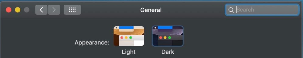
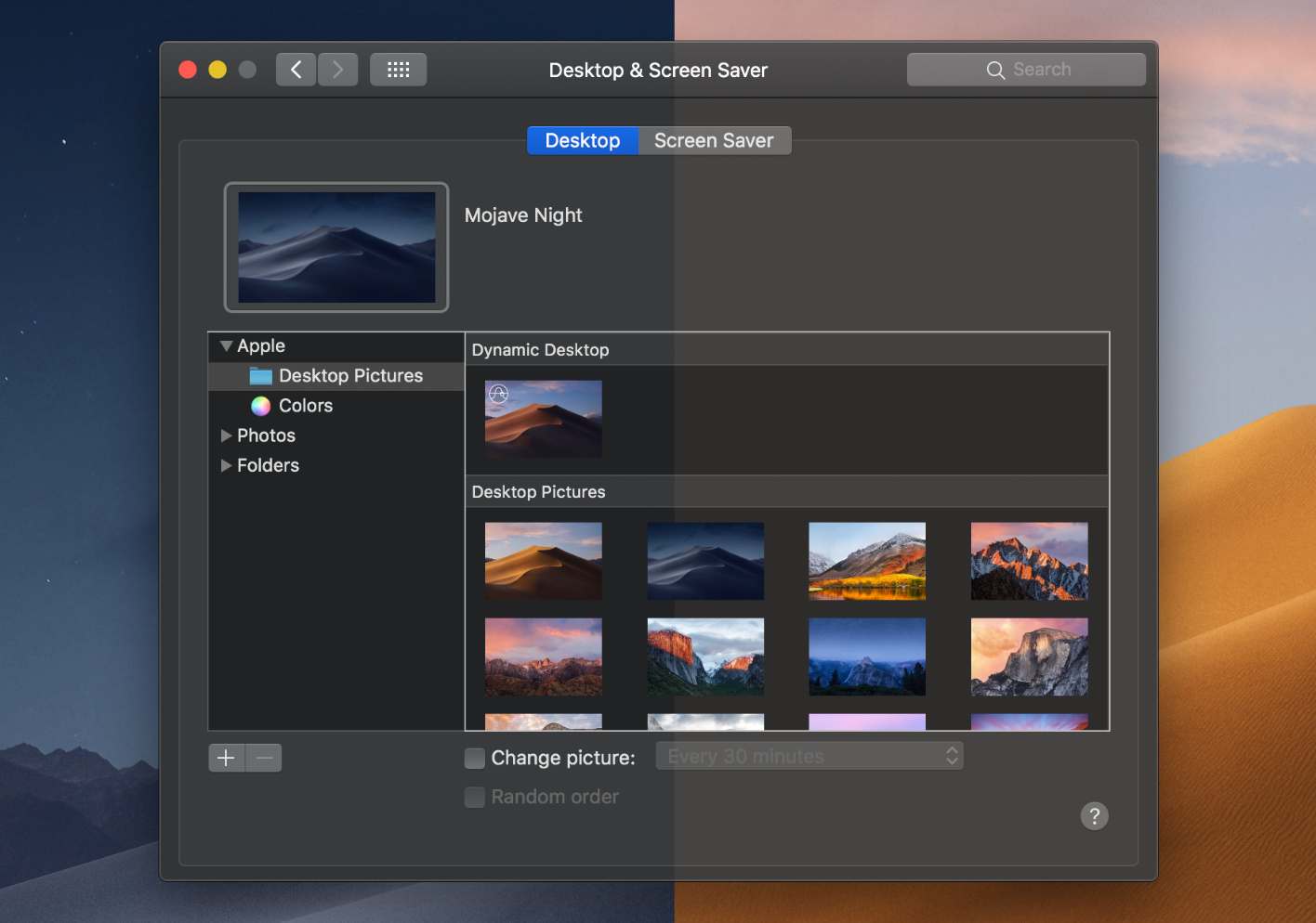
If the current, single dark theme of Dynalist would be as pleasant and as considered as the dark theme of macOS, this feature request would not exist. :stuck_out_tongue_winking_eye:

Not sure, if you know that the dark theme of macOS has this magical feature called Desktop Tinting.

“When active, Desktop Tinting causes window backgrounds to pick up color from the user’s desktop picture. The result is a subtle tinting effect that helps windows blend more harmoniously with their surrounding content.”

So, in a way, macOS has millions of dark themes.

Are you (@Shida) using the stock Dynalist dark theme yourself, for longer periods of time? @Erica, are you?

When scanning long lists of bright text on almost black backgrounds, don’t you get these trails in your eyes? I do. On “dim” themes (as opposed to “lights out” or almost black themes) the light-trails are not so bad. This phenomena is the reason why I started this thread. I would love to stick to discussing this key idea.

@mkteku have you tried one of the community themes https://talk.dynalist.io/c/showcase/10

1 Like

That little bit of almost-black (behind “Weekly stats”) is #121212.
The color behind the text elements, is a lighter #1E1E1E.

(Obviously, I do not want for the contrast to be too low. Something like the way Twitter does it, I feel like that’s the ticket. Don’t you?)