Very nice looking theme. I copy the code from Userstyles and paste it into Dynalist but it doesnt work. What do i do wrong?
If you want to use the style in Dynalist’s built-in custom CSS box you need to remove the leading ‘@-moz-document domain(“dynalist.io”) {’ and the very last ‘}’.
Unfortunately that ‘moz’ bit is required to upload to userstyles… just updated the theme and included that info.
1 Like
Here’s Mine: this theme modifies the CHECKBOXES (and their bullets)
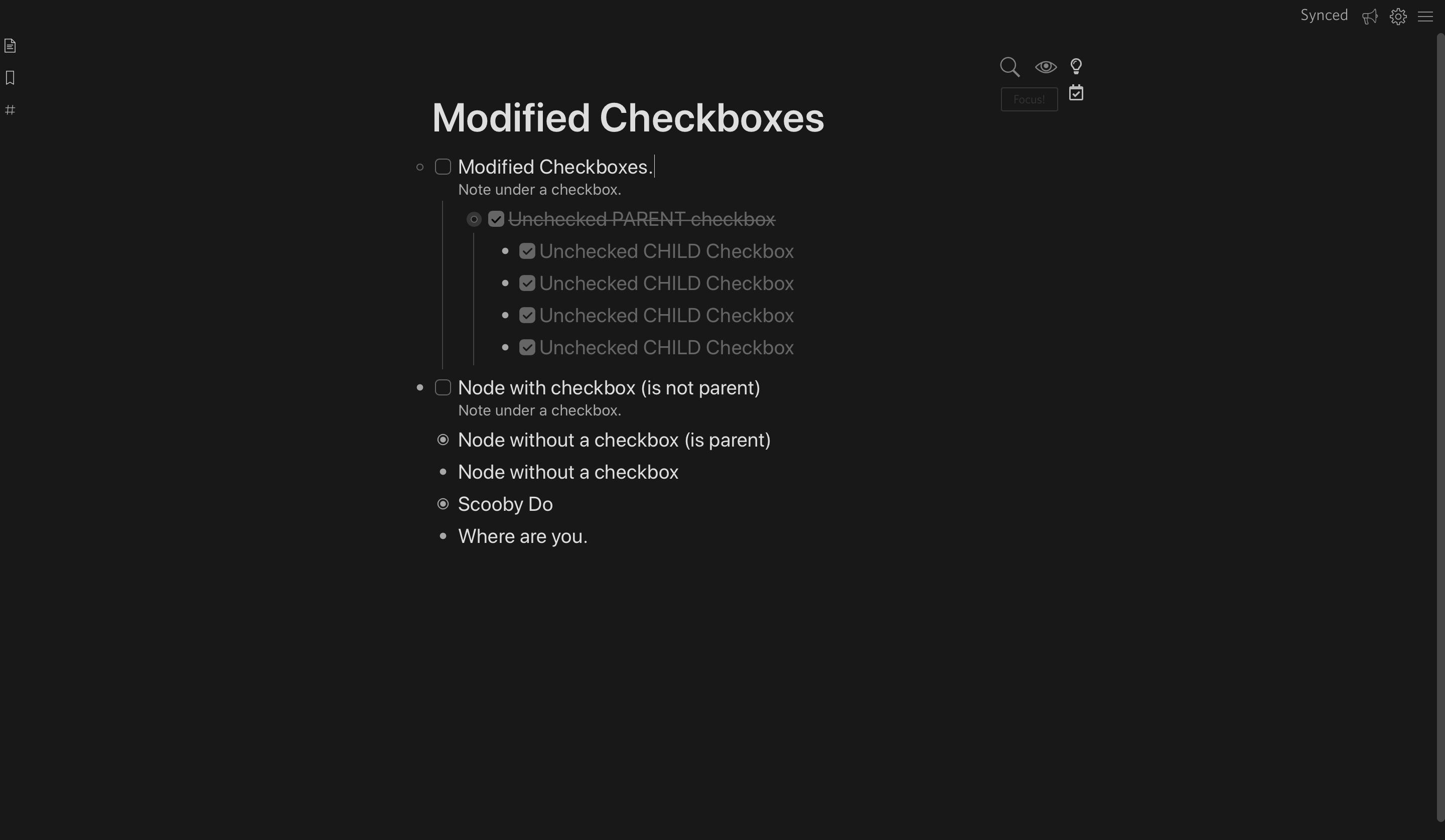
Note#0: There’s a whole bunch of small, little, other things, that happen in this css. You might like them. You might NOT!!
Note#1: Some of those “other things” are on mobile.
Note#2: I’m not sure how this looks with the light themes. I only really use the dark themes.
Also, with this css, all unchecked child checkboxes are checked… when you check-off the parent checkbox that… has those unchecked child checkboxes inside and unchecked. Like this:
Parent Checkbox (UNCHECKED) with child checkboxes (unchecked)

Parent Checkbox (CHECKED) with child checkboxes (unchecked) **

Note#3: Unfortunately… IF!.. you have a checkbox that’s underneath a “non-checkbox” node, the alignment is… well, it’s a little off. “Lining up” nodes with checkboxes to the bullets of “non-checkbox” nodes is a current side project of mine. The crux of the problem is “what do ya do with the bullet on a node that has a checkbox!!!”
Anywho, here’s the css:
/*** DYNALIST V21 ***/
/**********************************
***********************************
***********************************
INTERFACE
***********************************
***********************************
**********************************/
/****
PRO CSS viewBox
***/
textarea.setting-text-field {
width: 100%;
min-height: 500px;
}
/**************
**************
**************
BREADCRUM
**************
**************
**************/
.DocumentBreadcrumb-item {
text-decoration: none !important;
text-transform: capitalize;
color: hsl(0, 0%, 25%);
font-size: .95em;
transition: .2s;
}
.DocumentBreadcrumb-item:hover {
color: hsl(0, 0%, 45%);
transition: .2s;
}
.DocumentBreadcrumb-item:hover+.DocumentBreadcrumb-item {
margin-left: 30px;
}
.DocumentBreadcrumb-item:hover .DocumentBreadcrumb-delimiter {
transform: scale(1.2);
width: 14px;
height: 1;
}
.DocumentBreadcrumb-delimiter {
margin: 0 6px;
vertical-align: middle;
content: none;
color: rgba(0, 0, 0, 0);
display: inline-block;
width: 10px;
height: 10px;
/* background: red; */
background-image: url("data:image/svg+xml,%3Csvg viewBox='0 0 18 18' fill='none' xmlns='http://www.w3.org/2000/svg'%3E%3Cpath d='M16.055 7.55867L9.90643 1.41004C9.41012 0.913736 8.60544 0.913736 8.10914 1.41004C7.61283 1.90635 7.61283 2.71102 8.10913 3.20733L13.1274 8.22564C13.4542 8.55242 13.4542 9.08224 13.1274 9.40903L8.01588 14.5206C7.48111 15.0554 7.47854 15.9216 8.01013 16.4596C8.5462 17.0021 9.42135 17.0047 9.96064 16.4654L16.055 10.371C16.8316 9.59436 16.8316 8.33526 16.055 7.55867Z' fill='%23888888'/%3E%3C/svg%3E%0A");
transform: scale(1);
/* background-color: red !important; */
background-repeat: no-repeat;
fill: red !important;
}
/**
**
**
**
SCROLLBAR
**/
::-webkit-scrollbar {
background: transparent;
}
/***
CONTEXT MENU */
.ContextMenu {
z-index: 10000000000000 !important;
/*** DOCUMENT WIDTH ***/
}
/**************
**************
**************
ZOOM & CONTEXT HOVER MENU
**************
**************
**************/
/*** POINTERS: ZOOM & MENU ***/
.node-hover .mod-zoom:hover {
cursor: zoom-in;
}
.node-hover .mod-menu:hover {
cursor: pointer;
}
.has-checkbox .node-line-strict.node-hover {
margin-left: -120px;
}
.node-hover .mod-menu:before, .node-hover .mod-zoom:before {
color: rgba(255, 255, 255, 0);
transition: .1s;
}
/***ZOOM & MENU ICON VISIBLE ***/
.node-hover:hover .mod-menu:before, .node-hover:hover .mod-zoom:before {
color: rgba(255, 255, 255, 1);
transition: .1s;
}
.search-match {
background: rgba(255, 255, 0, 0);
color: rgb(255, 247, 123);
text-shadow: 0 0 5px rgba(255, 255, 0, 0);
}
/*********TOOL BOX THINGY********/
.DocumentTools-overlay {
background: none;
box-shadow: none;
}
/***************************
***************************
DOCUMENT WIDTH
***************************
***************************/
.is-desktop .DocumentContainer.is-centerDocument .Document {
max-width: 720px;
margin: 0 auto !important;
}
/***************************
***************************
TOP NAV
***************************
***************************/
.AppHeader {
box-shadow: none !important;
background: #181818 !important;
}
.is-mobile .AppHeader, .is-mobile .AppHeader * {
height: 1px;
}
.MobileHeader-option {
font-size: 15px;
height: unset;
padding: 7px;
position: absolute;
top: 0;
}
.MobileHeader-mainMenuIcon {
font-size: 16px;
padding: 6px 10px;
}
.MobileHeader-moreOptions.js-stop-mousedown-propagation {
height: auto !important;
background: black !important;
}
.MobileHeader-moreOption {
height: 46px !Important;
}
/***
MOBILE - MAKE DOCUMENT HEIGHT STRETCH FROM TOP TO BOTTOM */
.is-mobile .main-container, .main-container {
height: calc(100%) !important;
}
/*BOTTOM TOOLBAR
.node-toolbar {
height:20px;
}
.node-toolbar-options-container {
height: unset;
}
.node-toolbar-option {
display: inline-block;
line-height: 22px;
padding: 0 6px;
text-align: unset;
vertical-align: unset;
}
.node-toolbar-option svg {
height:13px;
width:13px;
}
*/
/*** SIDEBAR BAR ***/
.is-desktop .LeftPaneSlidebarContainer {
box-shadow: none;
z-index: 1111 !important;
top: -30px;
/* height: 100% !important; */
}
.is-desktop .LeftPaneSlidebarContainer {
box-shadow: none;
}
.is-desktop .Pane {
background-color: #181818;
}
.is-desktop .Pane-header {
background-color: #181818;
}
.is-desktop .LeftPaneContainer-nav, .LeftPaneContainer-nav {
background: #181818 !important;
}
.is-desktop .LeftPaneContainer-navItem {
background: none;
}
/**************
**************
**************
BODY FONT COLOR
**************
**************
**************/
.Node {
color: hsl(0, 0%, 87%);
}
.is-heading {
color: hsl(0, 0%, 93%);
}
/**********************************
***********************************
***********************************
BULLET BULLET BULLET
***********************************
***********************************
**********************************/
/**********************************
IMAGES
***********************************/
a.node-displayed-image-link {
width: 100% !important;
max-width: 100% !important;
height: unset !important;
border-radius: unset !important;
background-color: unset !important;
background: unset !important;
border: unset !important;
display: block !important;
padding: 0px !important;
padding-left: 0px !important;
}
.is-largeFont a.node-displayed-image-link img, .is-mediumFont a.node-displayed-image-link img {
border: 1px solid rgba(40, 40, 40, 1);
border-radius: 4px;
max-width: 100% !important;
display: block !important;
padding: 0px !important;
}
.node-displayed-image {
margin-bottom: -20px;
}
/**********************************
***********************************
***********************************
NOTES
***********************************
***********************************
**********************************/
/*** Notes Color ***/
.Node-note, .Node-renderedNote {
color: hsl(0, 0%, 66.70%) !important;
}
.is-mediumFont .Node-noteContainer {
font-size: calc(1em - 2px) !important;
}
.is-largeFont .Node-noteContainer {
font-size: calc(1em - 1px) !important;
}
.is-mediumFont .Node-noteContainer .node-inline-item, .is-mediumFont .Node-noteContainer .node-inline-code, .is-mediumFont .Node-noteContainer .node-multiline-code, .is-largeFont .Node-noteContainer .node-inline-item, .is-largeFont .Node-noteContainer .node-inline-code, .is-largeFont .Node-noteContainer .node-multiline-code, .is-smallFont .Node-noteContainer .node-inline-item, .is-smallFont .Node-noteContainer .node-inline-code, .is-smallFont .Node-noteContainer .node-multiline-code {
vertical-align: baseline;
}
/**
LINKS in notes */
.is-smallFont .Node-noteContainer a.node-link, .is-smallFont .Node-noteContainer .node-inline-item, .is-smallFont .Node-noteContainer .node-inline-code, .is-smallFont .Node-noteContainer .node-multiline-code {
font-size: 12px;
line-height: 14px;
border-radius: 3px;
}
.is-mediumFont .Node-noteContainer a.node-link, .is-mediumFont .Node-noteContainer .node-inline-item, .is-mediumFont .Node-noteContainer .node-inline-code, .is-mediumFont .Node-noteContainer .node-multiline-code {
font-size: 14px;
line-height: 16px;
}
.is-largeFont .Node-noteContainer a.node-link, .is-largeFont .Node-noteContainer .node-inline-item, .is-largeFont .Node-noteContainer .node-inline-code, .is-largeFont .Node-noteContainer .node-multiline-code {
font-size: 14px;
line-height: 16px;
}
/**
TAGS in NOTES */
.is-smallFont .Node-noteContainer .node-tag.js-prevent-default, .is-smallFont .Node-noteContainer a.node-tag.js-prevent-default, .is-largeFont .Node-noteContainer .node-tag.js-prevent-default:before {
font-size: 12px;
line-height: 14px;
vertical-align: baseline;
}
.is-mediumFont .Node-noteContainer .node-tag.js-prevent-default {
font-size: 14px;
line-height: 16px;
vertical-align: baseline;
}
.is-largeFont .Node-noteContainer .node-tag.js-prevent-default {
font-size: 14px;
line-height: 16px;
vertical-align: baseline;
}
/**********************************
Numbered.
**********************************/
.Node-self.is-numbered>.Node-bullet:after {
counter-increment: node;
content: counter(node) '';
font-weight: 700;
position: absolute;
left: -4px;
width: 20px;
background: none;
}
.Node.has-checkbox>.Node-self.is-numbered .Node-noteContainer {
margin-left: 26px;
}
.has-checkbox .Node-self.is-parent.is-numbered .Node-bullet:before {
position: absolute;
top: 50%;
left: -15px;
}
.has-checkbox .Node-self.is-parent.is-numbered .Node-bullet {
margin-left: -20px;
}
.Node-self.is-numbered>.Node-bullet {
text-align: right !important;
}
.is-desktop .Node-self.is-parent.is-numbered .node-icon.mod-expand-collapse:before {
display: none;
}
/**********************************
***********************************
***********************************
CHECKBOX
***********************************
***********************************
**********************************/
/**********************************
CHECKBOX - BULLETS
**********************************/
/*Checkbox - BULLET */
.Node.has-checkbox .Node-bullet, .Node.has-checkbox .Node-children .Node-bullet {
position: absolute;
margin-left: -23px;
z-index: 100000 !important;
}
.is-mobile .Node.has-checkbox .Node-bullet, .is-mobile .Node.has-checkbox .Node-children .Node-bullet {
margin-left: -26px;
}
.Node.has-checkbox .Node-children .Node .Node-bullet {
position: relative;
margin-left: 0px;
z-index: 100000 !important;
}
.Node.has-checkbox .Node-children .Node.has-checkbox .Node-bullet {
position: relative;
margin-left: 0px;
z-index: 100000 !important;
}
.is-mobile .Node.has-checkbox .Node-children .Node .Node-bullet {
position: relative;
margin-left: -6px;
z-index: 100000 !important;
}
/*Checkbox - CHECKBOX */
.Node-checkbox {
margin-left: 3px;
height: 18px;
}
/*Checkbox - CONTENT Container */
.Node.has-checkbox .Node-contentContainer {
margin-left: 7px;
}
.Node.has-checkbox .Node-children .Node-contentContainer {
margin-left: 4px;
}
/*Checkbox - NOTE Container */
.Node.has-checkbox .Node-self .Node-noteContainer {
margin-left: 26px;
}
.Node.has-checkbox .Node-self.is-parent+.Node-children .Node.has-checkbox>.Node-self .Node-noteContainer {
margin-left: 46px;
}
.Node.has-checkbox .Node-self.is-parent+.Node-children .Node>.Node-self .Node-noteContainer {
margin-left: 26px;
}
/**********************************
CHECK ALL CHILD CHECKBOXES WHEN A PARENT CHECKBOX IS CHECKED
**********************************/
/*Check unchecked when parent is checked*/
.Node.has-checkbox.is-checked .Node-self.is-parent+.Node-children .Node.has-checkbox .Node-checkbox:before {
content: url("data:image/svg+xml,%3Csvg viewBox='0 0 132 132' fill='none' xmlns='http://www.w3.org/2000/svg'%3E%3Cpath fill-rule='evenodd' clip-rule='evenodd' d='M36.5464 0.471191C16.6641 0.471191 0.546387 16.5889 0.546387 36.4712V95.5288C0.546387 115.411 16.6641 131.529 36.5464 131.529H95.604C115.486 131.529 131.604 115.411 131.604 95.5288V36.4712C131.604 16.5889 115.486 0.471191 95.604 0.471191H36.5464ZM96.9344 43.3059C99.5332 40.7071 103.747 40.707 106.346 43.3059C108.944 45.9047 108.944 50.1182 106.346 52.717L62.8153 96.2472C61.6972 97.3653 60.2803 98.0023 58.8216 98.1584C56.8388 98.4247 54.7588 97.796 53.2349 96.2721L30.8727 73.9099C28.2784 71.3156 28.2784 67.1095 30.8727 64.5152C33.467 61.9209 37.6731 61.9209 40.2674 64.5152L56.582 80.8298C57.3631 81.6109 58.6294 81.6109 59.4104 80.8298L96.9344 43.3059Z' fill='%23666666'/%3E%3C/svg%3E%0A");
background: rgba(0, 0, 0, 0) !important;
border: none !important;
transition: .2s;
}
/*Check CHECKED when parent is checked*/
.Node.has-checkbox.is-checked .Node-self.is-parent+.Node-children .Node.has-checkbox.is-checked .Node-checkbox:before {
content: "";
background: #666666 !important;
transition: .1s;
border: 4px solid #666666 !important;
}
/**********************************
CHECKBOX BULLETS
**********************************/
.has-checkbox .Node-self .Node-bullet:before {
content: "";
cursor: pointer;
display: inline-block;
vertical-align: middle;
background: rgba(100, 100, 100, 1);
border: 1px solid rgba(100, 100, 100, 1);
border-radius: 7px !important;
width: 7px !important;
height: 7px !important;
margin-top: -3px;
transition: .1s !important;
box-shadow: 0 0 0 1px rgba(100, 100, 100, 0);
z-index: -1;
}
.has-checkbox .Node-self.is-parent .Node-bullet:before {
content: "";
cursor: pointer;
display: inline-block;
vertical-align: middle;
background: rgba(0, 0, 0, 0);
border: 1px solid rgba(100, 100, 100, 1);
border-radius: 7px !important;
width: 7px !important;
height: 7px !important;
margin-top: -3px;
transition: .1s !important;
box-shadow: 0 0 0 1px rgba(100, 100, 100, 0);
z-index: -1;
}
.AppContainer:not(.is-using-bullet-to-zoom) .has-checkbox .Node-self.is-parent.is-hovering .Node-bullet:before {
content: "";
cursor: pointer;
display: inline-block;
vertical-align: middle;
background: rgba(0, 0, 0, 0) !important;
border: 1px solid rgba(100, 100, 100, 1);
border-radius: 7px !important;
width: 7px !important;
height: 7px !important;
margin-top: -3px;
transition: .1s !important;
box-shadow: 0 0 0 4px rgba(100, 100, 100, .4);
}
/***COLLAPSED***/
.has-checkbox .Node-self.is-parent.is-collapsed .Node-bullet:before {
content: "";
cursor: pointer;
display: inline-block;
vertical-align: middle;
background: rgba(100, 100, 100, 1) !important;
border: 1px solid rgba(100, 100, 100, 1);
border-radius: 7px !important;
width: 7px !important;
height: 7px !important;
margin-top: -3px;
transform: rotate(0deg);
box-shadow: 0 0 0 0px rgba(100, 100, 100, .4);
}
.AppContainer:not(.is-using-bullet-to-zoom) .has-checkbox .Node-self.is-parent.is-collapsed.is-hovering .Node-bullet:before {
content: "";
cursor: pointer;
display: inline-block;
vertical-align: middle;
background: #636363 !important;
border: 1px solid rgba(108, 108, 108, 1);
border-radius: 7px !important;
width: 7px !important;
height: 7px !important;
margin-top: -3px;
transform: rotate(0deg);
box-shadow: 0 0 0 4px rgba(100, 100, 100, .41);
}
/**********************************
TEXT - IS CHECKED
**********************************/
.Node.is-checked * {
color: hsl(210, 0%, 40%) !important;
}
.Node.is-checked .node-line.Node-contentContainer.has-color.mod-color-label-6:before {
background: hsl(210, 0%, 40%);
}
/***BODY FONT CHECKED ***/
.is-checklist.is-checked .node-line {
color: rgb(100, 100, 100) !important;
text-decoration: none !important;
transition: .2s;
}
/***NOTES CHECKED***/
.is-checklist.is-checked .Node-note, .is-checklist.is-checked .Node-renderedNote {
color: rgb(100, 100, 100);
transition: .2s;
}
.Node-checkbox:hover {
cursor: pointer;
}
/***********************************
BOX -- UNCHECKED
***********************************/
.Node-checkbox:before {
border-radius: 4.5px;
background: rgba(0, 0, 0, 0);
border: 1px solid #666666 !important;
transition: .204s;
box-shadow: none;
}
/***********************************
BOX -- IS CHECKED
***********************************/
.Node.is-checked .Node-checkbox:before {
background: #666666;
transition: .1s;
border: 4px solid #666666 !important;
}
/***********************************
CHECKBOX -- CHECK PART
***********************************/
.Node-checkbox:after, .Node.is-checked .Node-checkbox:after {
content: url("data:image/svg+xml,%3Csvg viewBox='0 0 81 58' fill='none' xmlns='http://www.w3.org/2000/svg'%3E%3Cpath d='M78.3455 2.83466C75.7467 0.235855 71.5332 0.235859 68.9344 2.83467L31.4104 40.3586C30.6294 41.1397 29.3631 41.1397 28.582 40.3586L12.2674 24.044C9.67313 21.4497 5.46698 21.4497 2.87271 24.044C0.278432 26.6383 0.278435 30.8444 2.87271 33.4387L25.2349 55.8009C26.7588 57.3248 28.8388 57.9535 30.8216 57.6872C32.2803 57.5311 33.6972 56.8941 34.8153 55.776L78.3455 12.2458C80.9443 9.64698 80.9443 5.43347 78.3455 2.83466Z' fill='black'/%3E%3C/svg%3E%0A");
transform: rotate(0deg) scaleY(1.05);
width: 10px;
margin-top: -6px;
margin-left: 1px;
border-radius: 0px;
background: rgba(0, 0, 0, 0);
border: none;
transition: 1s;
}
.is-mobile .Node-checkbox:after, .is-mobile .Node.is-checked .Node-checkbox:after {
margin-left: 0px !important;
margin-top: -6px;
}
@media (max-width:500px) {
.is-mobile .Node-checkbox:after, .is-mobile .Node.is-checked .Node-checkbox:after {
margin-top: -7px !important;
}
}
/**********************************
CHECKBOX FONTS SIZES
**********************************/
/***
.is-smallFont .Node-self.is-heading1 .Node-checkbox {
margin-top: 9px;
}
***/
.is-smallFont .Node-self.is-heading3 .Node-checkbox {
margin-top: 4px;
}
.is-mediumFont .Node-self.is-heading1 .Node-checkbox {
margin-top: 10px;
}
.is-largeFont .Node-self.is-heading1 .Node-checkbox {
margin-top: 12px;
}
.is-checklist .Node-self+.Node-children {
padding-left: 25px;
margin-left: 0px;
border-left: none;
}
.is-checklist .Node-self+.Node-children .is-checklist .Node-children {
padding-left: 0px;
margin-left: 25px;
border-left: none;
}
/*** More Space between checkbox and text ***/
.is-checklist .Node-contentContainer, .is-checklist .Node-noteContainer {
padding-left: 5px;
}
/* LINKS */
.is-smallFont a[target="_blank"] {
font-size: 14px;
line-height: 17px;
background-color: #262626;
border: 1px solid #444;
border-radius: 4px;
text-decoration: none;
padding-left: 3px;
padding-right: 3px;
display: inline-block;
}
.is-mediumFont a[target="_blank"] {
font-size: 16px;
line-height: 19px;
background-color: #262626;
border: 1px solid #444;
border-radius: 4px;
text-decoration: none;
padding-left: 3px;
padding-right: 3px;
display: inline-block;
}
.is-largeFont a[target="_blank"] {
font-size: 18px;
line-height: 21px;
background-color: #262626;
border: 1px solid #444;
border-radius: 4px;
text-decoration: none;
padding-left: 3px;
padding-right: 3px;
display: inline-block;
}
/** TAGS */
/** TAG FONT SIZE */
.is-smallFont .node-tag.js-prevent-default {
font-size: 14px;
line-height: 16px;
}
.is-mediumFont .node-tag.js-prevent-default {
font-size: 16px;
line-height: 18px;
}
.is-largeFont .node-tag.js-prevent-default {
font-size: 18px;
line-height: 21px;
}
/** TAG MAIN */
.node-tag.js-prevent-default,
.DocumentContainer.has-tagBackground .node-tag {
display: inline-block;
vertical-align: middle;
color: inherit;
background: hsl(0, 0%, 14.9%);
border: 1px solid hsl(0, 0%, 26.67%);
border-radius: 2.5px;
padding-top: 0px;
padding-bottom: 0px;
padding-left: 6px;
padding-right: 7px;
margin-top: 0px;
text-decoration: none;
transition: .23s;
}
.DocumentContainer.has-tagBackground .node-tag:hover {
background: hsl(210, 6%, 37.9%);
border: 1px solid hsl(210, 6%, 37.9%);
color: hsl(0, 0%, 74.9%);
}
/**TAGS IN NOTES: [BASE STYLE]*/
.node-tag.js-prevent-default:before {
visibility: hidden;
}
.Node-noteContainer .node-tag.js-prevent-default, .Node-noteContainer a.node-tag.js-prevent-default {
border-radius: 2.5px;
background: hsl(0, 0%, 14.9%);
border: 1px solid hsl(0, 0%, 26.67%);
padding-top: 0px;
padding-bottom: 0px;
padding-left: 3px;
padding-right: 3px;
text-decoration: none;
display: inline-block;
vertical-align: bottom;
}
/*******************
*******************
*******************
TITLE - IS CURRENT ROOT
*******************
*******************/
.Node.is-currentRoot>.Node-self .node-line, .Node.is-currentRoot>.Node-self.is-heading .node-line, .Node.is-currentRoot>.Node-self .node-line-strict, .Node.is-currentRoot>.Node-self.is-heading .node-line-strict {
font-size: 40px;
line-height: 1.0;
font-weight: 600;
}
.Node.is-currentRoot>.Node-self .Node-checkbox, .Node.is-currentRoot>.Node-self.is-heading .Node-checkbox {
margin-top: 14px;
margin-left: -1px;
}
.Node.is-currentRoot>.Node-self .Node-checkbox:before, .Node.is-currentRoot>.Node-self.is-heading .Node-checkbox:before {
width: 20px;
height: 20px;
border: 1px solid #666666 !important;
}
.Node.is-currentRoot>.Node-self .Node-checkbox:after, .Node.is-currentRoot>.Node-self.is-heading .Node-checkbox:after {
width: 13px;
margin-top: -3px;
margin-left: 2px !important;
}
.is-mobile .Node.is-currentRoot>.Node-self .Node-checkbox:after, .is-mobile .Node.is-currentRoot>.Node-self.is-heading .Node-checkbox:after {
width: 13px;
margin-top: -3px !important;
margin-left: 1px !important;
}
.is-mobile .Node.is-currentRoot.has-checkbox>.Node-self>.Node-contentContainer {
margin-left: 5px;
}
5 Likes
I really like the idea with the filled and empty bullets! This has to be the most extensive custom css posted here yet.
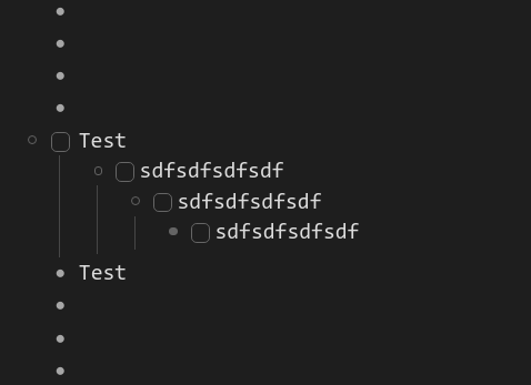
For me checklists get intended a little bit to the left. Is that by design?
Thanks Philipp!
In short: no, unfortunately, it isn’t. It’s something that just happens. ( I too, don’t like it and am trying to fix it).
It is strange though: in your screen shot, it only happens on the first parent. I’ll investigate!
1 Like
With these you can add #q or #h to the end of an image url to display the image at quarter or half size. I think it’s a nice hack since the markdown syntax doesn’t work.
.node-displayed-image[src$="#h"]
 {
    max-width: 50%;
    max-height: 50%;
 }
.node-displayed-image[src$="#q"]
 {
    max-width: 25%;
    max-height: 25%;
 }
17 Likes
That’s smart!
1 Like
WHOA. Dude! That’s awesome!
1 Like
Amazing work! Dynalist gained new freshness! Thank you @Napier. I’m curious though how do you use tags that are defined in the stylesheet (“@read”, “@time”, “@est”, “@waiting”, “@inProgress”, “@dnf”, “# ”, “#
”, “# ”, “#
”, “# ”, “#5/5”, “#4/5”, “#3/5”, “#2/5”, “#1/5”, “#?/5” ) from you workflow perspective? Could you share you approach?
Thanks a million
Thank you! Glad others are finding it useful.
Here’s an example of my inbox this morning for reference:
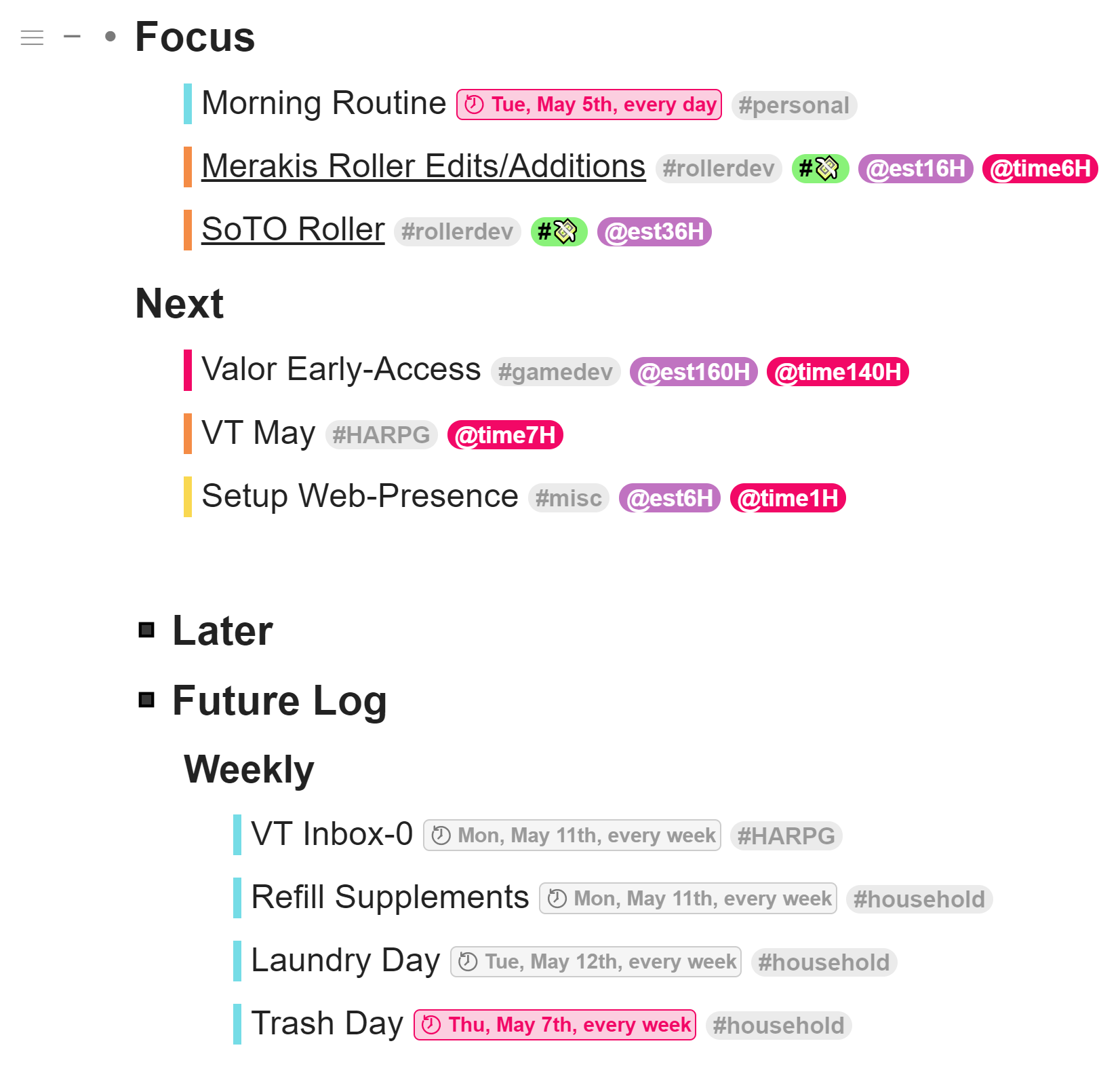
I’ve concocted a sort of digital bullet-journal-esque system (tried using an actual notebook for this several years back, but it took too much time to upkeep and the information didn’t feel accessible or organized enough).
There are a few sentences worth of ‘action plan’ at the top (not pictured) where I write out observations of what I need to focus on from my previous monthly review.
Most tasks are grouped into ‘focus’, ‘next’ and ‘later’ categories (‘later’ normally lives with the other two, temporarily collapsed to make things a bit more manageable for myself during a busy time). Any recurring/scheduled tasks go in the ‘future log’ (except daily recurring, which go in focus, though I’ve found it’s better to have most of those daily tasks in the habit tracker I keep in my spreadsheet timelog, so I have them as an overview of the month).
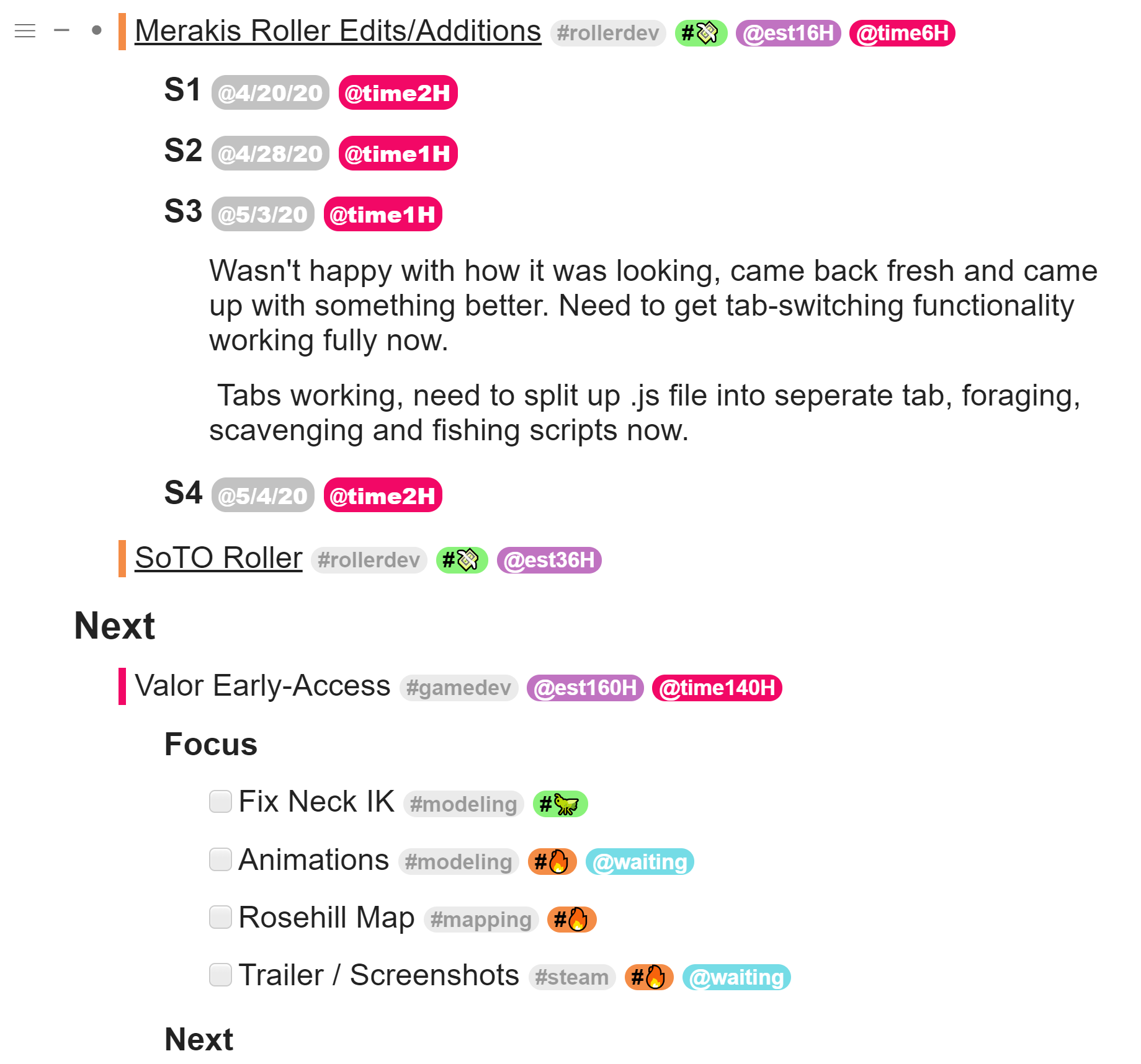
For larger tasks I keep devlogs and/or a burn-list in the task itself:
I’ve found this sort of system gives me an intuitive way to have everything in one place and go from overview to a more focused task view very quickly.
Labels are arranged as such:
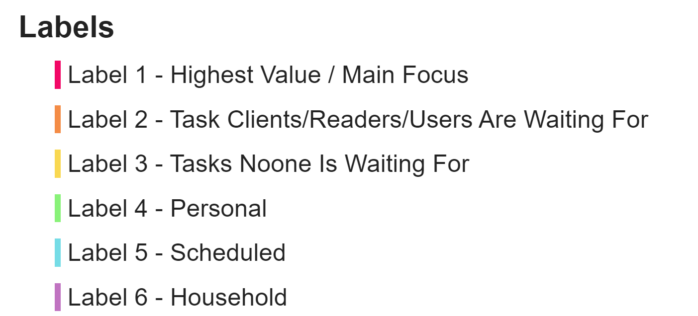
Fun side-effect of the rainbow colour scheme was that the ordering can change and still be in order. E.g. tasks could be listed as ‘1, 4, 5, 6’ or ‘5, 6, 1, 4’ and still be in nice rainbow order.
And the special tags I’m using are:
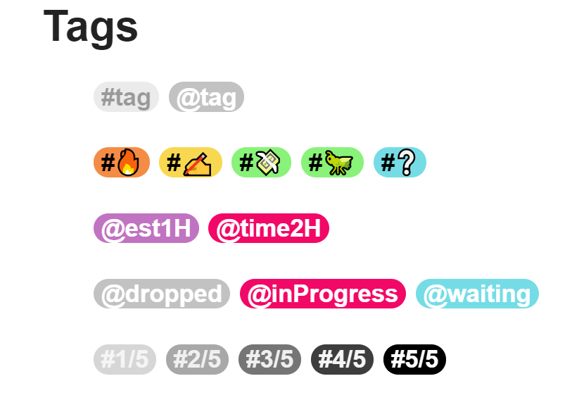
Normal #tag tags are being used for genres/areas of work, essentially.
The emoji tags are still evolving, and vary from use case to use case. Primarily I use them to tag things in my dev tasklists (bugs, may or may not be working and need stesting, refactor, core feature, etc.). The lil’ money tag is for commissions. :'D
@est0H and @time0H are for time tracking, @est for my estimate of what it will take and @time for actual hours spent. I timetrack in a spreadsheet for an overview, however I found that trying to track there in more detail was annoying. I suppose I’m tracking ‘my’ time in the spreadsheet and ‘task’ time here.
@dropped and @inProgress were for media lists (see below). @waiting is for tasks when the task is paused while I’m waiting for someone/something else. Also using @inProgress for aforementioned dev tasklists.
The ratings at the bottom were for my media lists (books, movies, etc.), however I recently moved those out to Goodreads and Trakt.
When a task is complete I move it to an archive list (not sure how useful this actually is, but meh).
tl;dr The whole point of all of this was to create a colour-coded, single-page task management system. This design just so happens to tickle my brain. Your mileage may vary.
I think the most important takeaway is that the ability to customize dynalist tags/labels with CSS means you can basically design your own systems inside dynalist.
Hopefully that answers your question. xD
7 Likes
Thanks for sharing this. I’m curious what your “burn-list” represents. A quick Google brought up some dubious uses of the term. 
Amazing, very thoughtful explanation, Thanks 
1 Like
Task-list, to-do list, burn-list… the mental imagery of ‘tasks burning that need to be finished before they burn out’ was amusing to me.
Very welcome!
I’m trying to automatically generate header styles for the top two levels, i.e., something like:
1st level: font-size: xx-large
2nd level: font-size: large
Can someone help me on how to specify the CSS selectors?
Joao_Antunes’s question got me thinking. Is there a tutorial on how to use custom CSS for Dynalist? Either on the Dynalist site or made by one of us users? I know there are general CSS tutorials on the web and I’ve read through many of those, but I would like to know how to specifically modify things in Dynalist.
It would be great to have a list of the different nodes/selectors/options (I’m not sure what to call them, I’m not a coder!) specific to Dynalist with an explanation of how to modify them. That way I could easily look up how to modify the first level font size or how to put boxes around nodes.
Has anyone put together a collection of custom CSS configurations? Beyond searching through the forum, I haven’t seen a place we can find examples of how to modify different parts of Dynalist. I’ve started to copy and paste all the examples into my Dynalist just for future reference. It isn’t really organized in any way, but I guess I could share the document if people were interested.
5 Likes
Please do. I have done the same maybe we can collaborate on it.
I think you can inspect an element in Chrome to see what it is called and thereby see the element you must write the css for .
Here is the link to the CSS code examples I have been saving: Dynalist CSS Examples
I hope it is helpful. As I said, it doesn’t have any order to it but perhaps I’ll do that sometime. (The librarian in me says I really need to organize everything!) I have not attributed where I got the various bits of code. If someone wants their contribution recognized, please let me know. I will give a big thanks to everyone who has shared their knowledge of CSS and code examples. I have learned a lot from what you all have posted.
Kenneth_Aar: I do know about the inspect element panel in Chrome and I do use it. I’ve learned quite a bit poking around there but it can be hard to find the exact element your looking for unless you know what it is and it takes a lot of time. Having a tutorial (as well as examples) would make things much easier.
5 Likes
Here is my CSS:
/ *Replace @@@Project tag with
*/
a[title=“Filter @@@Project”]::before {
visibility: visible;
content: “
font-size: 18px !important;
background-color: none
!important;
color: white !important;
font-weight: normal;
text-decoration: none;
filter: grayscale(100%);
}
a[title=“Filter @@@Project”] {
visibility: hidden;
font-size: 0%;
}
1 Like
Woah, that looks really useful for someone who’s looking to start tinkering with CSS! 
5 Likes