Post your current Custom CSS (with comments)!

This is my full CSS file with comments on it

5 Likes

I like the different colours for alternative link sources. But Iā€™m not sure what you are doing with the color labels. Whatā€™s your aim?

Different color labels for different things. I prefer less distracting colors for 1st and 2nd color tags

For those coming over from Workflowy, hereā€™s my Workflowy emulation CSS.

10 Likes

Refined my CSS a bit, posting here just in case I accidentally lose it

.node-inline-item {
    background-color: #ffffff;
    border: none;
    display: inline;
    vertical-align: middle;
    border-radius: 0px;
    text-decoration: underline;
    margin-top: 0px;
    font-size: 16px;
}

.node-link-internal.is-displayed:before {
    content: "";
}

.node-time{
    text-decoration: none;
}

.node-italics {
  color: #aaaaaa;
  font-style: normal;
}

.node-displayed-image 
{
max-width: 50px;
max-height: 50px;
vertical-align:top
}

/* Disappear tags */
.Node-openNote{ display: none; }
.ref .Node-openNote{ display: block; }
.node-tag[href="#"] { display:none; }
.ref .node-tag[href="#"] { display:block; }


.Node-self.is-collapsed.is-parent > .Node-bullet:before 
{
content: "\e90c";
}

.AppContainer:not(.is-using-bullet-to-zoom) .Node-self.is-parent.is-collapsed.is-hovering > .Node-bullet:before 
{
content: "\e90c";
}

.AppContainer:not(.is-using-bullet-to-zoom) .Node-self.is-parent.is-hovering > .Node-bullet:before 
{
content: "\e90c";
}

.node-displayed-image:hover 
{
max-width: 100%;
max-height: 100%; 
position: relative; 
top: -15px;
}

.LeftPaneSlidebarContainer,
.LeftPaneSplitter,
.DocumentBreadcrumb,
.AppHeader,
.Node.is-currentRoot > .Node-self,
.DocumentTools-icon
{
opacity: 0;
}

.LeftPaneSlidebarContainer:hover,
.LeftPaneSplitter:hover,
.DocumentBreadcrumb:hover,
.AppHeader:hover,
.Node.is-currentRoot > .Node-self:hover,
.DocumentTools-icon:hover
{
opacity: 1;
-webkit-transition: all 0.2s ease-in-out;
-moz-transition: all 0.2s ease-in-out;
-o-transition: all 0.2s ease-in-out;
transition: all 0.2s ease-in-out;
}

.AppContainer:not(.is-using-bullet-to-zoom) .Node-self.is-parent.is-collapsed.is-hovering > .Node-bullet:before 
{
content: "\e90c";
opacity: 1;
}

.AppContainer:not(.is-using-bullet-to-zoom) .Node-self.is-parent.is-hovering > .Node-bullet:before 
{
content: "\e90c";
opacity: 1;
}

.Document-rootNode.node-bold
{
opacity: 0;
}
.Node.is-currentRoot > .Node-self .Node-contentContainer, .Node.is-currentRoot > .Node-self.is-heading .Node-contentContainer {
font-size: 16px;
}
2 Likes
  • Resized tags
  • Rounded ā€œPillā€ tags
  • Tag background color
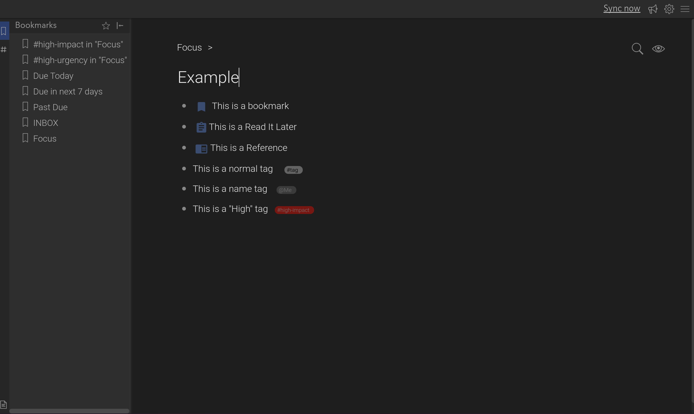
  • Example colored tag
  • Material Icons for Bookmarks, ReadItLater, and References
  • Render material icon at start of line no mater tag text placement (this is true to the rendered line, so a multiline entry wont move the icon to the start of the first line)
  • Moved the Files icon to the bottom of the screen out of the way
  • Moved the Bookmarks and tags icons up (needs some tweaking)
  • Changed the highlight color for Bookmarks, Tags, Files
  • Changed the color on the collapsed node icon

CSS

  /* Set Up standard tag format */
.node-tag[title*="@"]
{
    font-weight: normal;
    color: white !important;
    background-color: #666!important;
    border-radius: 10px;
    text-decoration: none;
    padding: 1px 8px 1px 4px;
    font-size: 0.8em;
    opacity: 0.4;
    font-size:60%;
    word-wrap: normal;
    white-space: nowrap;
}
.node-tag[title*="#"]
{
    color: black !important;
    background-color: #ccc!important;
    border-radius: 10px;
    text-decoration: none;
    padding: 1px 8px 1px 4px;
    font-size: 0.8em;
    font-weight: bold;
    opacity: 0.4;
    font-size:60%;
    word-wrap: normal;
    white-space: nowrap;
}
.is-collapsed>.Node-bullet:before 
{
    color: darkturquoise;   
}

/* Set up Material Icons */
@font-face {
    font-family: 'Material Icons';
    font-style: normal;
    font-weight: 400!important;
    src: url(https://fonts.gstatic.com/s/materialicons/v38/flUhRq6tzZclQEJ-Vdg-IuiaDsNcIhQ8tQ.woff2) format('woff2');
  }
a[title^="Filter #bookmark"] {
  visibility: hidden;
  position: relative;
  margin-right: -50px;
  float: left;
}
a[title^="Filter #bookmark"]:after {
    font-family: 'Material Icons';
    font-weight: normal;
    font-style: normal;
    line-height: 1;
    letter-spacing: normal;
    text-transform: none;
    display: inline-block;
    white-space: nowrap;
    word-wrap: normal;
    direction: ltr;
    text-rendering: optimizeLegibility;
    -webkit-font-smoothing: antialiased;
    visibility: visible;
    /* position: absolute; */
    top: -5px;
    left: 0;
    content: " \e866";
    font-size: 22px;
    color: cornflowerblue;
    float: left;
}
a[title^="Filter #readlater"] {
    visibility: hidden;
    position: relative;
    margin-right: -50px;
    float: left;
  }
a[title^="Filter #readlater"]:after {
    font-family: 'Material Icons';
    font-weight: normal;
    font-style: normal;
    line-height: 1;
    letter-spacing: normal;
    text-transform: none;
    display: inline-block;
    white-space: nowrap;
    word-wrap: normal;
    direction: ltr;
    text-rendering: optimizeLegibility;
    -webkit-font-smoothing: antialiased;
    visibility: visible;
    /* position: absolute; */
    top: -5px;
    left: 0;
    content: " \e85d";
    font-size: 22px;
    color: cornflowerblue;
    float: left;
}
a[title^="Filter #reference"] {
    visibility: hidden;
    position: relative;
    margin-right: -50px;
    float: left;
  }
a[title^="Filter #reference"]:after {
    font-family: 'Material Icons';
    font-weight: normal;
    font-style: normal;
    line-height: 1;
    letter-spacing: normal;
    text-transform: none;
    display: inline-block;
    white-space: nowrap;
    word-wrap: normal;
    direction: ltr;
    text-rendering: optimizeLegibility;
    -webkit-font-smoothing: antialiased;
    visibility: visible;
    /* position: absolute; */
    top: -5px;
    left: 0;
    content: " \e86d";
    font-size: 22px;
    color: cornflowerblue;
    float: left;
}


/* Set up colored tags */
.node-tag[title*="#high-"]
{
    font-weight: normal;
    color: white !important;
    background-color: red !important;
    border-radius: 10px;
    text-decoration: none;
    padding: 1px 8px 1px 4px;
    font-size: 0.8em;
    opacity: 0.4;
    font-size:60%;
    word-wrap: normal;
    white-space: nowrap;
}


/* Move Files, Bookmarks, and Tag icons */
.LeftPaneContainer-navItem--myFiles
{
    top: 95%;
}
.LeftPaneContainer-navItem--bookmarks
{
    top:-10%;
}
.LeftPaneContainer-navItem--tags
{
    top:-10%
}
.is-desktop .LeftPaneContainer-navItem.is-active, .is-desktop .LeftPaneContainer-navItem:hover {
    background:#283c6e;
}

8 Likes

image

box shadow for inline images to make them stand out a little more

.node-displayed-image {
border: 1px solid;
padding: 5px;
box-shadow: 2px 2px;
}

2 Likes

That image thing is a pro feature?

Yes I believe so. Or maybe itā€™s just for uploads. If you host the image elsewhere (or use base64 url) you can probably embed images even without pro

Love the bookmarks, reference and readlater, is there a way normalize spacing?

image

Thanks

4 Likes

Thatā€™s a great question. You can try playing with the margin settings a bit but there has to be a better way of doing it. I did start using percents instead and itā€™s lined up better, but not sure how it will work across different devices (phone, web, desktop app, etc).

a[title^=ā€œFilter #readlaterā€] {
visibility: hidden;
position: relative;
margin-right: -4%;
float: left;

a[title^=ā€œFilter #bookmarkā€] {
visibility: hidden;
position: relative;
margin-right: -4.5%;
float: left;
}

a[title^=ā€œFilter #referenceā€] {
visibility: hidden;
position: relative;
margin-right: -4%;
float: left;
}

Great thread guys and gals!

/* checkbox on mobile does not trigger zoom */
.is-mobile .Node-bullet {
pointer-events: none;
}

I use this CSS to hide the little infinity icon on Dynalist links. Not because I donā€™t like it, but because I need the room! :smiley:

/* Don't show icon for Dynalist links. */
.node-link-internal.is-displayed:before {
    content: none;
}
7 Likes

Before coming to Dynalist I spent a lot of time customizing Todoist with Stylish, but every week or so theyā€™d push an updating breaking my CSS! I had sworn off customizing for awhile, but seeing how customization-friendly Dynalist seems to be I finally put together a custom style for myself again.
Thanks to many that have posted in this topic and on this thread! Iā€™ve used many snippets!
At first I was just happy to change tags to pill-format, but then I realized that being able to customize formatting on individual tags is completely game changing for me. Right now Iā€™m experimenting with using it for time tracking (not that this couldnā€™t be done without the special formatting, I suppose, but this just fits my brain so much better).


Script: https://userstyles.org/styles/177309/dynalist-candy

12 Likes

Post Sawyer pic

Wow this is the most polished theme I saw in while! I especially like the color labels. Thanks for sharing!

Thank you, and youā€™re very welcome! :smiley:

1 Like

WOW! Iā€™m so impressed with your CSS solutions and I sort of copy-pasted my own one togetherā€¦ :grinning: Can anybody please HELP me and tell me how to achieve the following:

After completing a node with a certain #tag, I would love that #tag to change its color (e. g. from a bright red to grey). Thank you so much!

2 Likes

That would be easy if the CSS class or id would change when completed, but this is not the case. I hope somebody can prove me wrong but for that to happen it needs some JavaScript or jQuery.