Piotr I thought of another idea related to coloring
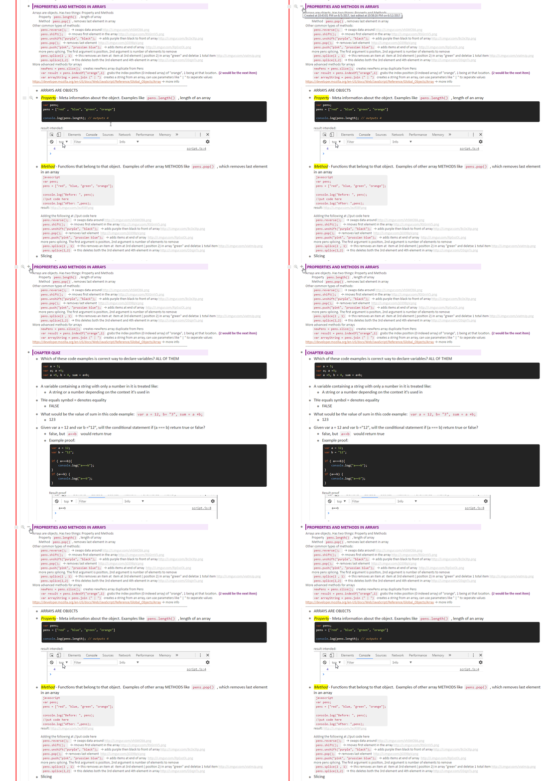
I use the bulletpoint’s note a lot, when I condense course notes. Example:

It would really like a selective way of coloring only the bulletpoint’s note
Selection would be made right from the bulletpoint itself. Like #note:lavender or something.
Or maybe on the parent list of all of these, assign something like #note:lavender so all children’s bulletpoint notes have it. Also, it would override things like #bg:yellow too
That would be super neat
I might make it myself later though if you don’t do it, I can see myself using it on every course I take after I finish this javascript course
P.S. unrelated note. I use your multicode syntax color thing pretty much everyday, its super wonderful ![]()
EDIT :
I think the user should be able to select whether #note:lavender applies to both the bulletpoint and the note, or just the note in the powerpack settings too
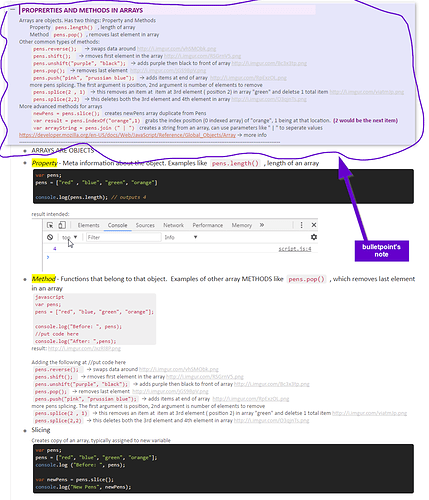
I’m leaning more towards “note+bulletpoint” looks cleaner to look at (see last pic)
Also I think the coloring of the note… should only be as long as the color tags.
Possibly even a slight border and or box shadow to it (optional). Also, everything on the bulletpoint and stuff below it should be white.
It reminds me of catalog design almost. I have some sample well-known brand hard copy catalogs actually following this style of design
Example:
EDIT EDIT I just realized on vertical monitor the colors don’t line up properly though.
Probably should look like this instead


