Fade or Remove Bullet for Checklist option

@senthil - Did you end up writing a userscript to hide or fade the bullets for checklists? If so, would you be willing to share it? Iā€™d love to use it.

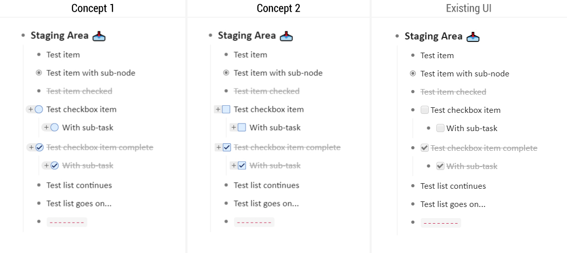
It looks so cluttered to have both bullets and checkboxes for the same item ā€“ and it also makes no sense. Itā€™s redundant. With paper to-do lists, who draws a bullet point in front of a checkbox? Iā€™m willing to bet very few people do. The checkbox IS a form of bullet.

Itā€™s been like this for a long time and youā€™re actually the first person to propose this.

I understand the costs of changing something that your users have gotten accustomed to and that you have linked to features/actions, but ^this^ is not a good reason for persisting with a design that was not ideal in the first place. The potential issues you mentioned (e.g. the bullet point is for drag and drop, and can optionally be clicked on to zoom) are not tied to a bullet per se, and can be solved with an alternative.

Check out bullets/checkboxes in Bear and Taskade ā€“ the list is much easier to scan and digest when itā€™s visually cleaner. Bear also does a great job of mixing checklists and bullets (i.e. ā€œchildrenā€ of a checkbox item can be bullets, and are not prescriptively limited to also being checkboxes).

4 Likes

This is one of the top issues i have with Dynalist - itā€™s extremely cluttered with all the extra bullet points. Makes it hard to scan quickly and therefore harder to use.

I also share the sale feeling with check-box and bullet, I would also prefer to have either bullet or a check box for tasks (at same location than the bullet).

1 Like

Maybe you could do it yourself with Custom CSS?

I donā€™t know how to identify items with checkboxes but I use Custom CSS someone on the forums wrote to customize my bullets somewhat because I didnā€™t like the default ones

.Node-self.is-collapsed.is-parent > .Node-bullet:before 
{
content: "\e90c";
}

.AppContainer:not(.is-using-bullet-to-zoom) .Node-self.is-parent.is-collapsed.is-hovering > .Node-bullet:before 
{
content: "\e90c";
}

.AppContainer:not(.is-using-bullet-to-zoom) .Node-self.is-parent.is-hovering > .Node-bullet:before 
{
content: "\e90c";
}
1 Like

Is there any update on this? I would love to see only checkboxes instead of bullets in checklists :ok_hand:

+1

I stand by my earlier comment in this thread.

1 Like

I feel the same way. Google Tasks looked very clean with only check boxes. The suggestion of fading the bullet when the list is turned into a check list seems good.

1 Like

+1 from me

Here you go. Get yourselves a pro account and paste in the Custom CSS box.

/* dont render bullet if checkbox exists */
.Node-outer > .Node.is-checklist > 
.Node-self > .Node-bullet {
display: none;
}
2 Likes

Nice. Thanks George. :+1:

Iā€™m curious how do you zoom or drag and drop after using this custom CSS. Iā€™m guessing youā€™re using shortcuts to accomplish those tasks?

1 Like

uh i never zoom a checkbox since theyā€™re never parents. Itā€™s my philosophy that all checkbox items ought to be managable bite size actions and so theyā€™re never parents.

and I donā€™t drag and drop. I use move hotkey, I use ummmm that hotkey that lets items move up and down the list, and i indent/outdent items.

Ok, got it.

Having an intuitive way to zoom in is our biggest obstacle to add this. I agree with everyone here that itā€™s ugly, but zoom is important to Dynalist and I donā€™t want to assume other peopleā€™s checkbox items donā€™t have children too.

Glad to hear everyoneā€™s genius ideas. Weā€™ve considered double click, middle click, or control click, but they are all too hidden for such a core interaction :frowning:

1 Like

my css solved it imo

i agree the no-css version should have all the stuff a noobie could intuit. Having CSS options for picky users like me is perfect.

1 Like

Took a cue from @Michael_Potterā€™s idea and made a mockup.

I have to admit this is not an easy or quick to implement solution. People may also confuse the ā€˜+ā€™ for zooming with the existing ā€˜+ā€™ and ā€˜-ā€™ buttons for expand and collapse.

1 Like

i like existing ui
concepts kind of ugly, because its confusing then a symbol is used sometimes and not other times without meaning anything different

Thanks for sharing the code. Makes it beautiful!:+1:

I agree with @Michael_Potter, but with modifications. I canā€™t comment on color but checkboxes should replace bullets, it should be the default behavior, and there shouldnā€™t be an option to change it. Either bullet or checkbox, but not both at the same time.

For me that did not work.
Had to add this instead:

/* make bullets invisible if checkbox exists */
.Node.has-checkbox .Node-bullet {
opacity: 1% !important;
}

This way, just the bullet becomes invisible and all the fuctionality remains working.

ā€¦ or you just toggle the view and use Article view for these docs. :sunglasses:

1 Like

#cute, one of the oh-so trivially cute nice to havesā€¦