Hi there
Wanted to share the CSS I created in case people are interested! I’d love to hear your feedback 
Key features:
- revamped navigation panel with new icons
- horizontal dividers of items
- disabled zoom in by clicking on bullets on mobile (I’m left handed and I accidentally zoomed-in far too often while trying to add a new item…)
Note1: I just upgraded to the Pro tier and the new CSS works like a charm in the Android app!
Note2: I use the Comfortable list density on medium font size Whitney, so if results may vary with different setups.
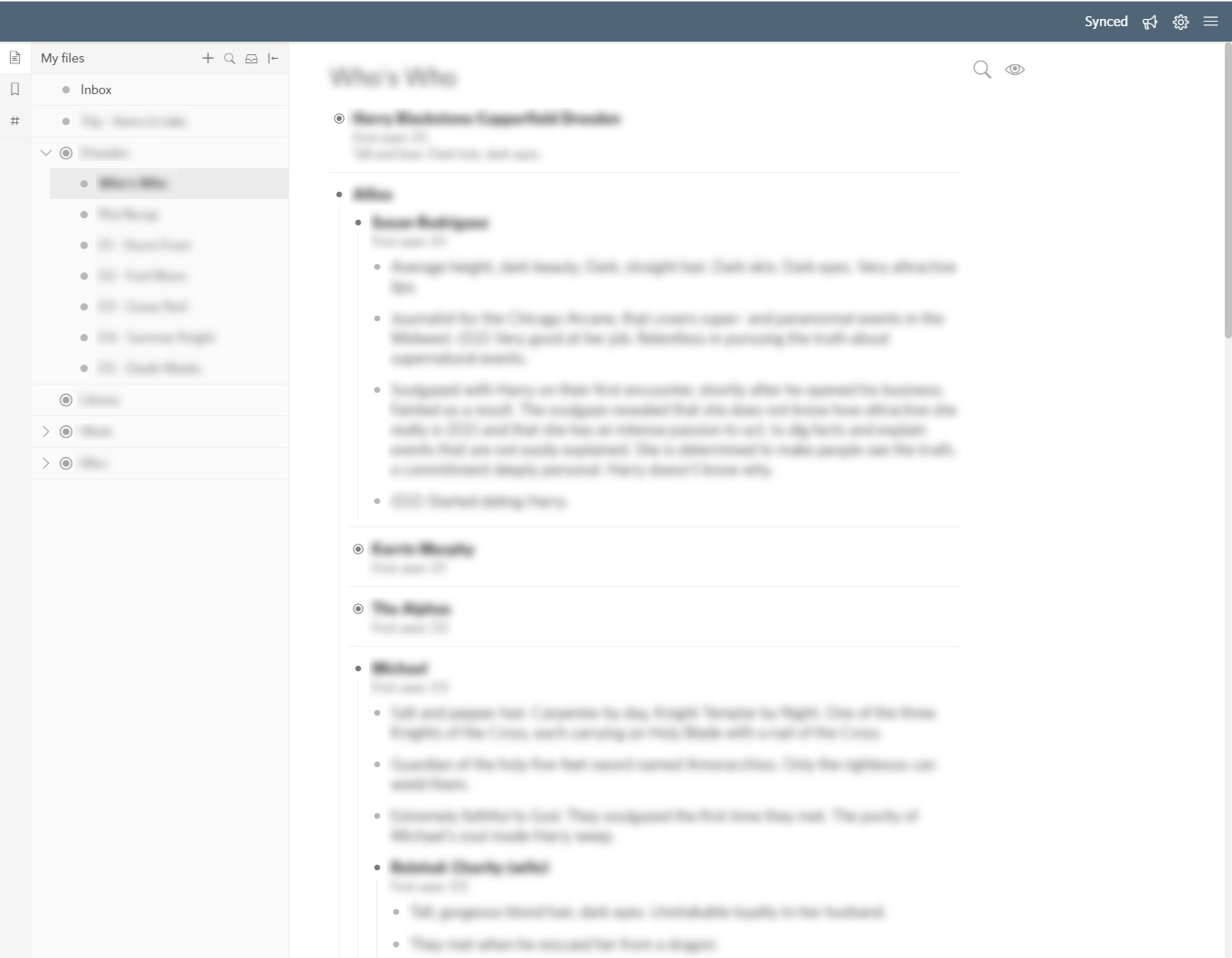
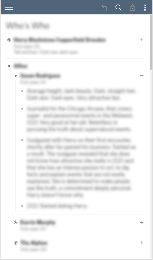
Some pictures:
Desktop:
Mobile - Nav drawer:

Mobile - Document
CSS code
/*----- App Header -----*/

/* increase height of app header; change its color */
.AppHeader {
	box-shadow: 0 1px 2px rgba(0,0,0,0.15);
    background-color: #506578;
    color: white;
}

/* make app header icons white */
.AppHeader-icon {
	color: white;
    border-radius: 2px;
    padding: 7px;
    top: 6px;
}

/* fix hover color of app header icons */
.AppHeader-icon:hover {
    box-shadow: None;
	background-color: rgba(255,255,255,0.2);
	color: white;
}

/* fix position of app header buttons after height increase */
.AppHeader-syncStatus {	bottom: 10px; right: 115px; }
.AppHeader-notifications { right: 74px; }
.AppHeader-settings { right: 40px; }


/*----- Drawer Icons -----*/

/* increase icons size*/
.pane-item-icon {
	vertical-align: -4px;
    font-size: 20px;
}

/* replace icons with bullets */
.FolderItem-icon:before   { content: "\e90c"; color: rgb(164, 164, 164); }
.DocumentItem-icon:before {	content: "\e90d"; color: rgb(184, 184, 184); }

/* increase left padding to align new bullets to parent text */
.pane-item-children { padding-left: 20px; }

/* increase line height to let items breathe */
.pane-item-title { line-height: 26px; }

/* add borders to separate items more clearly */
.Pane-content { padding-top: 0; } /* add lateral padding to have space between borders and edges */
.Pane-content > div { border-bottom: 1px solid #f1f1f1; } /* add bottom borders to separate parent items */

/* switch triangles icons to carets; rotate left caret to get a bottom-facing one */
.pane-item-header.is-collapsed .pane-item-toggler:before { content: "\e94a"; }
.pane-item-header:not(.is-collapsed) .pane-item-toggler:before { content: "\e926"; writing-mode: vertical-lr; }


/*----- Desktop-specific tweaks -----*/

.is-desktop .AppHeader { height: 44px; }

/* only keep a single border to separate left pane from content */
.is-desktop .LeftPaneSlidebarContainer { box-shadow: None; }
.is-desktop .LeftPaneSplitter:after { border-right: None; }
.is-desktop .LeftPaneContainer { border-right: 1px solid #f1f1f1; }

/* switch left pane bg to light grey*/
.is-desktop .LeftPaneContainer, .is-desktop .Pane {	background-color: #fafafa; }


@media screen and (min-width: 510px) {

    /* switch height of pane title to 35px */
    .Pane-header, .Pane-headerToolbar, .Pane-headerToolbarItem, .Pane-headerToolbarItem:before {
    	height: 35px;
        line-height: 35px;
    }

    /* add bottom border to pane title and files/bookmarks buttons */
    .Pane-header, .LeftPaneContainer-navItem > .tooltip {
    	border-bottom: 1px solid #f1f1f1;
    }
}

/* create square buttons for files/bookmark selection. harmonize with title height */
.is-desktop .LeftPaneContainer-nav, .is-desktop .LeftPaneContainer-navItem { width: 35px; }
.is-desktop .LeftPaneContainer-panes { width: calc(100% - 35px); }
.is-desktop .LeftPaneContainer-navItem { height: 35px; }

/* switch border color of buttons pane to light grey  */
.is-desktop .LeftPaneContainer-nav {
	padding-top: 0;
    border-right: 1px solid #f1f1f1;
}


/*----- make sidebar on top of document without resizing instead of shifting document space ----- */

.is-desktop .LeftPaneSlidebarContainer {
	z-index: 1;
}

@media screen and (min-width: 510px) {
    .DocumentContainer {
        left: 0 !important;
        width: 100% !important;
    }
}


/*----- Content Nodes - Hover -----*/

/* fix position of menu buttons */
.is-desktop .node-hover {
	position: absolute;
    left: 110px;
    justify-content: flex-start;
    width: 50px;
}


/*----- Content Nodes - Bullets -----*/

/* switch color of the bullets of last child level to light grey */
.Node-self:not(.is-parent) > a.Node-bullet:before { color: rgb(184, 184, 184); }


/*----- Content Nodes - Bottom borders -----*/

/* switch transparent border to padding to avoid gaps between borders for last children */
.Node {
    border-top: None;
    border-bottom: None;
	padding-top: 3px;
    padding-bottom: 3px;
}

/* add bottom borders after all collapsed items
   and children block of expanded items (.is-parent is used to exclude last level items) */
.is-parent.is-collapsed:after, .is-parent + .Node-children:after {
    content: "";
    display: block;
    margin-top: 8px;
    margin-bottom: 5px;
    border-bottom: 1px solid #f1f1f1;
}

/* add bottom border of first-level items without children */
.is-currentRoot > .Node-children > .Node-outer > .Node > .Node-self:not(.is-parent):after {
    content: "";
    display: block;
    margin-top: 8px;
    margin-bottom: 5px;
    border-bottom: 1px solid #f1f1f1;
}

/* add extra padding to center node text */
.is-currentRoot > .Node-children > .Node-outer > .Node > .Node-self:not(.is-parent) > .node-line { padding-bottom: 3px; }


/* remove borders of last item of .Node-children to avoid stacks of borders with nested lists */
.Node-children > .Node-outer:last-of-type > .Node > .is-parent.is-collapsed:after,
.Node-children > .Node-outer:last-of-type > .Node > .is-parent + .Node-children:after {
	border-bottom: None;
}

/* ensure all sub-nested lists have their border end at the same bottom level */
/*.Node-children > .Node-outer:last-of-type > .Node { padding-bottom: 0; }*/

/* adjust left margin to have consistent borders when expanded and collapsed */
.is-parent + .Node-children:after {
    width: calc(100% + 10px);
    margin-left: -10px;
}

/* adjust padding bottom to have consistent spacing between items when collapsed and epxanded */
.is-parent.is-collapsed { padding-bottom: 0; }
.is-parent.is-collapsed:after { padding-bottom: 3px; }


/*----- Content Nodes - Left borders -----*/

/* fix gaps between the border of notes and the children block  */
.is-mediumFont .Node-self.is-parent + .Node-children { margin-top: -5px; }

/* remove transparetn border when menu is open */
.Node.is-selected .Node-children { border-left: None; }

/* convert some padding to margin so the border is aligned with the children block */
.Node-noteContainer {
    width: calc(100% - 10px);
    margin-left: 10px;
    padding-left: 16px;
}

/* add border when expanded; adjust padding so it stays consistent with collapsed state */
.is-parent:not(.is-collapsed) > .Node-noteContainer {
    border-left: 1px solid #f1f1f1;
    padding-left: 15px;
}

/* remove padding so the border of child class .Node-outer is aligned with notes */
.Node-children {
    padding-left: 0;
	border-left: None;
}

/* add border to .Node-outer, except for first level */
:not(.is-currentRoot) > .Node-children > .Node-outer {
    padding-left: 10px;
    border-left: 1px solid #f1f1f1;
}


/* ----- Misc ----- */

.FilePane .Pane-headerToolbar { bottom: 0; }
.is-desktop .LeftPaneContainer-panes { top: 0; }

/* remove empty space at top of document */
.DocumentBreadcrumb {
	min-height: 0;
    padding: 0;
}

/* move toolbox out of the document itself; make it stick to the same position */
.DocumentTools {
    position: sticky;
	top: 10px !important;
    left: 100px;
}
.DocumentTools-overlay {
    right: -20px;
    background: transparent;
    box-shadow: None;
}
.DocumentTools-filterView {
	right: -20px;
}
.DocumentSearch-icon {
	right: 16px;
}

.is-archived > .pane-item-icon {
    font-size: 16px;
	vertical-align: -1px;
}


/* ----- Mobile specific tweaks ----- */

/* turn icons white on mobile, including lock when in read-only mode */
.MobileHeader-option, .MobileHeader-option--toggleReadMode.is-in-read-mode:before { color: white; }
.MobileHeader-mainMenuIcon, .MobileHeader-backIcon, .MobileHeader-option, .MobileHeader-title { color: white; }

/* reduce horizontal padding for more text real-estate */
.is-mobile .Node.is-currentRoot{ padding: 0 15px 0 15px; }
.is-mobile .Node-children { padding-left: 0; }
.is-mobile .node-line { padding-right: 5px; }

/* reduce top padding to remove blank space */
.is-mobile .DocumentBreadcrumb { padding-top: 0; }

/* align buttons to expand/collapse closer to the edge */
.is-mobile .node-hover {
    position: absolute;
    margin-right: 0;
    right: 10px;
	/*width: 100%;   extend width of node hover to 100% to overlay the bullet on the left and prevent possibility to zoom in */
}


/* ----- Mobile specific tweaks - Nav panel ----- */

/* use same bg color as the header bar */
.is-mobile .LeftPaneContainer-header, .is-mobile .LeftPaneContainer-nav { background-color: #506578; }

/* condense space around the header */
.is-mobile .LeftPaneContainer-header { padding: 10px 0 5px 0; }

/* prevent shadows bleading between header and nav by using negative spread */
.is-mobile .LeftPaneSlidebarContainer.is-open .LeftPaneContainer-nav { box-shadow: 0 3px 2px -2px rgba(0,0,0,0.15); }

/* change borders of nav items */
.is-mobile .LeftPaneContainer-navItem { border-bottom-color: #506578; }

/* add border between buttons and documents list */
.is-mobile .Pane-headerButtonContainer { border-bottom: 1px solid #f1f1f1; }

/* make search button stand out more by replicating other buttons layout */
.is-mobile .Pane-headerIcon--documentFinder {
	background-color: #f5f5f5;
    box-shadow: 0 2px 5px 0 rgba(0, 0, 0, 0.16), 0 2px 10px 0 rgba(0, 0, 0, 0.12);
    text-align: center;
    margin: 0 8px;
    padding: 5px 8px 5px 8px;
    border-radius: 2px;
    top: 0;
}
.is-mobile .Pane-headerIcon--documentFinder:before{
    position: relative;
    top: -2px;
    vertical-align: middle;
    font-size: 20px;
}

/* remove top  padding for tighter look */
.is-mobile .Pane-content { padding-top: 0; }

/* update padding of nested documents to account for blank space */
.is-mobile .pane-item-children { padding-left: 25px; } /* make items breathe a bit more */

/* align left icons vertically */
.is-mobile .pane-item-icon { vertical-align: -3px; } /* align icons with text */
.is-mobile .pane-item-toggler  { vertical-align: -1px; } /* align icons with text */
.is-mobile .pane-item-header { padding: 5px 5px 6px 50px; } /* update padding top for vertical centering */

/* align right icons vertically*/
.is-mobile .pane-item-menu-trigger { top: 1px; }
.is-mobile .pane-item-menu-trigger:before { content: "\e90f"; font-size: 14px; }
.is-mobile .pane-item-menu-trigger:before { content: "\e92b"; font-size: 14px; }

/* slightly move right icons to the left */
.is-mobile .pane-item-menu-trigger { padding-right: 12px; }

/* reduce font size */
.is-mobile .LeftPaneContainer-panes { font-size: 16px; }
.is-mobile .is-archived > .pane-item-icon {
    font-size: 16px;
	vertical-align: -1px;
}

/* disable zoom in */
.is-mobile .node-line.Node-contentContainer { position: relative; z-index: 100; }
.is-mobile .node-line.Node-bullet { position: relative; z-index: 0; }
.is-mobile .node-hover { z-index: 1; width: 100%; }
.is-mobile .node-line.Node-contentContainer {
    margin-right: 20px;
    padding-right: 0;
	width: calc(100% - 26px - 20px);
}
