I find the following fixes to customized stylesheet to make dynalist easier to read overall from a UX perspective
.Node-bullet:before {
    font-size: 6px !important;
}
.Node-self {
    padding-left: 83px !important;
}
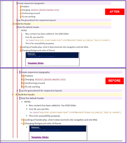
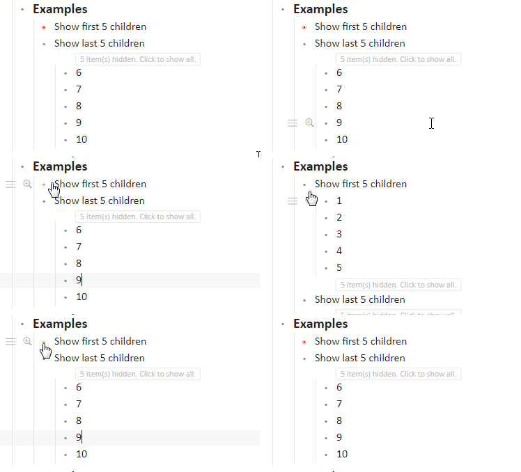
It makes bulletpoints smaller, so its overall less distracting, and has better vertical alignment to text in my opinion.
I might have to change up the bulletpoint: collapsed to be a bit bigger or different color down the road though, granted I don’t collapse a lot of items to begin with
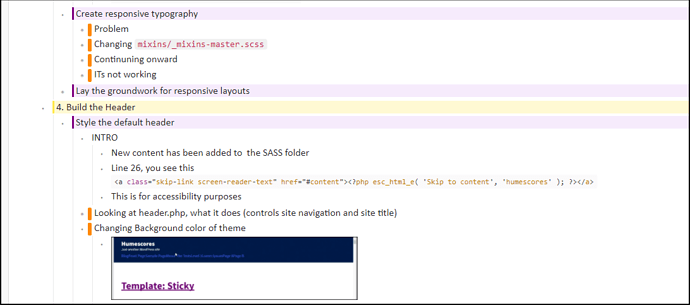
Example with changes:
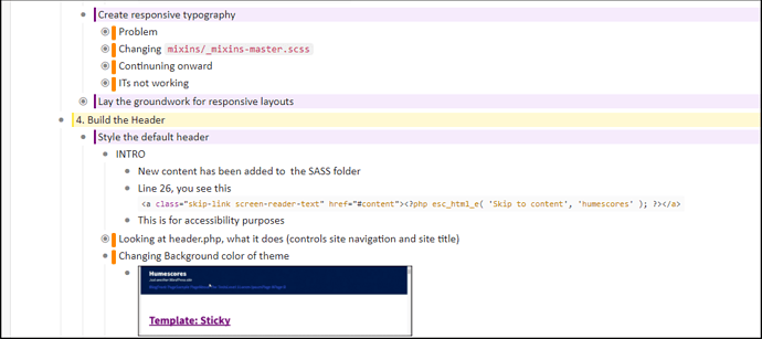
Without changes
I drew an illustration illustrating difference on vertical alignments. Vertical alignment intersects the start of the line now, which is more relevant, than the bulletpoint previously
I’ve been using this change for about 2 weeks and its given me significantly less headaches looking at dynalist.
Its a hybrid between read/edit mode
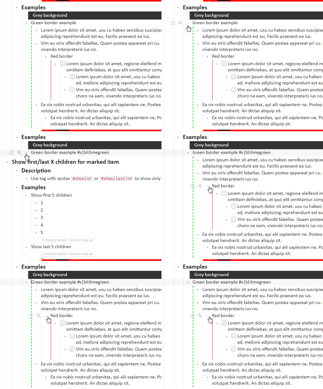
I cleaned up a lot of theme things that I use on my stylish extension found here (I added the changes here already)



 !!!
!!!