
Here’s a CSS fix that might be easier for people to read.
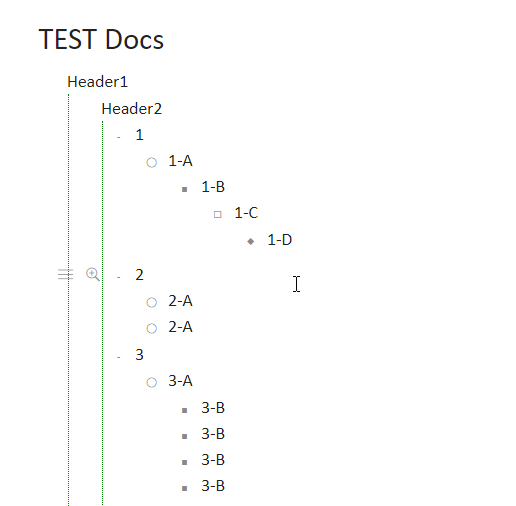
I find the vertical lines distracting so I removed all but the first 2 in the current view
Next, I like evernote/ onenote bulletpoint styling. It has different bulletpoint indicators depending on how far deep your bulletpoints are. This is what they look like;
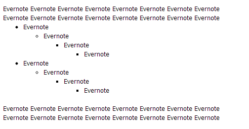
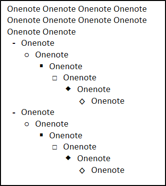
My implementation is a mix of dynalist bullet folding with some evernote/onenote bulletpoint styling
add this to your stylish.css file
/*==================================*/
/* Bulletpoint Styling and Border-Left */
/*==================================*/

/* Remove all Vertical lines except first 2 in current view */
.Node.is-currentRoot .Node .Node .Node > .Node-children {
    border-left: 0px !important;
}
/* Make Remaining Lines Green */
.Node.is-currentRoot .Node .Node-children {
    border-left: 1px dotted green !important;
}
/* Hide All Bulletpoints (1st and 2nd in current view) */
.Node.is-currentRoot .Node .Node-bullet:before {
	visibility: hidden;
}
/* Displays Any Collapsed bulletpoint */
.Node.is-currentRoot .Node .is-collapsed>.Node-bullet:before {
 	color:red;
    visibility: visible;
}
/* Overrides 3rd Bulletpoint in current view */
.Node.is-currentRoot .Node .Node .Node .Node-bullet:before {
	visibility: visible;
}

/* Overrides 4th Bulletpoint in current view */
.Node.is-currentRoot .Node .Node .Node .Node .Node-bullet:before {
	content: "◯";
    visibility: visible;
}
/* Overrides 5th Bulletpoint in current view */
.Node.is-currentRoot .Node .Node .Node .Node .Node .Node-bullet:before {
	content: "■";
    visibility: visible;
}
/* Overrides 6th Bulletpoint in current view */
.Node.is-currentRoot .Node .Node .Node .Node .Node .Node .Node-bullet:before {
	content: "☐";
    visibility: visible;
}
/* Overrides 7th Bulletpoint in current view */
.Node.is-currentRoot .Node .Node .Node .Node .Node .Node .Node .Node-bullet:before {
	content: "◆";
    visibility: visible;
}