
This is what my current notetaking system looks like for course notes:
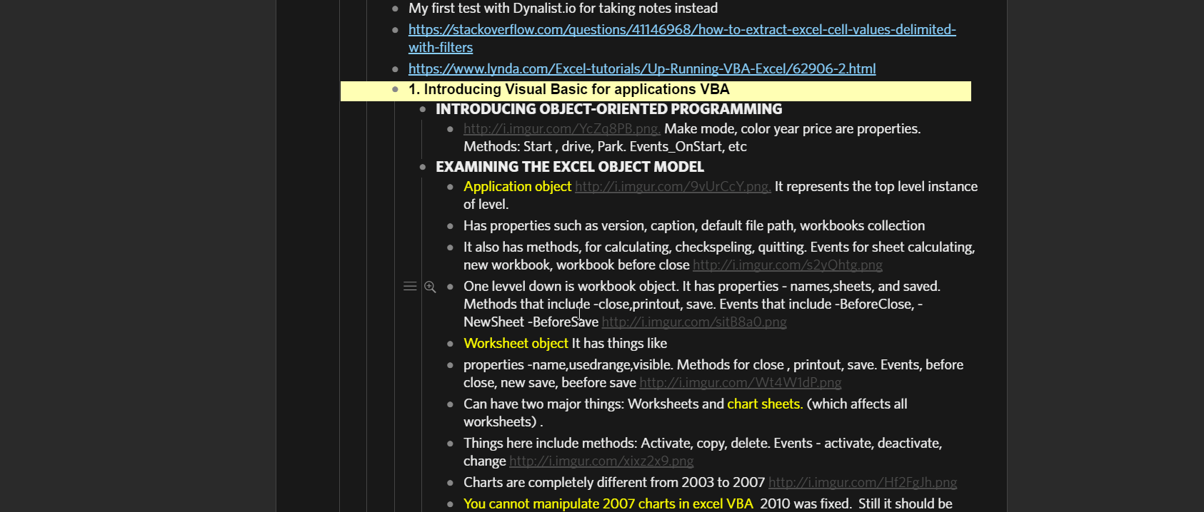
You can basically highlight whatever notes you want easily. I have done numerous testing to see what the best combination of color and fonts
My CSS skin is the following :
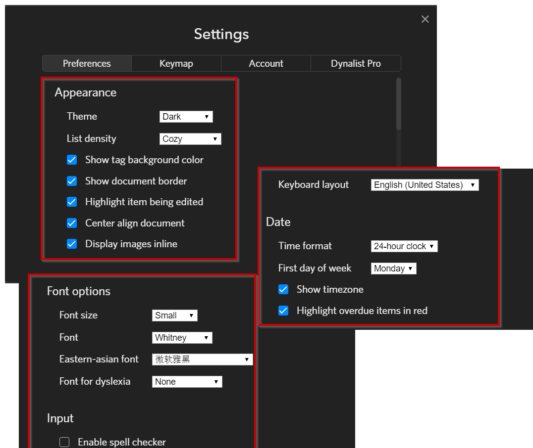
Settings I have set on dynalist.io itself
Chrome plugins that are required:
-
IMAGUS for previewing image links: https://chrome.google.com/webstore/detail/imagus/immpkjjlgappgfkkfieppnmlhakdmaab
-
STYLISH: (for customizing CSS skin) https://chrome.google.com/webstore/detail/stylish-custom-themes-for/fjnbnpbmkenffdnngjfgmeleoegfcffe
General rules for notetaking:
One document
H1 tags are in the root of the document, traditionally thought of as “Folders”
H2 tags are what’s traditionally thought of as “category tags”
H3 tags are what’s traditionally thought of as “subcategory tags”
BOLD is traditionally thought of as “highlighting text in a textbook”
ITALICS is traditionally thought of as “highlighted the subcategory or category tag in textbook with different color”
If you have any questions leave them here
EDIT 3/5/I7 looked ported over my CSS skin to my home PC, it doesn’t look like I had the finished CSS put on pastebin. I have fixed the pastebin so its now the correct CSS theme.
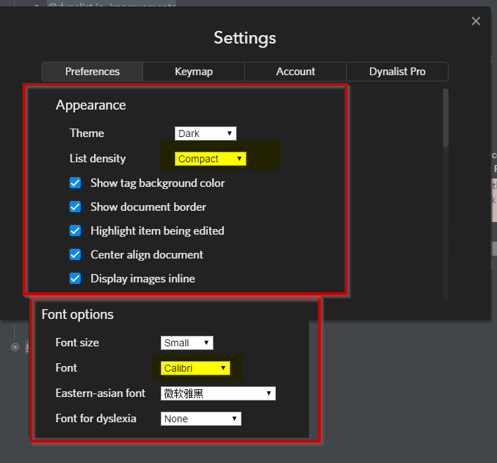
EDIT 3/7/17 I also edited my settings for more readability, I think Calibri + Compact is the easiest to look at , plus you can also fit more stuff then the standard “Cozy / Whitney” default settings. Its commonly said that Calibri, Arial, or Helvetica are the overall best fonts too
I have tweaked the CSS settings a bit, so its more optimized and less eye fatigue as well
H2 tags are grey color background now to fit the overall blackish theme w/o being too distracting
Italics are still used sparingly as very high priority readable-tags in the document
H3 is more of a traditional bold still (not changed)