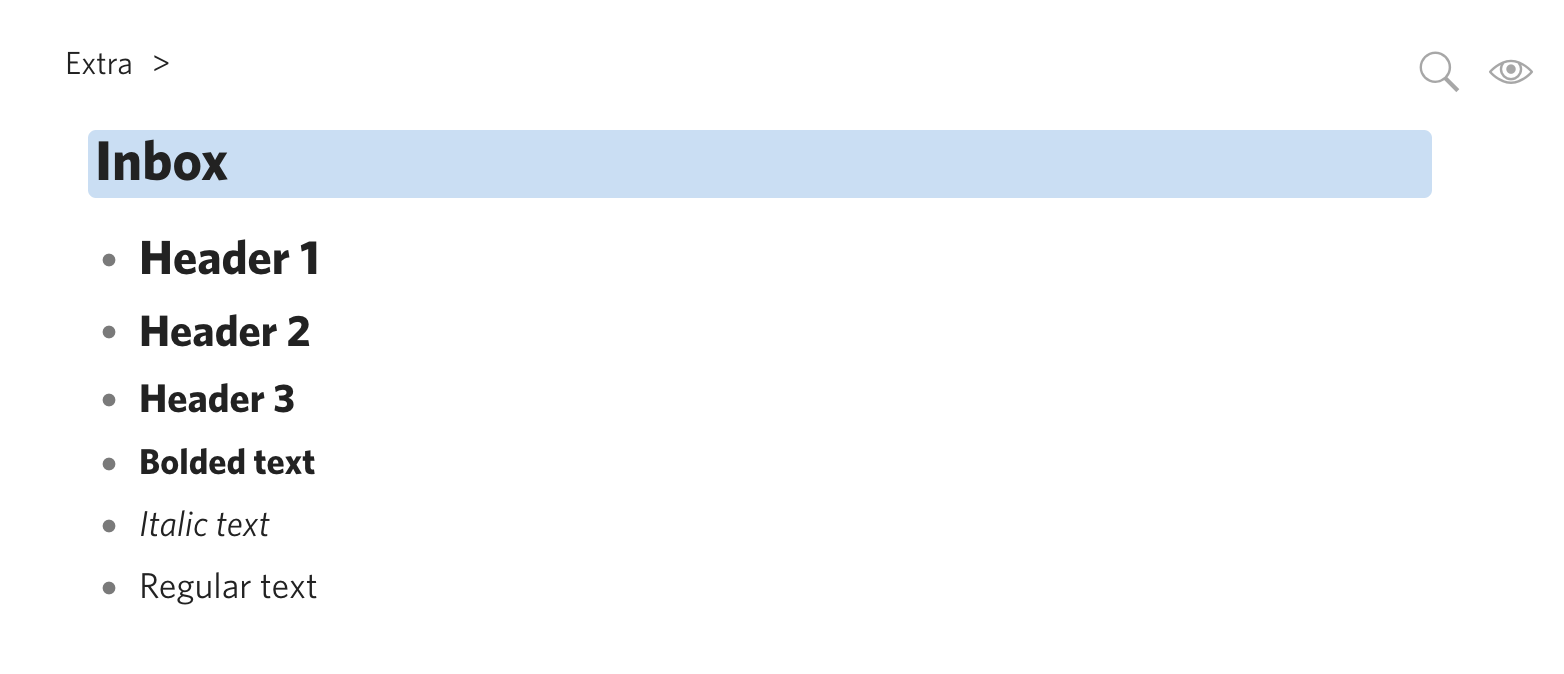
Look at a document, preferably one with multiple types of headers (header 1, header 2, header 3).
Expected result
Text renders normally, as it always has done in the past. Clearly distinguishable between different headers, and text looks “sharp”.
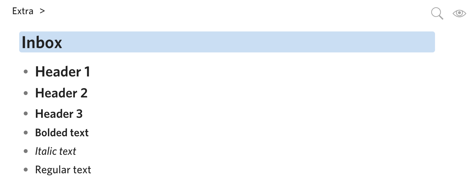
Actual result
Text looks “fuzzy”, and it all seems to have roughly the same weighting (hard to tell the difference between headers and regular text).
Issue only started today after the latest update. I had one tab up with the old version and one with the new one, and the difference was noticeable. I’ve tried going through all fonts in the settings and none of them look like the way it did before.
Since I had both versions opened, I inspected the CSS to see if there were any differences and I noticed that the Whitney fonts had been changed from OTF to WOFF.
We did make some changes to the default font - it’s slightly thicker. This change was made because our previous font set had some bad characters, but we didn’t find an otherwise identical set.
Definitely takes some getting used to, but I don’t see anything wrong from your screenshots.
I’m finding it extremely hard to get used to. I can’t seem to override it in my custom CSS, but if there’s a way to fix it that way then I’d be happy to just do that. Otherwise, if you could add a “Whitney Old” font (or set the new one as “Whitney Bold”) in the settings that would be great.
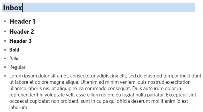
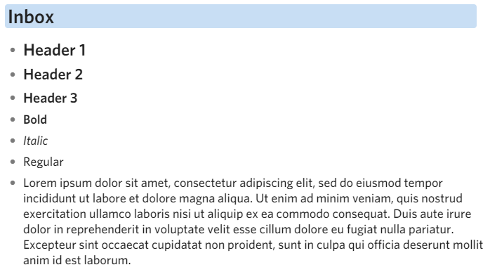
Also, it doesn’t come across in these screenshots because I took them on my Mac, but in Windows the new font looks much “fuzzier” than the old one which was crisp and sharp. Overall this is a big aesthetic regression from my point of view.
Here’s a comparison on Windows which might show it better, but sometimes it’s hard to see anti-aliasing effects in screenshots.
We’re thinking of adding Whitney Light option if you’re too used to the old font. Will also bump up the bold/heading width for the new font since they’ve became thinner unintentionally.
Aagh, this change landed with me today. Definitely, less attractive rendering on Windows. Also, threw out some of my page content. A “light” version or an additional font, similar to the original, would be appreciated. Have had to switch away in the meantime to Calibri.
Strange, I prefer the new rendering. In any event, font weight is a variable in CSS, so it should be possible to have the new font and correct this weight back to the old appearance.
Nice! Looks like ‘Whitney Light’ is now an option! FWIW, after using the new bolder Whitney for a day, I’ve got to say it really grows on you. There’s something about the spacing & character proportions that feels perfect (though this is on a Mac, not Windows machine so not apples to apples).
Whitney Light option is working great for me, thanks @Shida and @Erica for resolving this so quickly! I have to say that the default Whitney also looks a lot better now that the bold is heavier.