Wish the program kept the zoom context on the screen.
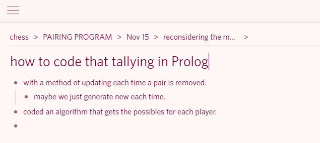
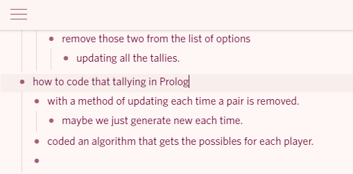
As long as your context is short, you can see both the title and the breadcrumbs to that title. Once it gets long, that information can be a long scroll away.
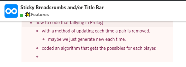
What would be nice is if it condensed itself when scrolling down as well. On the desktop there’s a huge white bar which would have room for this info, but on mobile that space is limited, so right below that bar makes more sense.
Or, imitate web browsers and have an address bar at the screen top (only crumbs instead of URLs). On mobile only, that address bar disappears when scrolling down, but reappears if you tap the screen top.