Steps to reproduce
Starting from scratch, what are the steps to make the bug happen? The fewer the steps, the better.
- Windows 10, desktop app
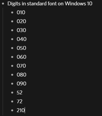
- Just start typing numbers, see attached screenshot under “Additional information”
Expected result
What do you expect to see after carrying out the steps above?
- I expect all digits to have the same height (if from the same font and size)
- I expect all digits to have the same width (if from the same font and size)
This last expectation is perhaps a matter of taste, the first one is not.
Actual result
Instead of the expected result, what happened?
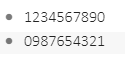
- The “5” and the “7” are smaller in height then the other digits, e.g. the “2”. This is really ugly. The “1” is also smaller in height, but less so.
- The “1” is much thinner than the others. That makes aligning numbers difficult.
Environment
Which operating system are you using?
Windows 10
Which browser are you using?
Desktop App
If you’re using a desktop or mobile app, what’s the version number of Dynalist?
1.3.5.
Are you using any third-party scripts for Dynalist, e.g. PowerPack?
No
Additional information
Anything else you think would help our investigation, like a screenshot or a log file? You can drag and drop screenshots to this box. For large amount of text, try putting them into something like Pastebin.
Additional comments
On Android the width issue is similar, but the height issue is much better, only “52” seems a little off, the 5 just a tad higher positioned than the 2. But that is a very small matter, not a real problem.
Also in this bugreporting system the font problem is there as in the Desktop App. But elsewhere in Chrome there is no issue.