Shrink down Markdown Imgur Images ![]() and IMAGE GALLERY

This adds onto the post I made here regarding adding handwritten notes, pictures, or just screencaps in general

Adding on

Basically, I’ve been using a TON of markdown embedded images with my application shareX and have found it extremely helpful for capturing information

One problem that I have is how big images are when you put them in markdown format ![](imgur.com) and this in turn kind of makes all my words on screen really hard to read

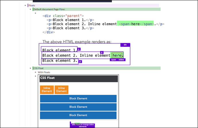
To highlight this issue, see this image on notes I am taking about CSS

I can only see a total of 6 dynalist bulletpoint notes, the images are far too big on my screen and dilutes the rest of my text

Rather, if I use some CSS on my stylish extension

.node-displayed-image {
    max-width: 20%;
}

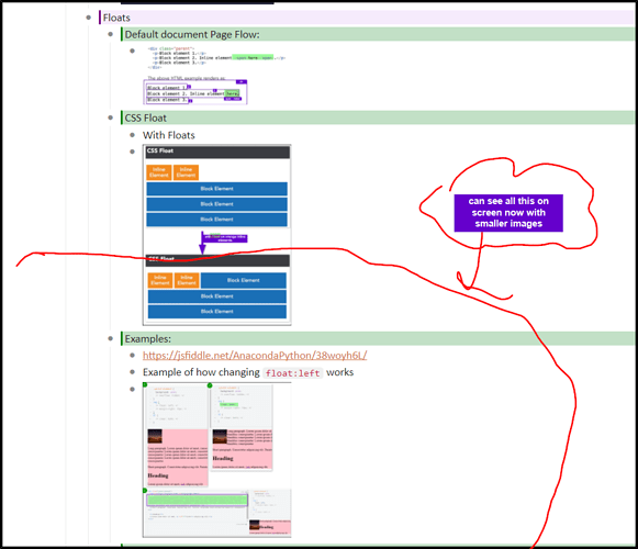
Screencapping the same real estate area:

I can see all my notes now

the thing is, I still can also expand each image extremely easy. using imagus chrome extension

All of my images are aligned in one vertical flow, so what I can do is this:

and just use my mouse to hover over and expand each image
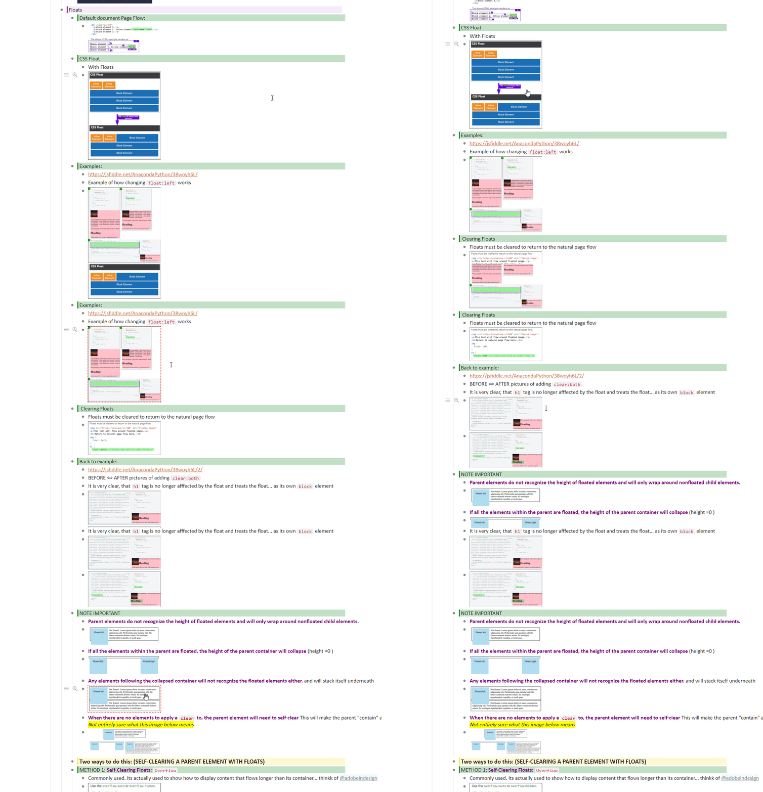
This behavior of viewing notes this way is similar to viewing attachments in airtable, viewing photos in googlephotos, wordpress photo galleries, etc

Its super helpful for viewing notes this way since if I can see a small thumbnail I know what those notes are generally anyways

So I no longer need to hover over some random imgur host link to find out what it is, I have a small image thumbnail and can determine if I think its worth the effort to hover over

This makes capturing things that rely alot on visual notes much easier (such as CSS class notes)

Also, if I combine this with my browser zoom I can do lots more things too (ctrl+) and (ctrl-)

At any point in time I can always modify it so all my images are bigger by deleting out that css

.node-displayed-image {
    max-width: 20%;
}

also since I’m using max-width property that means, if I got a small image, it will appear as it normally would, so I don’t even need to hover over image so I can see it as is.

for bigger images I just hover over to look at it

if you have any questions about my workflow feel free to ask them here :slight_smile:

1 Like

As a side note,

If the image with imagus is not working, I find that all I have to do is go from node-rendered to node-unrendered and everything works out fine

Example

1 Like

IMAGE GALLERY

When you use on stylish CSS

.node-displayed-image {
    max-width: 25%;
}

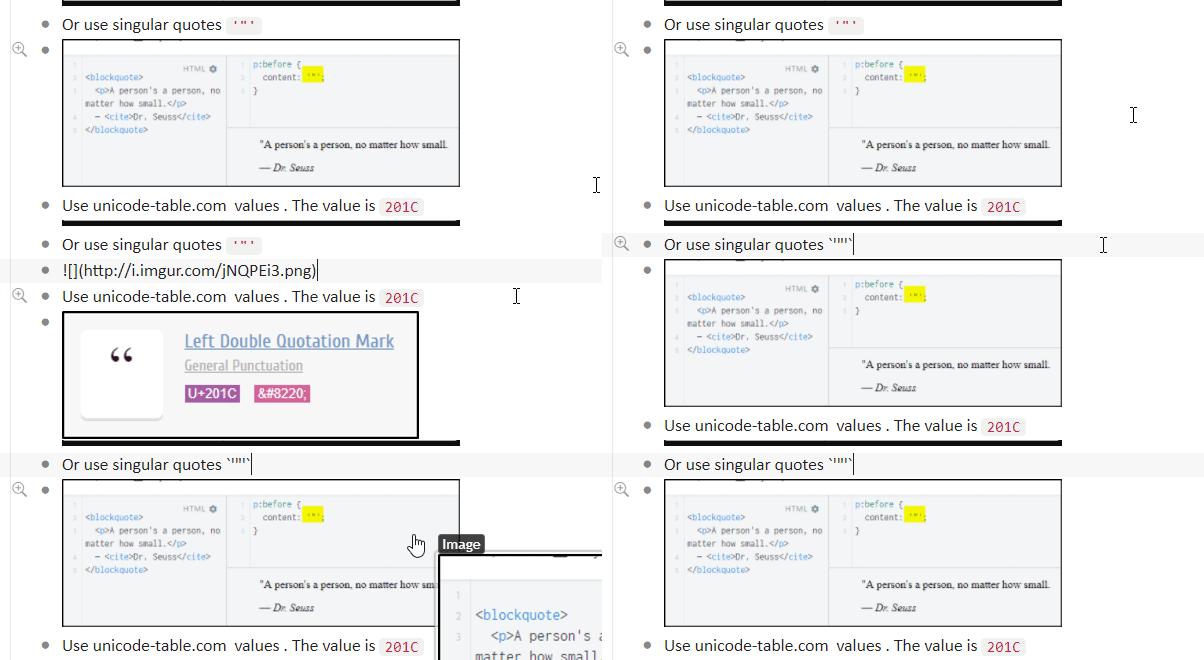
You can get image gallery that’s 3 pictures wide per node, in below example I put 9 images on on node on a 3x3 grid style gallery

Its also fully responsive (images shrink) since it uses the max-width property

If you set the value to to 20% instead, you can get a 4 image gallery on one bulletpoint node

at 10% you get 8 images, etc

Just write each markdown format image in one line

example (copy below to one bulletpoint node, and apply the CSS to your stylish above)

![](http://i.imgur.com/GDA2F6o.png) ![](http://i.imgur.com/qNOnro9.png) ![](http://i.imgur.com/QN23eo9.png) 

This gives you airtable-like features so its pretty handy

If you need to shrink the images down a bit to get a better context, the solution is pretty easy as well → just resize your window

Example

This way you can have multiple methods to view your data (Small thumbnails → hover over, big thumbnails with readable text) as the text size does not change when you do this

Useful for taking notes on slides and if you want to refresh it over quickly

Can be used like your own personal pinterest gallery / googleimages / googlephotos style layout.

you can also use these mini images like you would in anki too, makes it easier to retain information

If you want a full blown google photo like image gallery in dynalist, perhaps as design reference, just specify one document URL with that stylish CSS to have a value like 5%

Example of a 100 image gallery on a value of 5% fitting all on a 27" monitor

.node-displayed-image {
    max-width: 5%;
}

http://i.imgur.com/e4p2lXX.gif

Example uses for this → making your own meme library or giphy library, since you can easily right click any image link → share image link

down the road I’m going to write something for basic table support for taking notes on images (similar to how you take notes on a powerpoint presentation) using some css and js if needed

Dynalist is basically a mind-palace tool


!(8/1/2017 23:45)

EDIT

After about one week of using this workflow it has greatly made notetaking much more easier for me (with smaller images) and therefore breaking down information, retaining it, and refreshing it quickly too. I use the 25% value on the CSS snippet above

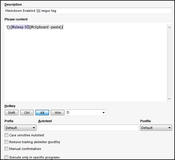
I use this phraseexpress shortcut a lot

which is ![]({#sleep 50}{#clipboard -paste})

My workflow is like this when capturing screenshots and adding it to dynalist using shareX https://getsharex.com

  1. ALT+A to screenshot
  2. Add a black border + quick annotations to image
  3. ALT+S
  4. Click in dynalist node
  5. ALT+D

This is very easy for me to do and only takes a few movements of my fingers

I also put gifs occassionally too and there also small enough to not be distracting so this is really helpful as well

My current methodology of learning is like this (using dynalist as a notetaking tool)

  1. Cramp 10-12 hours worth of learning material (2-3 courses) within about a month-2months
  2. Refresh video + refresh notes every so often
  3. Use search filters on notes (color:purple) so I can view notes in a different viewpoint
  4. When project is finished, go back and reference that only (code snippets) ,and references notes mostly by a rich keyword search text

Afterwards

  1. Find other authoritative sources → fill in missing gaps of information
  2. Apply learning through projects of my own / refresh notes

So far this has been very helpful for me

Current methodology for project-based work is just one document per project

2 Likes