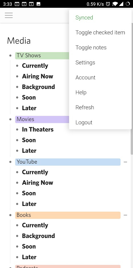
Is it possible to add custom CSS (or some other setting or “hack”) to get the sync status to show up on the top bar in the mobile app? Currently you have to click on the three dots and then look at the top item to see if it’s “Saved” or “Synced”, but I’d really like to be able to view this information without clicking into a menu.
Unfortunately the mobile app doesn’t sync once it goes out of focus or the screen is off, so I always need to check to make sure it’s “Synced” before closing it, so having this status front and center on the mobile app would be super useful.
I don’t have experience with CSS, and I’m not even sure it’s within the scope of what it can do, but if anyone knows of a way to use the custom CSS to add this functionality I would be extremely grateful!
Okay, so I think I figured out a way to do this in CSS, but it will require a little bit of help from the Dynalist team @Erica@Shida .
I want to set the color of the “three dots” (.MobileHeader-option--moreOptions) to red if it’s “Saved” and green if it’s “Synced”. The issue is that this element is not related in a way to the “Saved”/“Synced” elements that will allow it to be conditionally selected based on the status (e.g. display Red if “Synced” is status="display: none;", otherwise display Green).
The super simple solution (although will require a small change on the Dynalist side) is to add an invisible element as an ancestor to .MobileHeader-option--moreOptions that sets an attribute that describes whether we’re currently “Saved” or “Synced”. Then I can use the CSS descendant selector to conditionally set the “three dots” to either red or green using something like the following:
/* Make three dots red by default */
.MobileHeader-option--moreOptions {
 color: #d62c2c;
}

/* Make three dots green if saved */
.MobileHeader-option[sync-state='saved'] .MobileHeader-option--moreOptions {
 color: #31a036;
}
If there’s a simpler way to do this (ideally one that doesn’t require a change on the Dynalist side) I would be eager to know.
Thanks!
Just realized that CSS may only be evaluated on initial page load…which would mean this solution would not work as it would depend on the changing status. Would the CSS for the three dots be reevaluated if this element changed (or would it be possible to make that happen?).
For now I just changed the font colors for “Saved”/“Synced” to make it stand out more, but I would really like a “zero-clicks” solution for checking the status on mobile.
Here’s my current CSS:
/* Make Save Now status red */
.MobileHeader-moreOption--saveNow {
color: #d62c2c;
}
/* Make Saved status red */
.MobileHeader-moreOption--saved.is-disabled {
color: #d62c2c;
}
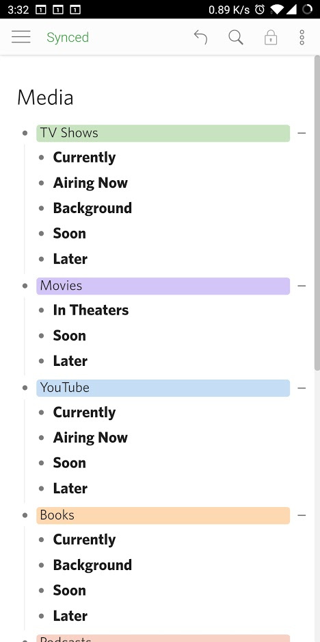
/* Make Synced status green */
.MobileHeader-moreOption--synced.is-disabled {
color: #31a036;
}
I added CSS to always make the moreOptions menu visible, but removed all of the moreOption elements within the list unless .is-moreOptionsOpen is present. Then I made it so that by default all of the sync elements were visible unless explicitly [style*="display: none"] was present, and set the moreOptions style to be left aligned so I didn’t block the existing icons and made the background invisible so that only the text showed up. Per my original CSS posted in this thread I made the text red when not synced, and green when synced so it stands out more.
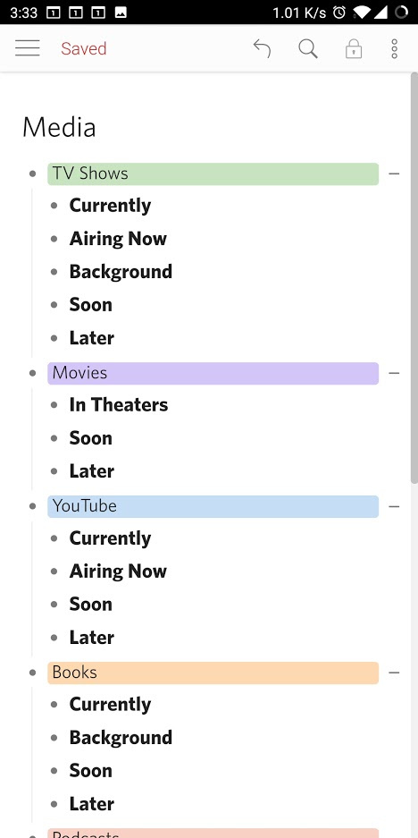
Here is what it looks like when it is in “Saved” state (not synced):