The screenshot looks kinda squished… could you tell me the operating system and screen size of your environment? Just want to make sure it’s not some bug of ours.
Thanks!
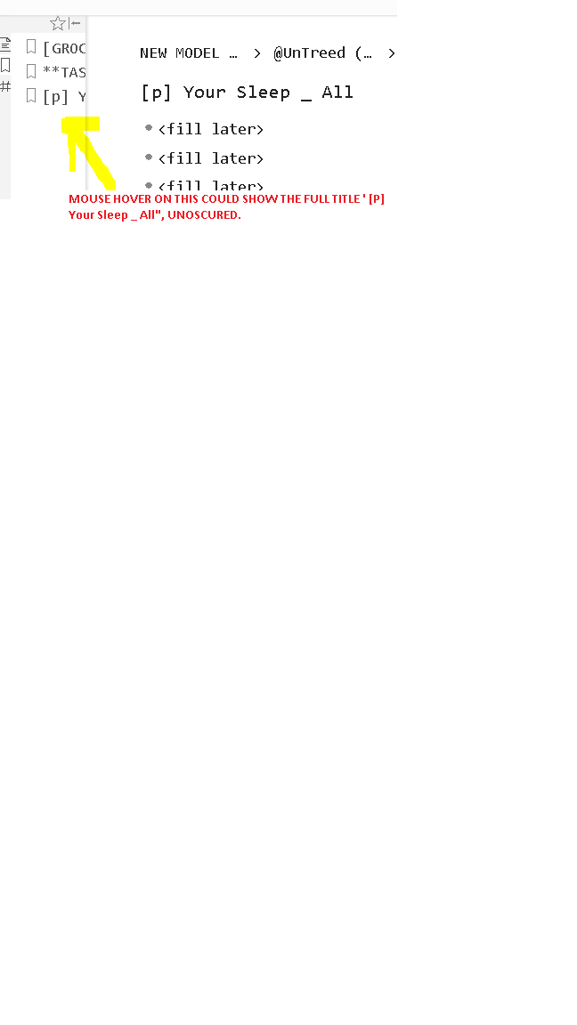
And yeah, being able to see the full title on hover would be useful.
I’m sure It’s my setup , and not a bug. I use a 24 inch monitor but i use it in portrait mode and zoom out below 100 percent. I also keep that part intentionally squished because it distracts me.
The only potential issue we have with tooltips is that when you can see all of it and the tooltip keeps popping up, it would be a little annoying. And the solution to that would be to either detect whether it’s shown completely (harder and more error-prone) or just delay the tooltip a bit so you need to hover for longer for the tooltip to show up.
I have listed some top-of-head Ideas to get around it. I am not a dev, so I have no idea which would take more effort to implement. Hopefully one of these is easy to.
Let me clarify why I am needing this. I(and I am guessing there are others like me) have this system where the first 2 or 3 words of each document is the same. eg. [p],All,Finances.
This is in addition to Tags which serve a different purpose in my setup.
So the bookmark pane looks is a list of entries ,all of which look the same because I can only see first few words!
But I also want to clarify that if it’s too hard to implement, I will figure out a workaround and post in the forums. It’s not that big of an issue.
Suggestions:
Option inside ‘settings’ that is turned off by default.
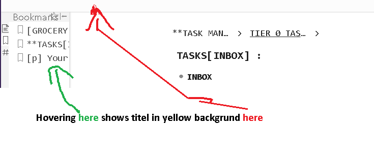
The tile shows up in (say)yellow background in some empty space instead of as a tooltip.
Let me know if I misunderstood, but the issue you mention would only happen if the user has not decided which bookmark to click on> has already moved the mouse pointer to bookmarks area and hovering there while he decides where to click> but can’t do so because there is a tooltip blocking visibility.
Yes?
In that case, how about Making the tooltip nice and (relatively)big and easy to see. And the area that it blocks is the same area the bookmark they are hovering on.
That way when it blocks something, it still shows what it’s blocking in the same font size as what is being blocked.
In other words, the tooltip doesn’t appear above the bookmark or below it. it appears ON the bookmark and has the same font size as the bookmark being blocked so people don’t have to squint. Perhaps even the same style and background color so it doesn’t even FEEL like anything is being blocked.
Thoughts about Delayed tooltip:
Imo it would make the experience less fluid and be micro-painful as people who need it, wait for it for to appear.
And when it does appear, it will still annoy people who don’t need it, by blocking their view. They would have to remember to move away quickly and will be pissed off whenever they forget!
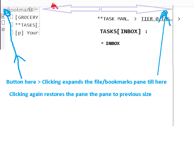
I guess that looks similar to ‘Collapse pane’ ptin already available. But I like to keep file pane open and squished so I can quickly switch to frequent locations at the top, so I can’t collapse.
But I can’t see the full title of infrequent items without unsquishing>choosing>then squishing again ever time I want to use file/bookmark pane for infrequent items.
The above idea could solve this without implementing tooltips on hover.
P.S: I feel like I am being too nitpicky, so I want to reiterate what a fantastic tool Dynalist is! This issue can be get around by reworking my system if I need to, so I just want to say Great job on an excellent tool, even if any of this can’t be done.
No, not blocking the mouse, more like having it show up gets your attention and that annoys some people. Just like the sync status keeps changing while you type is annoying. I don’t think tooltips will block clicking in any way.