Original:
Proposal (the same as two spaces before the title):
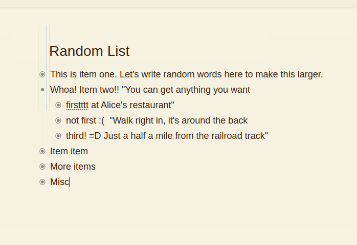
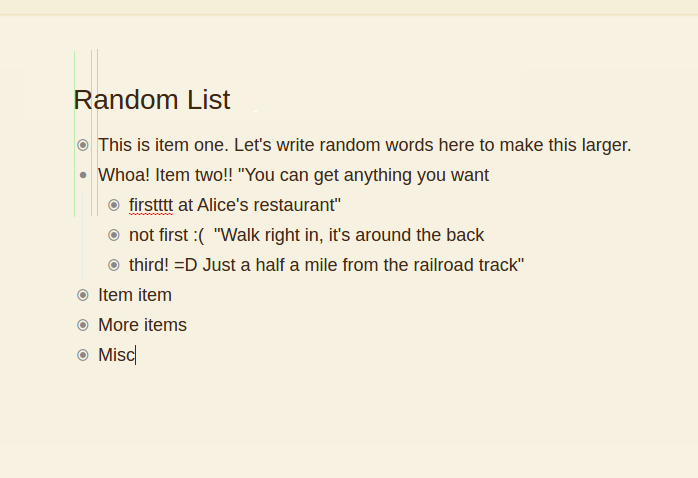
I thought you were going to align the title with item text rather than item bullet, but in the second screenshot it doesn’t look like it’s aligned with anything?
It’s kind of between the bullet and the text item.
Honestly it looks a little weird. Alignment means aligning two things right? Do you mean to make it align with the text instead of the bullet point?
The way I can describe what I was imagining, is that I wasn’t thinking about the bullets as a part of the item, but something aside. Then the title would be a lot to the left of the text.
But if you think the bullets as really part of the item “block”, then the title is already aligned to the items.
With this other way of looking at the design, I’m not sure if it is worth it to change it, but might be some insight on how users perceive the design.
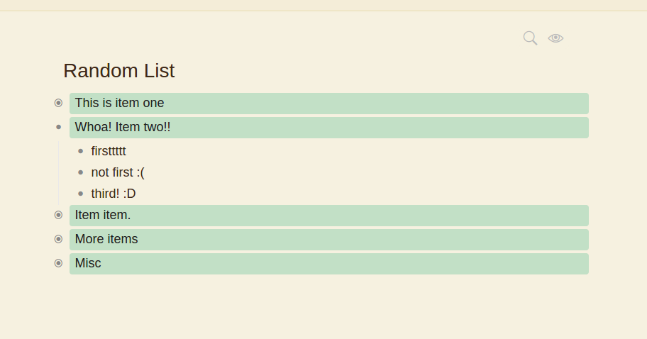
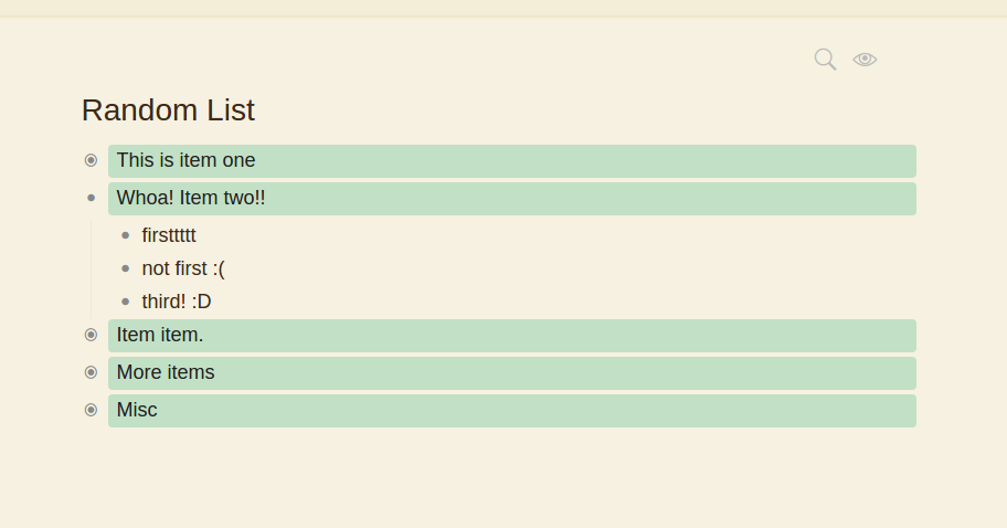
Also, when I saw the list without the green labels, it looked like the problem is even smaller.
Here’s some screenshots anyways:
The topic can be closed.
Ah, I get it now. Thanks so much for the detailed explanation and screenshots.