Pretty please. 
You’re asking how to make a dynalist icon on your desktop?
Open Applications folder, right click dynalist, create Alias, drag to desktop
To change the icon drag any picture into the Info page icon
@BigChungus Not quite.
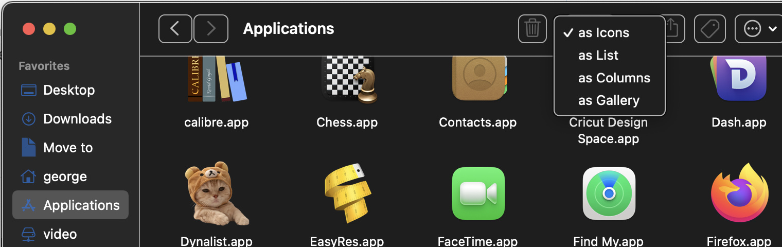
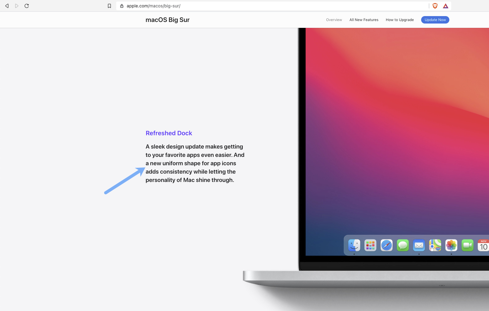
Apple unified desktop icons to be the same size in MacOS Big Sur.
Dynalist is currently larger than the new recommended size from Apple. And thus, sticks out like a sore thumb. ![]()
For example:
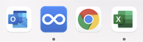
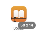
You’re showing microsoft outlook and excel, which match because they’re the same office suite, and google chrome has white space because it’s a circle. My big sur icon size is the same as they’ve always been on mac. See the Big Sur icon for Apple Books (the orange icon) is still similar to dynalists. And finder, and preview…
But you can customize them to whatever you like by copy and paste in Info
I’m pretty sure developers are just expected to embed a square image that fills edge to edge, and all of the scaling is the responsibility of the operating system. Like if you turn on dock scaling effects the icons become huge.
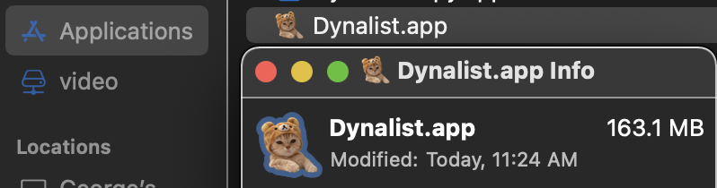
Using your Books example, they’re not the same size. Dynalist is 2 pixels wider, alas, not following the new unified size
Both icons are 512x512 png images that go edge-to-edge. Why whatever dock you’re using scaled them differently is another question. Is that the OSX dock?
Yep, the default macOS dock. I recently upgraded to Big Sur, and haven’t made any amends to it.

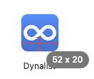
Dynalist 2 pixels wider there as well. As you’ll see, Discord is using the new icon size—and matches Books
Ah Apple did put some transparent pixels on the edges of their icons 
That is so bizarre. Is there an Apple support document on this, or is it just a random design choice that a few other apps are copying lately? Every other OS and earlier version of Mac embedded edge-to-edge images and scaled them later. It’s a really bad UIUX policy to embed a weird scaling in the icon image itself imo but here apple is…
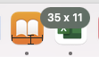
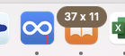
Feel free to measure them yourself if you like ![]()
So basically, Apple are trying to unify the design like they have on iOS, but developers have to implement the change themselves. So if developers decide not to bother updating their icons, they’ll remain larger than everything else lol.
It’s ok, Workflowy is much worse ![]()

Yeah there’s still plenty of popular mac apps that aren’t copying apples stock app shrunken icon style
I’d really like to know apples rationale for not being edge-to-edge on all their icons
You say unify but has Apple confirmed that anywhere? It would be trivial for them to scale all icons the same in Big Sur in their rendering engine but they specifically chose not to. Their goal might be to differentiate stock app icons from others, meaning their mission is to un-unify, who knows. I’d guess 99% of icons on computers in history are edge-to-edge square - so my mind cannot believe Apple wants to change that.
sure but they might just be talking about Apple apps that come with the computer
because why don’t all edge-to-edge icons get scaled to that shape automatically?
https://developer.apple.com/design/human-interface-guidelines/macos/overview/whats-new-in-macos/
All apps, not just Apple apps.
Oh I found a rationale, it actually makes a bit of sense now. They want room for overlaid tool pictures to stick out a bit for a 3d effect
You’re right after all - they are pushing a design guide App icons | Apple Developer Documentation
There’s even a website for impatient folks to crowdsource compliant icons and paste them to their computers themselves
Yep, it’s quite a struggle for those with OCD 