Glad to hear that it works for you. You don’t see the row of icons at the top right because they don’t exist in the mobile version.
Exactly, but this really isn’t a permanent solution for me. I don’t like Chrome.
I did a quick search and found the following link similar to your problem. Basically if you zoom too much Firefox will switch to mobile view.
1 Like
I did try zooming out (zoom out… zoom out some more… zoom out some more…) and that took care of the original problem. Unfortunately, the level of zooming makes the text reeeeeeeeeeeeeeaally small, like four point type. Very hard to read.
I compared that level of zooming to the “actual size” view of the browser screen. There are 3-4 levels of zooming out, between the view that lets me see it correctly as a browser version and the actual size.
Still not a solution 
I appreciate your efforts. Hoping someone else can chime in, because this problem makes it difficult for me to use Dynalist.
It just suddenly happened on its own. I didn’t do anything to change the view or the zooming of my browser.
Take a video of what you’re seeing. But first, delete everything in your Custom CSS to make sure that isn’t the issue.
Is this essentially what you’re seeing happen?
Thanks for chiming in!
I have no idea what Custom CSS means, but what you showed in the video isn’t anything like what I’m seeing.
What you showed in your video has both the left pane visible and the document pane showing the full document, just in narrower or wider form.
On my screen, if the left pane is visible, the document pane is obscured. The left pane covers up the left portion of the document panel.
As soon as I click the document panel to view the full document, the left pane with all its files and folders, disappears completely.
In that respect, as well as many others, my browser version of Dynalist is behaving exactly like the app.
If I want to expand or collapse a “parent” line with its “children” I have to use the plus or minus sign on the right side of the page, instead of the one on the left, usually visible on the browser version.
I do not see clickable three lines at the left edge of a line, giving me a menu to color code, unindent, export, etc.
The icons usually visible at the top right corner of the browser version (Synced, What’s New, Settings) are not displayed on my screen.
As far as i can see, the browser version of Dynalist is currently behaving exactly like the app, unless I zoom out so very far, the text is very small and hard to read.
I never had this problem until this past week, when it suddenly started happening. I’ve tried refreshing the screen, clearing my cache, even rebooting. Nothing changes the situation.
It would be really helpful if you could post a video. I used loom.com (free) for my video, or a smartphone works too. I’m just not able to visualize from words very accurately, as what you said could be intepreted a few different ways.
Press Ctrl/Cmd+Comma, then click the Pro tab, then scroll to the bottom. You’ll see a large text input box labeled Custom CSS. Make sure nothing is typed in there.
I think you’re seeing the 2 second preview loop. Click play to see the longer video.
I watched the longer video. This is nothing like what’s happening for me. In your video, both panes (left panel with files and the document pane) remain fully visible unless the browser window has been reduced to make it very narrow. In my situation, no matter how wide the browser window is, one pane always HIDES the other, depending on what I click.
Here’s a video of my screen. https://vimeo.com/572586989
If I click the left pane to see files, that hides the document pane.
If I click the document pane, that hides the left pane.
Icons usually visible on the browser version, but not in the app, are not visible in the browser version.
If I want to open up a collapsed item, I need to use a plus or minus at the right side --that’s what is supposed to happen in the app, but not in the browser version.
The left side of the document lines no longer offers a clickable menu to color code, unindent, export, etc. Again, that’s what we get in the app. But it’s not supposed to happen in the browser version.
Essentially, instead of a browser version of Dynalist I now have the mobile app on my computer. I’ve already tried clearing the cache and rebooting. This now happens all the time, unless I zoom out the screen so much, the text becomes VERY small and hard to read.
I hope you can understand what I’m saying now that you’ve got a video.
BTW, I did check the Custom CSS box and there’s nothing typed there.
Ok, yeah, you’re stuck in mobile view when you use Firefox. That’s weird.
What about when you open a New Private Window in firefox, and then log into dynalist? This would test if an extension is causing the issue.
The code that triggers mobile view is (min-width: 510px) and (orientation: portrait), screen and (min-height: 510px) and (orientation: landscape) so I not sure why firefox is interpreting that condition as true when chrome doesn’t.
Yes. Still happens in a private window, if I view the window in “actual size”. In order to have it display correctly, I have to zoom out, which make the text much smaller.
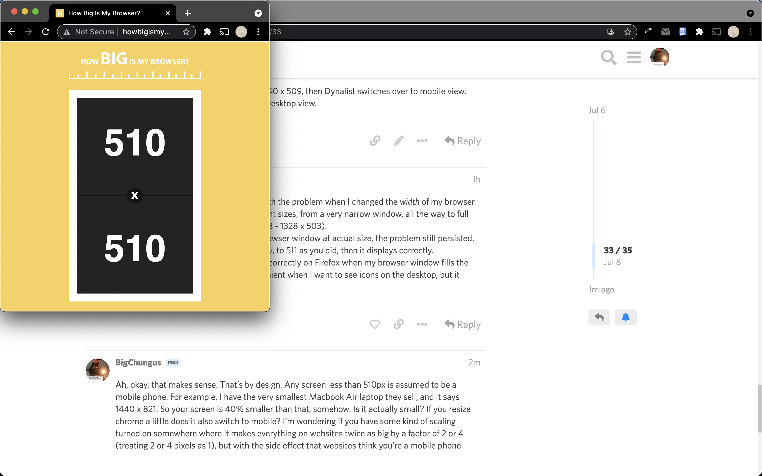
What dimensions does this tell you? http://howbigismybrowser.com/
On my computer, when the browser is 1440 x 509, then Dynalist switches over to mobile view. But when 1440 x 511, it switches back to desktop view.
Interesting question. Nothing changed with the problem when I changed the width of my browser window. I tried this at a number of different sizes, from a very narrow window, all the way to full width of my very wide monitor (454 x 503 - 1328 x 503).
In all of those cases, when viewing the browser window at actual size, the problem still persisted.
But when I expanded the window vertically, to 511 as you did, then it displays correctly.
So it looks like Dynalist will only function correctly on Firefox when my browser window fills the full height of my monitor. Not very convenient when I want to see icons on the desktop, but it works.
Ah, okay, that makes sense. That’s by design. Any screen less than 510px is assumed to be a mobile phone. For example, I have the very smallest Macbook Air laptop they sell, and it says 1440 x 821. So your screen is 40% smaller than that, somehow. Is it actually small? If you resize chrome a little does it also switch to mobile? I’m wondering if you have some kind of scaling turned on somewhere where it makes everything on websites twice as big by a factor of 2 or 4 (treating 2 or 4 pixels as 1), but with the side effect that websites think you’re a mobile phone.
On my small macbook, a window must be this big or smaller to trigger mobile layout.
I think this is the standard way websites make their layout mobile-friendly so a lot of websites work the same way Responsive Web Design Media Queries
That explains it. Thanks so much for sleuthing this out with me!
1 Like
Hello again. Resizing the window has been helping with this problem in the last few years (thanks!). But now, that isn’t helping any more and the problem is back.
A couple of days ago, I noticed that the desktop, web version of Dynalist started spontaneously reverting to the mobile view, all on it own. I hadn’t changed the size of the window to make that happen. And now…it’s stuck that way all the time.
I’ve tried reducing both height and width to a tiny square, then stretching it to the full size of my monitor screen. Nothing brings it back to the web version view.
As I said three years ago, this creates several problems, including the one in the title of this post: the left pane disappearing. Also, it puts plus and minus signs at the right edge, instead of the left, making it harder to see what they refer to. There’s nothing to click at the beginning of the lines to color code the document text. All of the browser-specific features are gone.
Hoping someone can help me fix it again this time. Resizing the window no longer works.
I’ve tried rebooting the computer, didn’t help.
FYI, I’m on Firefox.
This is weird. The first I would try removing all custom CSS and see if this still happens.
Second, I would try to maximize the window, open the debugger, and see what can be figured. One deal in the debugger is at the top left there’s an icon where you can play with different forced device configurations. I honestly have no idea what the solution might be but I would investigate here for clues.
(Just to be sure, you haven’t accidentally switched your address to m.dynalist.io?)
Every one of your suggestions is completely beyond my expertise.
Fortunately, I found a solution (by accident) since I posted this most recent comment.
If I resize the window vertically to the maximum height of my monitor, while keeping the width of it still narrow, then it reverts to the correct format.