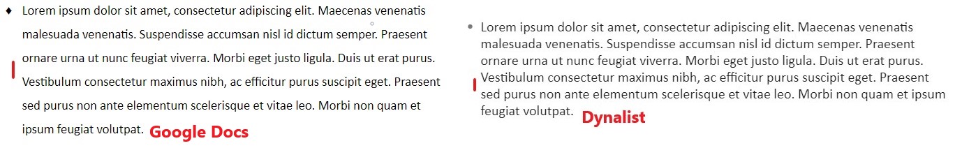
I’m currently using Calibri at Large size, which is acceptable for easy reading, but I think it’d help me with readability if there was more space between the lines in a paragraph.
Please check the attached screenshot. I’ve added a paragraph from Google Docs for comparison.
Is there a way to make Dynalist’s paragraphs look like that of Google Docs?
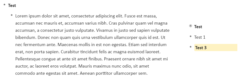
Hi Craig, I tried the custom CSS and it’s perfect for line spacing. However, the starting line does not align to the centre of the bullet, and instead appears below the bullet by a few pixels.
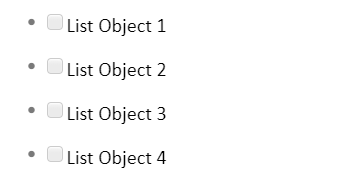
Please check the screenshots. The incorrect alignment is most noticeable on the second screenshot, with the list items and checkboxes. My knowledge of CSS is limited, so I wasn’t able to fix this issue. I understand that it may be difficult to solve, in which case, I can live with the code as it is.
Thanks Piotr. -4px works well on the web and the desktop app. However, -1.8px works well on mobile.
I’ll most likely keep the value at -4px, since I use Dynalist on my PC, but if I use it on my phone, I can change the value to -1.8px and then change back once I’m on the PC.
Can I use decimal values? Or should I round it off to 2px?