Here’s my pastebin CSS file
Files are messy since I never clean it up, but it works as intended
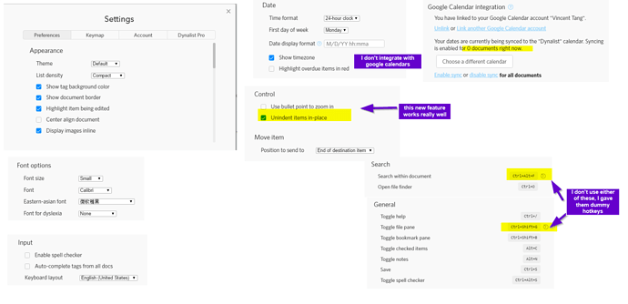
These are my options in settings I leave on:
Quick summary of what the color schema selection was:
font-type faces and general settings
Default theme. There’s been many studies on what theme schemas are best (Dark, light,Sepia, etc). Sepia tends to fail in conjunction with flux and specific color calibrated monitors and during daytime user. Dark is very bad for your eyes in a lit-room settings, which your room should be lit anyways so go buy more office lights. Default works best. Christmas is the most awful theme of the lot, its too contrasting and I’m not even sure if this theme was made as a holiday joke either.
I use calibri font for all my normal notes for high readability on the most compact list setting. Generally speaking calibri is a superior sans-serif font and agreed upon in the design community as such
I disabled spellchecker because I almost always know when I mistype something but intentionally choose to ignore it for writing speed and efficiency
I use comic-sans as my 2ndary font for headers -H2 H3, since its hilariously easy to see (its a joke that comic sans is SO unprofessional looking that its shunned in resume writing) while at the same time not too distracting, therefore, a good 2ndary font. Also, its supported by every browser and windows OS since its a legacy font, so I never have to worry about cross-device / cross-app functionality.
H1 tags are reserved for outlining extremely complex documents (100+ subheaders / headers long). I use it primarily to heavily densed PDFs (like ecommerce user manuals) , code libraries, etc. Its a wildcard RESERVED cache header*
I push bulletpoints back at its current location. The reason for this is because you can do anything the standard default workflowy / dynalist SHIFT+TAB does, but much more with this. It also intuitively makes more sense if your used to wordprocessors like MSword
Time stamps are only for applying easy to read time stamps. Not for managing TODO later lists, etc. I run a macro , “e#” to generate current time within 5 minutes for easy readability !(5/5/2017 10:55)
Color selection pallette
I choose neutral colors and neutral fonts (brown, grey, black, green, blue, purple and yellow)
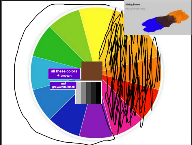
This is my color selection Matrix:
I only chose half of the color wheel since it was more than enough colors for me to work with
Certain colors elicit certain emotions, this is well studied in color psychology, art, and webdesign
Brown is selected as well since its a very neutral color, and it is created by mixing 2 complimentary colors together (Orange and blue, Green and red). I use it for my H3 tags
I picked mostly Analogical colors, colors that work together in sequence
By default, Yellow is what I associate with “highlights” so I picked that naturally
Green and blue tend to be the most neutral colors and elicit “trust” so its less distracting on your eye overall in the grand scheme of things.
Blue. I just use the default theme’s tag background blue and a darker blue font for “#” tag names. I leave @ tag names on the regular default
Green. I use “g#” macro to apply the CTRL+SHIFT+4 color, and this is the only primary color I use. I use it to delimit large textx of information in my daily log
I chose “grey” as my imgur links because its too long of a URL and distracts from my work, so all I see is a grey light blob and I highlight my mouse over with imagus. IT requires less mainteance than using the markdown syntax for text links, , and makes it easy to both (1) READ (2) ENTER DATA at the same time, in a WYISWYG format, allowing me to enter data faster without any reservations
Purple is used for BOLD FONTS, because, a regular bold black font doesn’t stand up too well with my headers, or all my other conventions
Red is too distracting and is designed / geared toward “open loop” productivity -type setups, whereas mine is more “closed loop” , as in my dynalist has 0 maintenance associated with it. Once a month I’ll use red as a RESERVED color to highlight something of super high importance, otherwise I don’t.
Orange and pink were omitted because too many colors is too distracting
I also color certain URLs with different colors. Some reason on my CSS file it isn’t 100% working as intended here though, but I try and keep youtube links + github links + imgur links different from everything else, since there so distinctively different in terms of what they do for me compared to blogposts, etc
3rd Party plugins for maximizing Real Estate
I run FLUX to monitor during what time of day, whether I use warm / less warm colors for minimal eye fatigue, on a dual monitor setup, since I find I don’t need 3 or 4 monitors anyways, so long as I am very good at macro’ing everything
IMAGUS, for previewing my image links. I don’t use dynalist’s PRO built in file attacher, because I can’t manage the backend image links. HOWEVER, I do use it for PDF files many times which is extremely helpful, but I have file redundancies on all those assets in dropbox though
There’s nothing else I really use besides STYLISH, which is kind of obvious. I don’t run any Tamper Monkey scripts currently, haven’t found a need for it at the moment
I use rawbytez clip to dynalist plugin too mentioned on forums
Other than that, nothing else really
Macros with phrase express / General Dynalist things
I use only one document. Other doucments are purely just duplicated copies where I apply CTRL+SHIFT+1 red colors to everything so I know there duplicated. This is how I maintain version control for my note workflow revisions, even though I have dropbox + google integrations daily using dynalist Pro.
I run a lot of unicode + macros here with phraseexpress . Dating functions, etc etc
I’ll have to clean it up later for me to upload it (.pxb file), its really messy looking and only makes sense to me at the moment
this is the most current macro I wrote up ![]()

