I think the current “infinity” log is too close to that of Coursera’s, maybe you want to think about redesigning it?
We tried but it’s not an easy job. What Dynalist does is very abstract, so it’s hard to design a logo around a physical object, like Dropbox does. That would be the preferably but it’s hard; let us know if you have any ideas!
Otherwise it would be just a generic “D” on a blue background (our color), which one could argue is pretty similar to services like Disqus as well.
When there are so many services and apps and brands it’s actually challenging to design a unique logo ![]()
2 Likes
I see what you mean. Something like this is nice too but hey, that looks like any list.
Like @Erica says – hard to be 100% unique in this area!
1 Like
OS: @Erica – think Google Drive, OneDrive, Google Photos; it’s better to have a brand(ed) icon than an icon that relies on a physical thing.
As @ruud said, it’s about your @Erica brand. I tried Evernote, OneNote, Google Keep, Microsoft OneNote, workflowy, and liked dynalist best and I am migrating my Endnote content over to dynalist.
How about something like one of the following. Change the human image to a letter D, and reverse the direction and makes it looks dynamic. 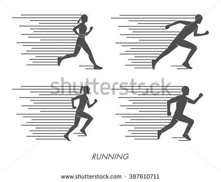
Or the NASCAR logo.
I think that regardless of what the best way to change the logo is, if at all, focusing on the product features remains as priority. I say this only because it wouldn’t be worth holding your breath for at the moment (not that anyone’s being impatient and that I hate everyone’s ideas, but I just wanted to throw that out there).
I understand that Coursera and Dynalist are probably used together, and can lead to some confusion with multiple tabs open and that a few people have mentioned how the logo looks similar to XYZ’s app/site’s logo.
And as a final note, since I’m only a forum mode, it’s important to disclose that I don’t speak on behalf of Erica or Shida.
1 Like
When I think of the word Dynalist, I think dynamite and sometimes dinosaur. Both are popular internet icons with various connotations in a marketing sense.
A great example of a logo is the Notebooks app.
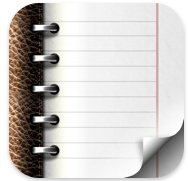
Maybe Dynalist could incorporate a notebook but have elements of fire or electricity or energy in the background as to distinguish the dynamic powers of the product? ![]()
![]()
![]()
![]()
1 Like
That’s an interesting idea. We’ll keep that on the back burner ![]() and see if we wake up with any good ideas some day
and see if we wake up with any good ideas some day ![]()
1 Like

I tried.
2 Likes
Yep this is the first thing I noticed. The only difference is there is no gradient in the blue and the white is flattened.
1 Like
Sorry about that! I wasn’t looking at the them side-by-side when coming up with it. And you know logos are not as easy to change as code.
Hopefully we can come up with a better logo soon…
This guy’s logos are the best: https://dribbble.com/george-bokhua
I bet he could beautifully combine a ‘D’ and an infinity symbol into a killer Dynalist logo!
1 Like
Hey, thanks for the pointer! Taking a look ![]()
But why is it white iInfinity sign on blue background and not vice versa?
Also, check this out, please. It’s very famous local russian design studio, that publishes some parts of work processes for every project they make.

