A picture worth a thousand words!
As you can see, the gray background is slightly lower than it should be. Indeed the positioning is slightly off

A picture worth a thousand words!
As you can see, the gray background is slightly lower than it should be. Indeed the positioning is slightly off
Could you please follow the bug template or at least give us some information on what platform you’re using?
This bug might also be dependent on your preferences. Have you changed settings like font size and list density?
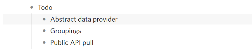
I’m asking because I can’t seem to repro on latest version of web app on Chrome, with default font size and list density settings:
Let me know, thanks!
Hi Erica, sorry for that, I (wrongly) assumed that it will be easy to reproduce!
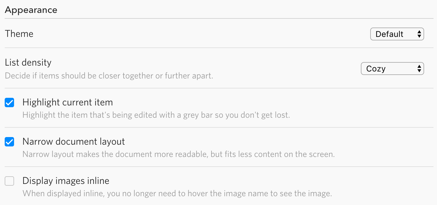
That screen was done in Chrome on MacOS Sierra, here are my “appearance” settings (I suppose they are the default ones):
The problem is also present in MacOS downloadable app and on ios, here is a couple of ios screenshots (latest ios, latest app, iphone 8+):
Hmm, it might only happen on macOS then, I’ll test that out.
@Dmitry3: could you please confirm whether this is fixed in the latest version (v1.1.2)? Thanks in advance!
I checked on both osx and iphone and it seems to be fixed now. Thanks a ton! Care to say what was the culprit? I’ve spent a few minutes in an inspector trying to understand what’s going on, but failed.
I had no idea, but it seems to only happen on browsers that’s based on Safari (that includes the mobile and desktop apps).
My guess is that it has something to do with element positioning. Somehow the same positioning code would place it ~3 px away from what’s rendered on other platforms.
The root cause might be too low-level for the purpose of fixing this bug. I did some quick searches based on keywords like “Safari positioning off” and didn’t find anything, so I just add a 3 px rule specifically for macOS and iOS devices. Not an ideal fix but it works until we know someday (or Apple changes Safari someday)…