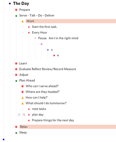
Readily Identify Any Collapsed Level while also Allowing Custome Bullet-Icons

I wanted to be able to

  1. Readily/Better identify any level that has children that is-collapsed, while also
  2. Customizing any Level ‘Bullet-icon’ (using text characters).

I found @Vincent_Tang 's post “CSS Fixes Part 2 - Onenote/Evernote Style bulleting” which helped me get started.
@Kevin_Murray pointed out an interesting problem that I solved using a work-around. I’m interested if anyone has more insight/pointers.

At that post I describe the css-code challenges and limitations in trying to achieve my desired result, so I wont labor that further here. I am sharing the code here for anyone possibly interested.

What it does (2 things):
1) Method for customizing the bullet-icon-character and color of any level’s bullet.

Note1: The Last level “custom bullet-icon” you assign in the CSS will be assigned to all following levels. I only went to 9 levels.

Note2: There are various ways of achieving assigning custom bullet-icons to levels (either explicitly or relative to the current view). I investigated only two methods, and each had its limitations and issues (detailed at the other post cited above). There is very likely a way-better approach …I didn’t spend time hunting here on methods; this was a crude bootstrap effort ;^) I am very interested if you have some other methods to point out for trying.

2) Make any “Has Children and Is-Collapsed” Level display the “Circled-Bullet Icon” in Red (of course, you can make it whatever you want) …AND… including Red on-Hover Plus-Minus Icons display.

Note: The solution will cascade indefinitely ;^)

CODE

/* ===== Override default bullets for levels 2 - 9 ===== */
.Node.is-currentRoot .Node .Node .Node .Node .Node .Node .Node .Node .Node .Node-bullet:before {
    content: "\2622";  /* level9 -radiation warning */
    color:crimson;
}
.Node.is-currentRoot .Node .Node .Node .Node .Node .Node .Node .Node .Node-bullet:before {
    content: "\2620";  /* level8 -jolly roger */
    color:slatebllue;
}
.Node.is-currentRoot .Node .Node .Node .Node .Node .Node .Node .Node-bullet:before {
    content: "♣";  /* club */
    color:violet;
}
.Node.is-currentRoot .Node .Node .Node .Node .Node .Node .Node-bullet:before {
    content: "¤";  /* level6- ~sun */
    color:purple;
}
.Node.is-currentRoot .Node .Node .Node .Node .Node .Node-bullet:before {
    content: "♦";  /* level5- small diamond */ 
    color:goldenrod;
}
.Node.is-currentRoot .Node .Node .Node .Node .Node-bullet:before {
    content: "★";  /* level4- star */
    color:orange;
}
.Node.is-currentRoot .Node .Node .Node .Node-bullet:before {
    content: "■";  /* level3- small square */
    color:forestgreen;
}
.Node.is-currentRoot .Node .Node .Node-bullet:before {
    content: "◆";  /* level2- diamond */
    color:darkblue;
}
.Node.is-currentRoot .Node .Node-bullet:before {
    content: "■";  /* level1- big square  */
    color:blue;
}

/* ======= expand~collapse +hover bullets ======== */
/* Static Bullet Indicating 'more' */
.Node.is-currentRoot .Node .Node-children>.Node-outer>.Node .Node .Node .Node-self.is-parent.is-collapsed>.Node-bullet:before,
.Node.is-currentRoot .Node-children>.Node-outer>.Node .Node .Node .Node-self.is-parent.is-collapsed>.Node-bullet:before,
.Node.is-currentRoot .Node-children>.Node-outer>.Node .Node .Node-self.is-parent.is-collapsed>.Node-bullet:before,
.Node.is-currentRoot .Node-children>.Node-outer>.Node .Node-self.is-parent.is-collapsed>.Node-bullet:before {
    content: "◉";
    color:red;
}
/* hover minus for collapse indicator */
.Node.is-currentRoot .Node .Node-children>.Node-outer>.Node .Node .Node .Node-self.is-parent.is-hovering>.Node-bullet:before,
.Node.is-currentRoot .Node-children>.Node-outer>.Node .Node .Node-self.is-parent.is-hovering>.Node-bullet:before,
.Node.is-currentRoot .Node-children>.Node-outer>.Node .Node-self.is-parent.is-hovering>.Node-bullet:before {
    content: "\e93a"; /* hover-minus */
    color:red;
}
/* hover plus for expand indicator */
.Node.is-currentRoot .Node .Node-children>.Node-outer>.Node .Node .Node .Node-self.is-parent.is-collapsed.is-hovering>.Node-bullet:before,
.Node.is-currentRoot .Node-children>.Node-outer>.Node .Node .Node-self.is-parent.is-collapsed.is-hovering>.Node-bullet:before,
.Node.is-currentRoot .Node-children>.Node-outer>.Node .Node-self.is-parent.is-collapsed.is-hovering>.Node-bullet:before {
    content: "\e928";  /* hover-plus */
    color:red;
}
2 Likes

Cool! I would like different colors / icons for 6 and 8. Easily editable.

I must repeat: This is the BEST improvement for dynaList in a LONG time (excepting mobile enhancements which resolved longstanding pain points for editing on my phone). It adds so much joy to an outline:

P.S. colors are ▲ orange, :diamonds: red, :heart: pink, :clubs: violet, :spades: slateblue, ★ crimson.

1 Like

Right on @Alan. I’m so glad its found some interest and love. I really needed this at-a-glance assist -super helpful for me ;^)