
Is it possible to have an overview pane just like the one in Moo.Do ? I find it convenient to see the overall big picture and categorize the items.
I think what you have in mind is the Dashboard feature that many have been calling for. I imagine this a filtered view of the database according to customisable criteria, such as until:today. Ideally, this flat list could be manually sortable, transforming it into a workable to do list.
@Kevin_Murray, I think @Chris means something else. You’d understand immediately if you’ve used Moo.do before.
@Chris: there’s a feature request for this on the roadmap and you can vote for it there: https://trello.com/c/Bwzfc0Bj/103-overview-panel
@Erica Is there any progress on this? Navigating through long documents with multiple headings and sub-headings is rather cumbersome right now. A table of contents pane would make it so much easier. [Something like Moo.do or Dropbox Paper or Slite]
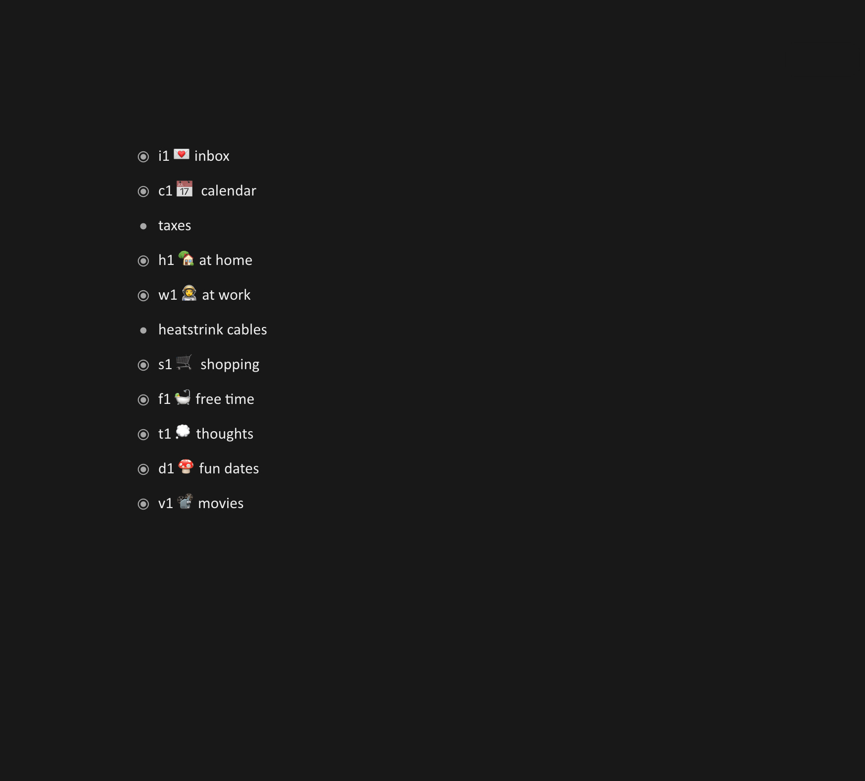
Can someone show me this? I am curious. I looked thru all the moo do screenshots on google images but I don’t see it.
Sorry to say this, but this will most likely be a plugin (not everyone needs it), and that would have the dependency of our plugin system. There’s still a long way to go…
1 Like
Thanks for the response. I guess I’ll have to find a workaround since I have some fairly long documents. I could try splitting them into separate documents so I can quickly access them from the document panel.
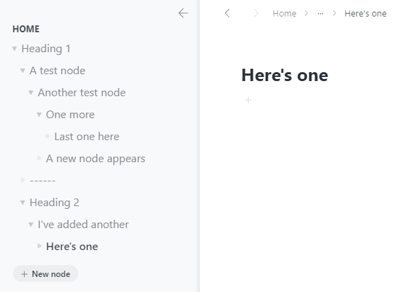
It’s actually a table of contents panel. Regardless of which node you’re zoomed in, the TOC panel always shows all the high-level nodes and subnodes in a doc. It also stays locked on the left of the doc, making it really easy and quick to navigate.
Take a look at these screenshots -
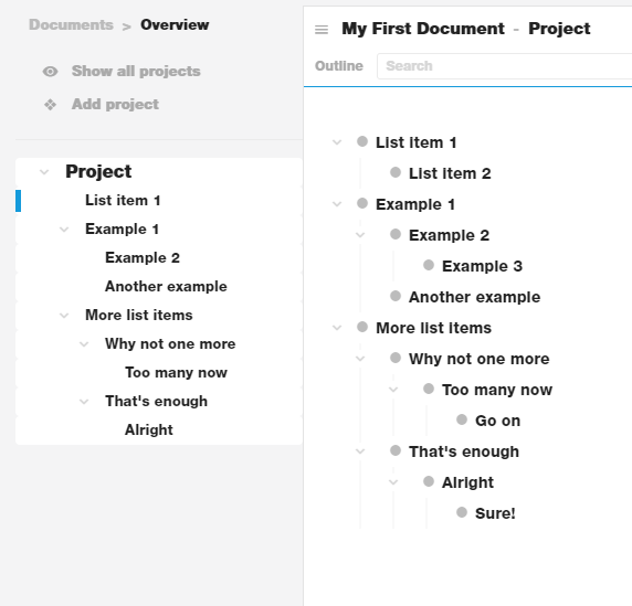
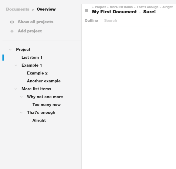
In this second screenshot, you can see that I’ve zoomed in to the node ‘Sure’. However, there’s a TOC on the left, using which I can quickly navigate to other parts of the doc. In Dynalist I have to keep zooming out until I reach the document level I want. Even to zoom in, it takes a lot of clicks (or a lot of ctrl + ] presses).
There’s actually a feature request for this on Trello - https://trello.com/c/Bwzfc0Bj, which is why I wanted to know if there was any progress on it.
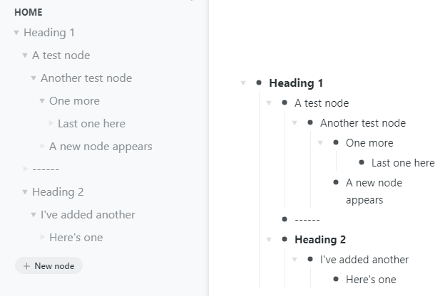
Seems Workflowy also has this. Tested on the desktop app -
1 Like
Looks like it’s the “left bar” experimental feature. Weird that I’ve never heard about it much. Is it recent?
I like the Moo.do implementation a little more. It seems that it expands all by default, which is what you want in most cases. In WF you still need to expand the sublevels by hand, which requires lots of clicking to set things up in a deeply nested document.
Yeah I think Workflowy added this recently.
And I agree, moo.do’s pane is much better, and makes it really easy to navigate long documents with many levels of nesting. But I dislike their UI, especially the fonts - not easy to read at all.
I love Dynalist and it’s my only note taking app. For long-form writing, I use Typora, and previously used Google docs, both of which autogenerate a TOC. I guess this is why I feel it’s absence.
I understand it’s not a much requested feature, so for now, I’ve created multiple documents and nested them inside folders. Not the best solution, but it’ll do.
1 Like
Thank you for the input!
After trying both implementations a little more, I found another reason I prefer Moo.do’s: it scrolls to the specified item rather than zooms into it, which is what I expect a TOC to do (a TOC on the web, at least, like the ones on Wikipedia). This might be subjective though.
Yes I agree, it’s immediately noticeable on Moo.do. I did not even notice the zoom in Workflowy.
One thing I noticed is - Moo.do’s TOC only displays nodes with children, while Workflowy’s TOC displays all nodes. I still prefer Moo.do’s, since it’s closer to G.Docs and Typora. I can see Workflowy’s TOC becoming cluttered.
1 Like