@fred its the same way with the other theme 
Although I usually use default theme, and occassionally a dark theme on specific Dynalist documents only. I don’t know if you change settings a lot from default to dark, but I hardly ever do this. I like some documents to be dark theme only, everything else as light default theme
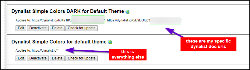
This is what my stylish setup looks like
Everything above is specific to my workflow, but if you want to play around with the settings erica and pottster mentioned above, here’s how I’d do it (see below)
what code does
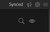
note these are all gifs
First,
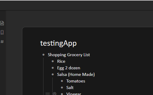
This is what adding this snippet of css code does (Look at topleft of image)
.AppContainer {
    background: #222222 !important;
}

Adding Pottsters code here
.DocumentTools-overlay {
background: #242424;
box-shadow: 0 0 3px 3px #242424;
}
Adding this code
.is-desktop .AppContainer.is-borderShowing .Document {
border-color: #444;
background-color: #242424;
background-image: none;
}
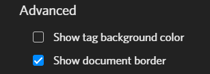
this is only if you had “show document border” on
Adding code
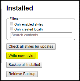
If you want to add the code, all you have to do is write a new style in stylish
say you want to add all of pottsters code. Just dump it on there
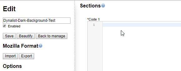
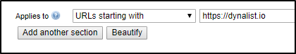
Before you do that make sure this is specified at the bottom though
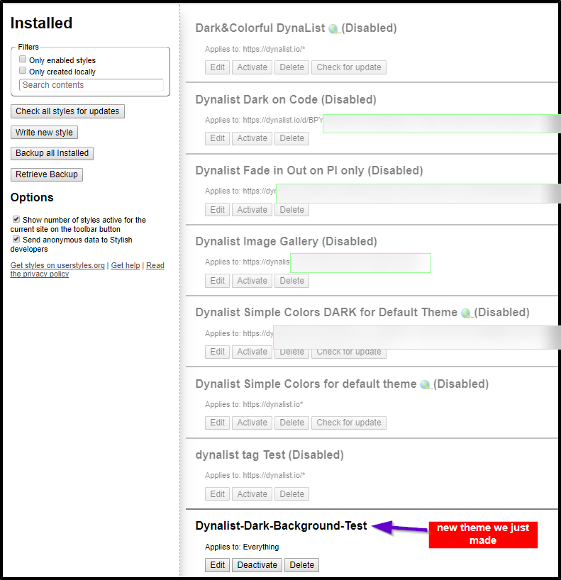
Now disable all your other themes, only have the one you just made enabled. I have lots of themes here I tested and never use
Make sure you have the correct settings on dynalist on
- ✓ Show Document Border On
- Theme: Dark
Now you can preview the results.
So in summary
- you can always have multiple css files enabled in stylish, maybe you turn one on in day (default theme), turn another on at night (dark theme)
- or you can specify some dynalist url docs to be all dark theme, everything else default
I personally use a dark theme on a case by case basis per document
everything else I use a basic light-colored theme (I use dynalist default theme only)