Is it possible – either as a feature addition or perhaps a CSS workaround – to make breadcrumbs display longer (or even complete) names?
Currently all but the shortest names are clipped, which needlessly restricts the breadcrumbs’ ability to reveal the context of the zoomed item. Here’s a typical example, with clipped names and wasted space:
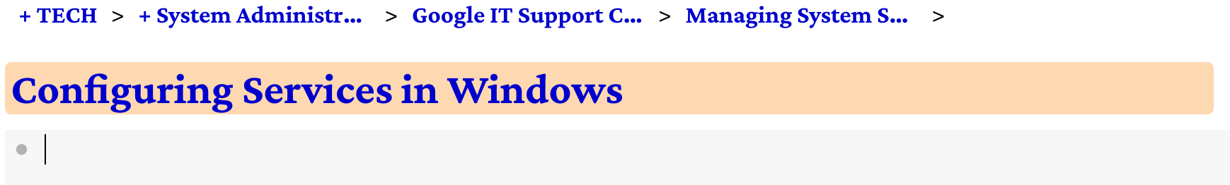
(Zooming out yields no less clipping, only more wasted space. Disabling my custom CSS also doesn’t solve the problem.)
I would love to be able to either expand or eliminate the limit on the length of breadcrumb names, and also to allow the breadcrumbs to be split across multiple lines if necessary.
Does anyone else have similar wishes, or an idea for how to achieve it?
(A possible model for how Dynalist could one day extend breadcrumbs even further is Zim Desktop Wiki’s Pathbar. Like many path bars, its items have flexible width. More interestingly, the Pathbar offers five display modes:
- None (hidden)
- Recent pages (without duplication)
- Recently Changed pages
- History (which can include duplicates)
- Page Hierarchy (like Dynalist’s current breadcrumbs).
In my opinion, all of these possibilities fit with the concept of breadcrumbs: a simple device for more easily retracing one’s path through a forest of notes.)

 . Thankfully, because it’s a CSS tweak, everyone need not agree.)