Swap "New folder" and "New document" in the folder context menu

Ron emailed me and suggested that

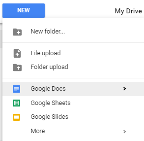
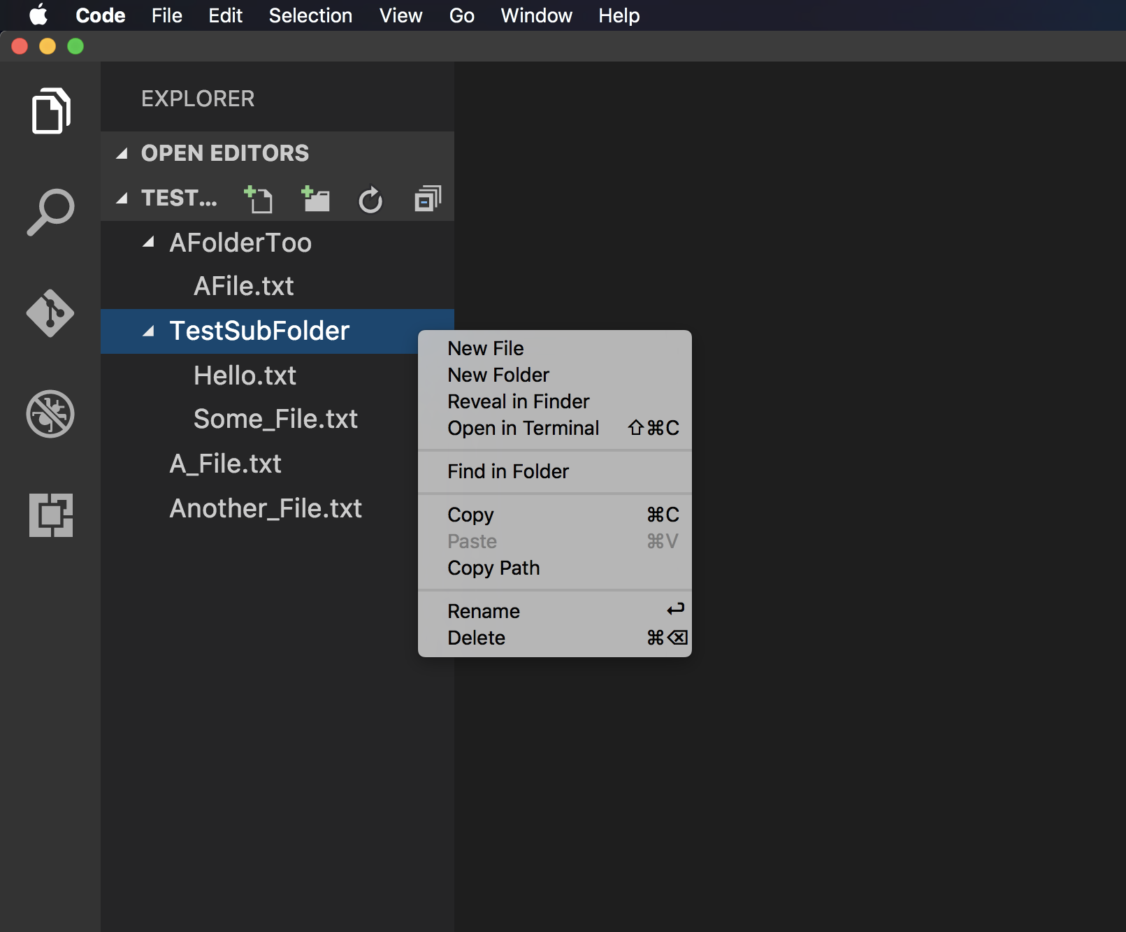
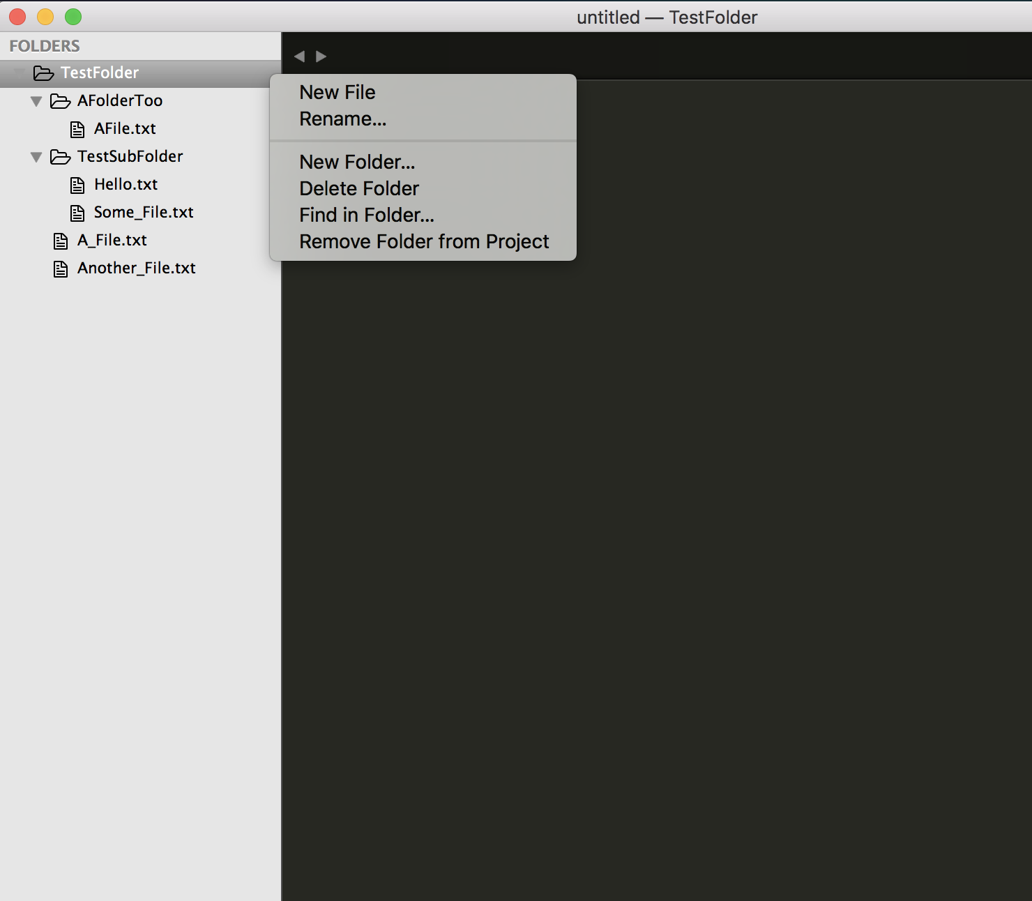
In the context menus (right click on a folder OR click the + button), the “New Document” item should be above the “New Folder” item. Users probably create more documents than folders, so it should be a more efficient mouse action. (The mouse doesn’t have to move as far.) I keep accidentally creating new folders!

Try it out with some users, and see if they like it better!

Wanna hear you ideas! :slight_smile:

3 Likes

+1 same for me here

1 Like

Makes sense to me. Better.

I like the idea from an efficiency perspective. It does go against some the standard UI conventions that exist. (see Google Drive example).

Not sure if efficiency of mouse action outweighs familiarity of UI conventions and the associated muscle memory.

Yeah, I think the argument is mostly from an efficiency perspective.

Not sure if it goes against the UI conventions, even we assume Google Drive is the the “standard” here. The first group in the menu is about creating new things, and the second group is about uploading things (that’s how I understand the menu, anyway). If there’s a “New file” option, it will probably sit above the “New folder…” option, since “File upload” is above “Folder upload”.

In a sense, putting non-folder files before folders is probably the standard.

Hi everyone,

“Ron” here! I’m new to Dynalist and love that the founders are so responsive. I’m currently using the other outlining app and am planning to switch over soon.

As for the New File vs. New Document issue, I am arguing that it is UI convention to put New File first. Here are two examples from my favorite text editors, Visual Studio Code and Sublime Text.

VS Code:

Sublime:

I assume most of us have way more documents than we have folders. And Microsoft agrees! When someone right clicks to create a “new” something in VS Code, Microsoft designers have decided that New File goes first.

Thanks, and have a great weekend!
Ron

3 Likes

As for Google Drive, I feel like the Google designers had a difficult UI problem to solve and made a trade-off.

My guess is that they decided that in the My Drive view, you are primarily organizing your various documents. Also, if they moved all the “New Google Doc”, “New Google Spreadsheet”, “New Google Slides”, “More” to the top of the context menu, then “New Folder” would be the 4th or 5th option, and that would be annoying.

If you go to the individual app view (e.g., https://docs.google.com/) there is a ginormous “Start a New Document” panel at the top. This view hides all the organizational features of Google Drive (e.g., new folder, move file) and only allows you to sort your docs by various attributes / views.

Ron

1 Like

I was going to make this suggestion but it seems it already exists. Is there a reason for “New Folder” to take precedence over “New Document” in a menu that has a tooltip that says “Create New File” other than that’s what some other company does?

One of the appeals to Dynalist is how fast I can create a document and start typing away, adding structure to thoughts as I go. If I’m fighting against instinct to click the first thing in the menu for creating another document (as indicated by tooltip description) and a + icon across the words “My files…” (which one would assume, the + sign refers to adding a new file), then I feel like that detracts from that appeal.

As Ron said previously, comparison to what Google Drive did isn’t appropriate since their screen is more for organizing files whereas Dynalist should be to create more dynalist documents.

Makes sense, we’ll swap them soon.

Thanks for the suggestion!

1 Like

Just saw the change live - made my day! You guys rock! :slight_smile:

1 Like

Thanks for noticing!

@Ron @yyyguy @Francisco_Barros @Clement_B, it’s been a long time, just wanna let you guys know this is now live.

1 Like

Awesome. Great work! :slight_smile:

Thanks for the work on this.