Ignore the text below. It was my user error (custom CSS) that contributed to the poor formatting that I complained about…
========================
Hello there!
I notice the text on this forum is very difficult to read on my fancy new macbook.
Can we turn up the contrast on the text please? Gray on light gray looks cool, but is hard to read. Even Apple’s website has moved away from gray on gray, and now uses a pretty dark gray (almost black) on light gray background.
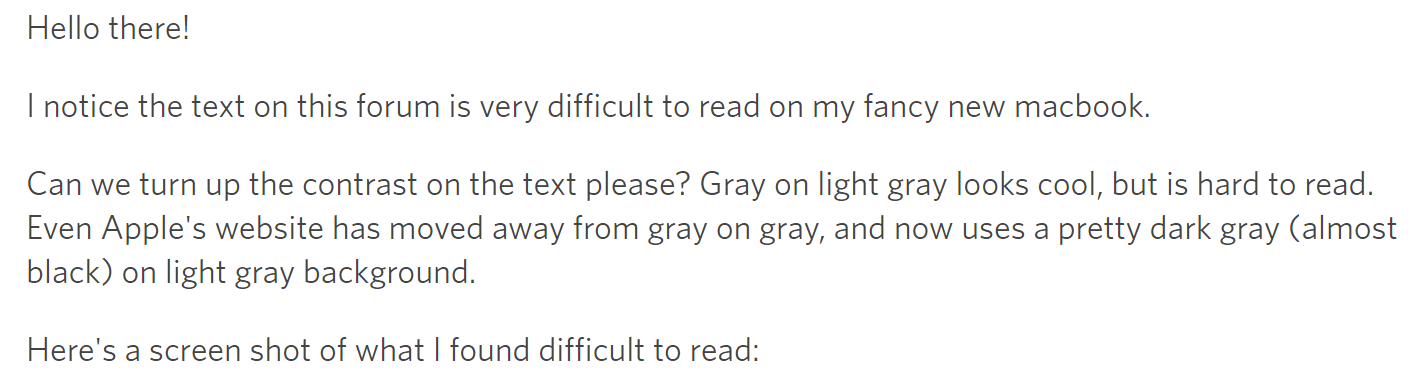
Here’s a screen shot of what I found difficult to read:

Thanks!