yes please I completely forgot about this, what I would really like is markdown support using ![]() to make the image selection size myself
can we get pandoc markdown formatting for image sizes?
{ width=50% } so I can set the width to be 50% of the total inline size on page? (in case the monitor size changes)
reference stackoverflow page: Changing image size in Markdown - Stack Overflow
or an option to set a physical px size like 300px x 400px would be nice too
oh you know what would be even better? have the images really small but allow the user to click and expand image size
Reddit RES does it like so

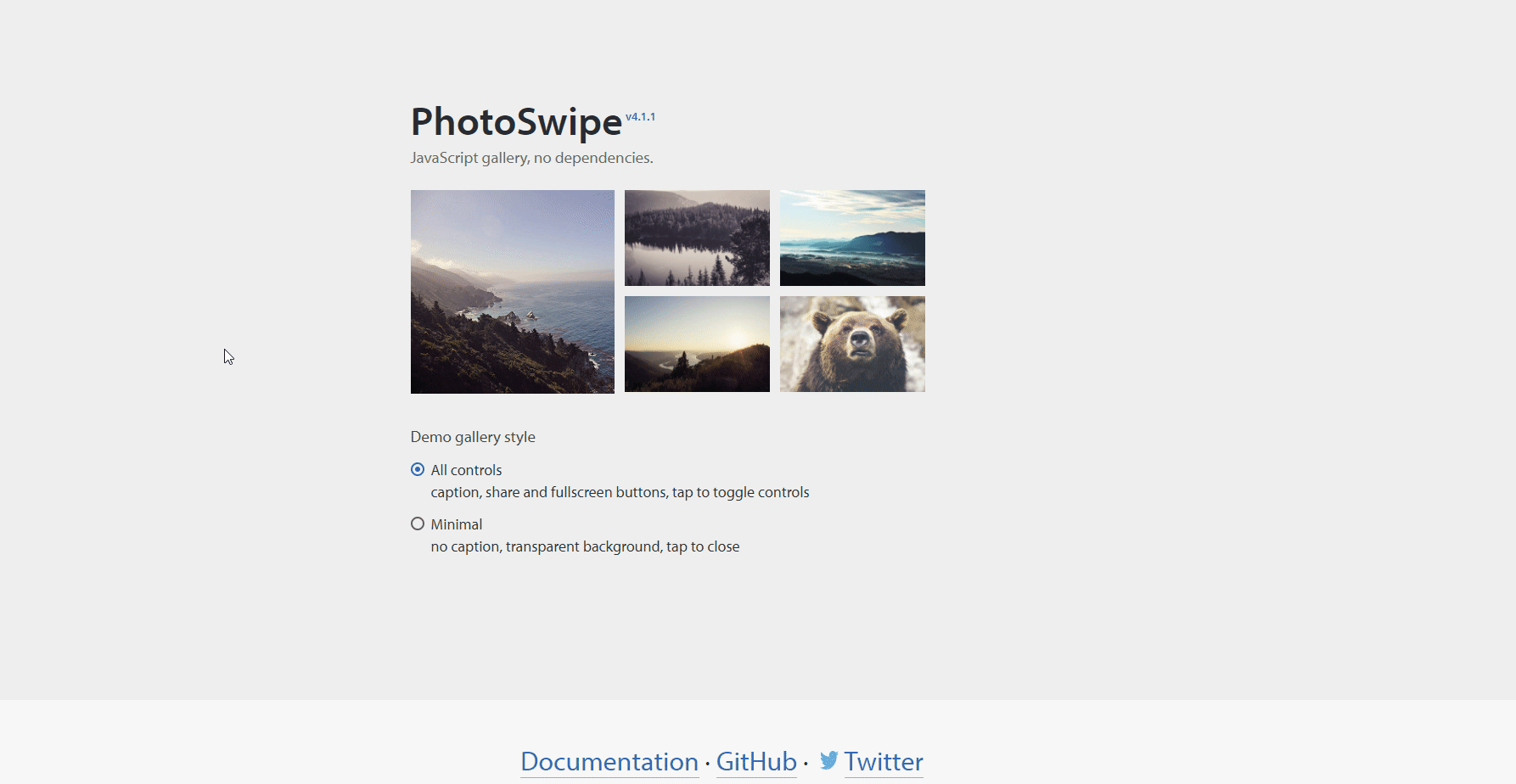
Or maybe a javascript plugin like photoswipe http://photoswipe.com/, similar things used in lots of wordpress blogs too
example: